ADK-HTMLGUI Programmers Guide
This document is for programmers and developers who want to understand and use the ADK-GUI framework.
Audience
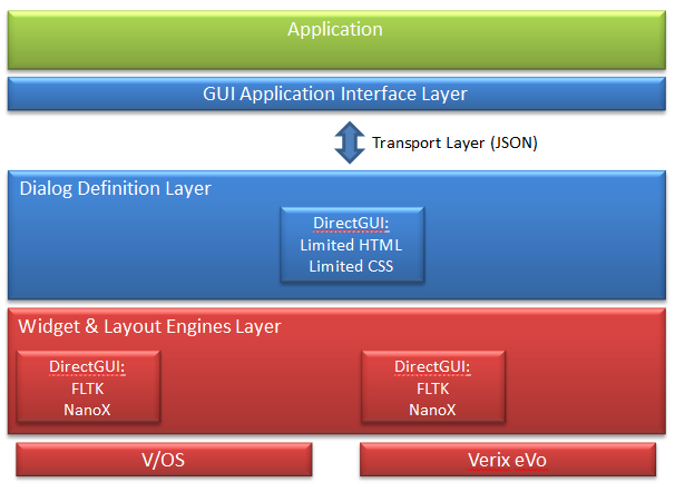
This guide provides information on the usage of the ADK-GUI system based on FLTK. With version 2.x, the support of the ADK-GUI variant running in a Web browser has been dropped since only the FLTK based variant was deployed in the field due to limited terminal resources.
Version 2.x focuses on issues that could not be fixed while preserving 100% compatibility with version 1.x. Minor changes are introduced that requires code changes when switching from version 1.x to 2.x. See Migrating from Version 1.x to 2.x for a detailed description of these changes.
Organization
Chapter 1, Introduction: Provides a general introduction to ADK-GUI
Chapter 2, Getting Started: Presents an introduction in ADK-GUI usage.
Chapter 3, Programming: Supplies ADK-GUI programming information.
Chapter 4, System Setup and Requirements: Presents environment setup and dependencies.
Chapter 5, Troubleshooting: Gives solutions for possible issues in ADK-GUI.
Annex A, Migrating from version 1.x to 2.x: Provides instructions for migrating from version 1.x to 2.x of ADKGUI
Introduction
ADK-GUI allows applications to define HTML based user dialogs and screen contents. This includes standard HTML support for static text, fonts, tables, images, input elements for numeric, textual, menus, buttons, etc. Specific support for PIN input is provided.
The application programming interface allows generic invocation of such pre-defined HTML documents with exchange of the relevant dialog parameters between the application logic and the GUI system supporting variable data definitions in the HTML documents.
In addition, specific APIs are provided for typical use cases such as menus, confirmations, and data inputs. These specific functions rely on HTML templates that get filled-in during runtime.
ADK-GUI implements a subset of HTML and CSS to be able to provide a fast and efficient solution with a small footprint.
ADK-GUI uses UTF-8 encoding to support international characters. However, to make full use of unicode the installed fonts need to support the characters in use. Providing an appropriate font is in the scope of the respective application.
Concepts
Platform Independent Application
HTML dialogs are separated from the application and stored in platform specific subdirectories. By this the application itself becomes platform independent. The platform dependent layout of dialogs is moved to HTML files. Therefore, the same application binary may be used on different platforms while only the HTML dialog files are different. Since also the input and keyboard handling is handled by HTML dialogs the whole bandwidth of devices can be covered, from small B/W displays with function keys up to large true color displays with touch screen.
Screen Layout
Most terminals display different types of information on screen, which are updated independently.
Example:
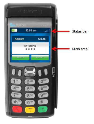
The above example shows a status bar that displays the date and time (along with other information) that is updated separately.
This concept is covered by UI regions. Each region has a unique ID used for displaying a dialog in a specific area on the screen. Region 0 is the default region and is usually assigned to the main part of the screen (i.e. the main application dialog).
Keyboard Navigation
Actions may be bound to function keys by using invisible buttons. For devices without touch screen capabilities, this is the only way of operating the device. Two different concepts are supported:
- Each key has a dedicated function, just like a button on a Web page. This is useful when there is an association that links a function key to a function displayed on screen (e.g. if there is a button on screen close to a function key).
Example: VX520 functions keys - Cursor like navigation uses some function keys to move an active element on screen like using a joystick. Another button is used to trigger an action on the active element.
Example: V200c 4-directional navigation keys
The selection of the concepts depends on the device. For example VX520 with its function keys around the display might be suited better for the first type of navigation while V200c with its 4-directional navigation key is a candidate for the second approach.
Variable Data
Most dialogs contain some dynamic data that needs to be controlled by the application. For this purpose, XML processing instructions are used to insert data provided by the application into dialogs. The following use cases are supported:
- Insert some text provided by the application
- Insert text found in a catalog (translation) file
- Insert barcode images
Multi-Language Support
There are two ways to display dialogs in multiple languages:
- Using catalog files to provide texts in different languages
- Switching between different sets of dialogs
Printer support
Printer support is covered in ADK-PRT. However, since ADK-PRT and ADK-GUI share quite some code, a combined server has been developed to reduce resource consumption, that provides both GUI and Printer support. However, for the user this combined server behaves just like two separate servers so that no special handling is required for using the combined server.
Getting Started
The GUI system comes with a sample application that demonstrates system features and provides a starting point for application developers who use the GUI system. It can be found in the example folder of the documentation package. The file README.txt in this folder gives exact instructions for compiling the example.
The GUI system is provided on different target platforms. The following sections describe how to use the GUI sample application on these platforms. In addition, this chapter gives general information about required components to run ADK GUI (runtime libraries, installing fonts).
Running ADK-GUI on V/OS
On V/OS the following optional OS download packages need to be installed for using ADK-GUI:
- FLTK
- libpng
In addion it may be required to install font packages containing true type fonts to be used.
ADK-GUI uses ADK-IPC for setting up TCP connections and pipes. For this the application needs to be linked with libvfiipc in addition to the ADKGUI libraries.
Using static libraries:
<library path>/libvfiipc.a Using shared libraries:
-L<library path> -lvfiipc <library path> is the path, where libvfiipc is located.
When shared libraries are used, the corresponding ADK-GUI and ADK-IPC packages need to be installed on the terminal.
dl.libvfiguiprt-X.X.X-X.tardl.libvfiipc-X.X.X-X.tar
Please always use the newest version of libvfiipc, which comes along with ADK components packages.
Packaging Resource Files on V/OS
For ADK-GUI using guiserver, resource files have to be accessed from processes running as a different (system) user. This has to be considered when packaging resource files so that access rights for these files are set up appropriately.
The recommended way is to have a separate package for the resource files (i.e. directory "www") and set group "system" when creating it.
See also the documentation of Package Manager or Packman Tool depending on the V/OS release.
Installing Fonts on V/OS
Providing fonts for the GUI system on V/OS requires the installation of a user font package containing font files in true type format (TTF). Detailed information on how to create user font packages can be found in the document V/OS Secure Installer ERS. An example user font package comes with the demo application in the documentation distribution package.
Earlier versions of Secure Installer required the file fonts.dir to be present. This is no longer required. It is generated automatically during installation.
Please note that the font name is not the same as the font file name. For use in HTML you need to use the font family name, not the file name. Also note that bold, italics, etc. are not part of the font family name but are controlled via the CSS font-weight and font-style properties.
Running on Microsoft Windows
Following is required:
- Visual Studio 2008
- FLTK 1.3.x library for Windows
- Boost library
A Visual Studio 2008 solution file is provided to compile the demo application.
Resource Folder
The demo application comes with a resource folder that contains several sample templates, dialogs and images for different platforms.
Programming
ADK-GUI Deployment Options
While ADK-GUI system provides a single header file (html/gui.h) that exports the GUI system API function calls, different client side libraries are provided to link with applications. These libraries provide the same interface but offer different deployment options (creating a monolithic executable or running the application with a separate GUI server).
Headers and binary deliveries
The ADK-GUI system is composed of the following deliveries:
| File | Purpose |
|---|---|
| gui.h | GUI system header file with exported definitions, functions, etc. |
| gui_error.h | GUI system header file with exported error codes |
| scriptproc.h | Generic scripting interface |
| jsproc.h | JavaScript interface |
| jsobject.h | GUI system header file with exported JSON interfaces (wraps ipc/jsobject.h) |
| libvfiguiprt.a | GUI system client library for use with guiserver/guiprtserver |
| libvfiguiprt.so | GUI system client shared library for use with guiserver/guiprtserver |
| libfltkgui.a | GUI system implementation library for monolithic applications (V/OS only) |
| libjsproc.so | JavaScript interpreter for scripting |
| libcpapp.so | CP application runtime library |
| guiserver | GUI server binary |
| guiprtserver | combined GUI and printer server binary |
All header files can be found in the 'html' directory.
An application has to be linked either with libvfiguiprt or with libfltkgui (see deployment options below).
Parameter Overloading
ADK-GUI uses C++ overloading to provide different variants of a function so that parameters can be omitted that have a default value. Unlike C++ default parameters these need not be found at the end of the parameter list. The following parameters are affected:
- display - if not provided, output goes to the display 0
- region - if not provided, output goes to region UI_DEFAULT_REGION (=0). Omitting the region is only possible if the default display is used
- key value map - an empty key value map is used if left out
Running ADK-GUI with GUI server
On V/OS the GUI service runs as a separate process with privileged rights to access HTML and graphical resource files accompanied with the applications. Different applications typically run in separate user spaces.
Using this deployment option more than one application can be run at the same time as long as they synchronize their access to the server and/or use different GUI regions. Synchronization between applications is not part of the GUI system and has to be provided separately. One solution for this is MAC, which is provided by ADK-SYS.
Applications link with the GUI client library to access the GUI API functions. They can either pass a URL to the UI resource files or send HTML documents directly. They also pass dynamic data over the inter-process interface into the GUI service. The GUI server then returns the result from the executed dialogs.
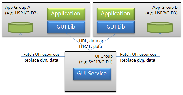
UI resources are assumed to be authentic (i.e. there is no additional authentication of UI resources within the GUI service). If required, the application provides the additional authentication for external resources.
For this setup applications need to link with libvfigui library of the GUI system.
The GUI server and client library use the environment variable GUI_DISPLAY to control the port used for communication between the two entities. Both, named pipes and TCP may be used for communication. For this GUI_DISPLAY either contains the absolute path name of the named pipe or the entry '<hostname>:<port-offset>'. The base for the <port-offset> is 5900. On V/OS, the overall default is ":\b 0" (TCP on localhost port 5900).
Meaning of field <hostname> for TCP connections:
For GUI server this field is ignored. For V/OS non-development devices, this port only accepts connections from localhost (<hostname> is always "127.0.0.1") for security reasons. V/OS development devices have external access enabled (<hostname> is always "0.0.0.0").
For GUI client library field <hostname> is not restricted and specifies the IP address or hostname of the GUI server, which library should connect to. An empty field <hostname> means connection is established to localhost (default on V/OS).
Examples:
GUI_DISPLAY=:0 (default)GUI_DISPLAY=:1 (access via port 5901)GUI_DISPLAY=/tmp/guipipe (access via named pipe /tmp/guipipe)Instead of GUIserver, the combined GUI and printing server guiprtserver may be used. It is the result of merging guiserver with the HTML printer server and supports the same set of GUI functions as guiserver but uses less resources than running guiserver and prtserver as separate binaries.
Setting up keepalives
TCP keepalive probes can speed up the detection of broken TCP links. For enabling keepalives invoke uiSetKeepalive() as first command before invoking other ADKGUI functions.
Running ADK-GUI as GUI Library
The GUI service can also be used as static library to be linked with an application process. In this setup the application links directly with the libfltkgui library of the GUI system. The result is a monolithic application that as everything in one executable.
Please note that monolithic applications needs to link additional static libraries to resolve symbols of library libfltkgui.a. These libraries come along with following distribution packages:
- V/OS: guiprt-contriblibs-vos-dev-X.X.X-X.zip
- V/OS2: guiprt-contriblibs-vos2-dev-X.X.X-X.zip
UI Resources
User interface resources are describing the content, layout and behavior of user dialogs.
The following items are supported:
- HTML documents (files) describing the content and layout of a single dialog
- HTML template file(s) describing the layout of standard dialogs. Dynamic data is entered prior representation.
- Image resource files
- CSS style sheet files
- Catalog files for Multi-language support
Resources accompany the application packages (i.e. they reside in the same user space as the related application).
Resource files are looked up in the resource directory. A search path for base resource directories can be provided in the environment variable GUIPRT_WWW_PATH. It may contain several directories separated by ':'. To refer to the current working directory, "$CWD" may be used and to refer to the directory, where the executable resides "$ORIGIN" can be used (on Linux only). These need to be found at the beginning of a path component, e.g. "$CWD/www". The first existing directory in this path is chosen for the base resource directory. If GUIPRT_APPNAME is set (see also Multi-Application-Controller Resource Subfolder Support), it also needs to contain the application subfolder to be chosen.
If not set the default is "$CWD/www", i.e. the www directory in the current working directory.
On x86 Linux the default is "$ORIGIN/../share/www:$ORIGIN/../www:$CWD/www".
By default, UI resource files are looked up in the "<platform>" subdirectory of this base resource directory. The platform is automatically determined by use of an OS function (e.g. for P400 this is "P400").
If this directory does not exist, UI resources are looked up in a directory whose name is constructed based on the type of display and keyboard. Its name is constructed as follows:
<width>x<height><color><numkeys><touch><width> and <height> are the width and height of the display in pixels. <color> is either 'M' for monochrome displays or 'C' for color displays. <numkeys> is the number of keys on the keypad. In case it cannot be determined '0' is used. <touch> is either 'T' if a touch display is present or 'N' if not.
Examples:
P400: 320x480C15T
UX100: 128x64M16N
The advantage of using this scheme is that several different terminals may share the same set of dialogs. For example, VX520C and VX675 have the same display and keyboard layout and therefore, will look up files in the same folder.
On V/OS the resource files and the application are usually located in home folder of the user. For instance, if an application is installed on P400 under /home/usr1 the default resource directory is:
/home/usr1/www/P400or/home/usr1/www/320x480C15TDue to compatibility reasons, "www/<platform>" is prior to new notation "www/<width>x<height><color><numkeys><touch>".
The default location can be changed by using the UI_PROP_RESOURCE_PATH property of uiSetPropertyString().
An optional prefix may also be set using the UI_PROP_FILE_PREFIX property of uiSetPropertyString(). This prefix is prepended to the file names provided for URLs and template names. If it contains one or more '/', then it will add new directory levels to the path. Otherwise, it only modifies the file name.
With prefix, the resulting file name is: "www/<platform>/<prefix><filename"
Since version 1.3.0, the UI system supports a default directory "www/default" for resource files. These can be considered as fallback in case a dialog is not found in the regular resource directory (e.g. because www/<platform> does not exist). Standard resource folder "www/\<platform>" and default resource folder "www/default" can also be used in parallel and files that are not found in the platform specific folder are secondly looked up the default resource folder. For instance, this is useful for multi-language catalog files that should be used for all platforms, whereas HTML files are still located in standard folder.
The following files types are supported by default resource folder:
- HTML documents (files)
- HTML template file(s)
- GUI system configuration file gui.ini
- CSS style sheet files
- Multi-language catalog files
Please note that image resource files location must be relative to the corresponding HTML document or template file. CSS style sheet files are not supported, since its location is specified in GUI system configuration file.
The default location of the default resource directory can be changed by using the UI_PROP_RESOURCE_DEFAULT_PATH property of uiSetPropertyString().
If the specified resource files cannot be found, the GUI system will automatically generate an error message on the screen. This is helpful during application development and testing and should not show up in a live system if resource files are provided correctly.
Example:
mainmenu.tmpl not found in /home/usr1/www/320x480C15TMulti-Application-Controller Resource Subfolder Support
Multi-Application-Controller (MAC) is used to run several applications in parallel on a terminal. Since version 2.5.0 the UI system has added support to lookup resources in a separate subdirectory for each application to avoid resource location conflicts. For this, MAC can be configured to set up the environment variable GUIPRT_APPNAME, which provides a name for each application that is used for the subfolder appname:
www/<appname>/<platform>or
www/<appname>/\<width>x\<height>\<color>\<numkeys>\<touch> GUIPRT_APPNAME is automatically considered during startup of an application so that most of the MAC handling is transparent to the application. Please note that the variable is just used to set up the default values for UI_PROP_RESOURCE_PATH and UI_PROP_RESOURCE_DEFAULT_PATH. Once an application has set the properties during runtime, value of GUIPRT_APPNAME is ignored.
An application can also set GUIPRT_APPNAME by itself to move the default resource folder. For this the environment variable has to be set using setenv() before calling any ADKGUI function.
GUI System Configuration File
The GUI system has a gui.ini file stored in the resource folder (--> www/<platform>/gui.ini) that provides global configuration and startup parameter for the system. This file has Windows INI-file format with sections and parameter value pairs.
The gui.ini file is automatically read on startup of the program. In case the application has modified gui.ini or changed UI_PROP_RESOURCE_PATH it has to call uiReadConfig() to re-read the file.
Standard Font
The standard font and font size can be adjusted in the [font] section.
Example:
[font]name=dejavu sanssize=10Decimal and Thousands Separator
The decimal and thousands separator can be adjusted in the [input] section.
Example:
[input]decimal_separator=.thousands_separator=%20Leading and trailing whitespace in this configuration is stripped, but URL encoding can be used to insert whitespace, e.g. to set the thousands separator to a single space use %20. Note that UTF-8 encoding is used, e.g. for the multipy symbol '×' the sequence %C3%97 would be used.
Alphanumeric Keyboard Definition
The GUI system supports alphanumeric inputs through pressing hard keys multiple times. Each key can be assigned with a number of characters that are selected in given order when pressing the key multiple times during alphanumeric inputs.
The definition of this alphanumeric keyboard is provided in the section [keymap] of the gui.ini file.
Example:
[keymap]1=12=abc2ABC3=def3DEF4=ghi4GHI5=jkl5JKL6=mno6MNO7=pqrs7PQRS8=tuv8TUV9=wxyz9WXYZ0=%200To use '*' and '#' for character input, add the following rules:
=*#=#Without these rules the keys only act as a function key.
Please note that the allowed_chars attribute for input fields operates as filter on the keymap.
Model specific keymaps can be provided as [keymap-standard], [keymap-europe], [keymap-arabic] and [keymap-rnib]. If found they are preferred over the default [keymap].
Standard Display Regions
To configure multiple display regions without using uiLayout(), the display regions in the [layout] section of the GUI configuration file can be specified. For more information, see Display Regions.
Syntax:
[layout-name]<reg_id>=<left> <top> <right> <bottom> [<flags>]...Section [layout] consists of one or more lines each standing for one display region. Region ID <reg_id> is used as key and value consists of following parameters to be separated by whitespaces:
<left> left position in pixels (+=width if negative)
<top> top position in pixels (+=height if negative)
<right> right position in pixels (+=width if negative)
<bottom> bottom position in pixels (+=height if negative)
<flags> optional region flags, numeric value as found in gui.h
Regions in gui.ini are activated by passing their name to uiLayout().
Example specifying two regions, region with ID 1 has a fixed height of 20 pixels:
[layout]1=0 0 -1 200=0 21 -1 -1CSS File
ADK-GUI allows specifying a CSS file in gui.ini as follows:
[stylesheet]css=<filename>The color of the scroll overlay can be set using:
[scroll]color=<RGBA>display=<time><RGBA> is the 8-character hex color value including alpha channel. The default is 00000060 which corresponds to a semi transparent black overlay. <time> is the time in milliseconds for which the scroll overlay is displayed after the last change of the scroll position. Setting it to 0 disables the scroll overlay. Setting it to a negative value the overlays are displayed permanently. The default is 1000.
The alpha channel is ignored on B/W devices.
HTML Support in ADK-GUI
Standard HTML elements are used to define the layout of dialogs.
The HTML support in ADK-GUI is limited. All unknown HTML tags are ignored and text without HTML formatting is displayed.
The following HTML tags are supported with ADK-GUI:
<b> - Bold text
| Attribute | Description |
|---|---|
| dir | direction (rtl, ltr or auto) |
<bdi> - Bi-Directional isolation
| Attribute | Description |
|---|---|
| dir | direction (rtl, ltr or auto) |
<bdo> - Bi-Directional override
| Attribute | Description |
|---|---|
| dir | direction (rtl, ltr or auto) |
<body> - Body of the HTML document
| Attribute | Description |
|---|---|
| - | - |
<br> - Single line break
| Attribute | Description |
|---|---|
| style | inline CSS style |
<button> - Button
| Attribute | Description |
|---|---|
| action | event emitted on activation of the element (see Event Handling) |
| autofocus | element gets initial focus |
| name | name |
| nofocus | prevent that the button gets focus |
| style | inline CSS style |
| value | returns value |
| disabled | button is disabled |
| immediate | when present the action is performed on push instead of on release (this attribute does not take a value) |
| pushsound | file name of WAV file to be played when the button is pushed. |
| dir | direction (rtl, ltr or auto) |
<center> - Center text block
| Attribute | Description |
|---|---|
| name | name |
| style | inline CSS style |
| dir | direction (rtl, ltr or auto) |
<div> - Section in a document
| Attribute | Description |
|---|---|
| dir | direction (rtl, ltr or auto) |
| name | name |
| style | inline CSS style |
<em> - Emphasized text
| Attribute | Description |
|---|---|
| dir | direction (rtl, ltr or auto) |
<font> - Font
| Attribute | Description |
|---|---|
| size | font size |
| face | font face |
| color | text color |
| dir | direction (rtl, ltr or auto) |
<h1> ... <h6> - HTML headings
| Attribute | Description |
|---|---|
| dir | direction (rtl, ltr or auto) |
<hr> - Horizontal line
| Attribute | Description |
|---|---|
| - | - |
<i> - Italic text
| Attribute | Description |
|---|---|
| dir | direction (rtl, ltr or auto) |
<img> - Image
| Attribute | Description |
|---|---|
| src | URL of the image. |
| alt | alternate text |
| align | alignment (supported: top/middle/bottom) |
| style | inline CSS style |
<input> - Input Field
| Attribute | Description |
|---|---|
| action | Event emitted on activation of the element (see Event Handling) |
| allowed_chars | Allowed characters for input (GUI specific HTML extension) |
| mask | Input mask (GUI specific HTML extension) |
| maxlength | Maximum input length |
| name | Name of the input field |
| cursorname | Cursor name for controlling the cursor position using the key value map |
| precision | Number of decimal digits (GUI specific HTML extension, for type number) |
| size | Size of the input field in characters |
| type | Input type (number, mask, text, password, radio, checkbox) |
| autosize | If set use the largest font so that the value fits the input field. The font size specified via CSS is used as minimum font size |
| prefix | prefix to be displayed |
| postfix | postfix to be displayed |
| placeholder | placeholder that is displayed if the input field is empty or in case of type number contains '0' |
| autofocus | element gets initial focus |
| dsep | decimal separator |
| tsep | thousands separator |
| sepkey | If provided with a key code, numeric input starts with the integer part of the number and pressing the selected key switches to the fractional part. |
| nocaret | Do not display the input cursor. |
| noinsert | For text, mask and password input: The cursor is always at the end of the input and cannot be moved. |
| novkbd | Do not have MAC display a virtual keyboard. Use this if you want to provide your own virtual keyboard for a specific dialog. |
| readonly | The value is only displayed and cannot be changed |
| rfill | In case of mask input, fill the mask from the end |
| show | In case of password input, this is a mask indicates which characters are to be displayed as clear text: If the mask has a '1' the corresponding character of the password is displayed as clear text. |
| style | inline CSS style |
| dir | direction (rtl, ltr or auto) |
| format | optional numeric format |
<li> List item (inside <ul> or <ol>)
| Attribute | Description |
|---|---|
| dir | direction (rtl, ltr or auto) |
<ol> - Ordered list
| Attribute | Description |
|---|---|
| dir | direction (rtl, ltr or auto) |
| type | one of 1,A,a,I,i |
| start | start value for counter |
| style | inline CSS style |
<option> - Option in a selection list
| Attribute | Description |
|---|---|
| action | Event emitted on activation of the element (see Event Handling) |
| selected | Element is selected |
<p> - Paragraph
| Attribute | Description |
|---|---|
| style | inline CSS style |
| dir | direction (rtl, ltr or auto) |
<pre> - Preformatted text
| Attribute | Description |
|---|---|
| - | - |
<select> - Selection List
| Attribute | Description |
|---|---|
| name | Name of the selection list |
| size | Visible size (number of option elements) |
| style | inline CSS style |
| dir | direction (rtl, ltr or auto) |
<source>
| Attribute | Description |
|---|---|
| src | URL of the video or sound file |
<span> - Section in a document
| Attribute | Description |
|---|---|
| style | inline CSS style |
| dir | direction (rtl, ltr or auto) |
<strong> - Bold text
| Attribute | Description |
|---|---|
| dir | direction (rtl, ltr or auto) |
<table> - Table
| Attribute | Description |
|---|---|
| border | Border size |
| cellspacing | Space between cells |
| cellpadding | Additional space inside cells |
| style | inline CSS style |
| dir | direction (rtl, ltr or auto) |
<th> - Table header cell in a table
| Attribute | Description |
|---|---|
| width | |
| height | |
| colspan | Cell spans this number of columns |
| rowspan | Cell spans this number of rows |
| style | inline CSS style |
| dir | direction (rtl, ltr or auto) |
<td> - Cell in a table
| Attribute | Description |
|---|---|
| width | |
| height | |
| colspan | Cell spans this number of columns |
| rowspan | Cell spans this number of rows |
| style | inline CSS style |
| dir | direction (rtl, ltr or auto) |
<tr> - Row in a table
| Attribute | Description |
|---|---|
| - | - |
<u> - Underline text
| Attribute | Description |
|---|---|
| dir | direction (rtl, ltr or auto) |
<ul> - Unordered list
| Attribute | Description |
|---|---|
| style | inline CSS style |
| dir | direction (rtl, ltr or auto) |
<video> - Video
| Attribute | Description |
|---|---|
| autoplay | The video will start playing right from the start |
| height | height in pixels |
| loop | The video will start over again when it is finished |
| muted | The video will start with sound turned off |
| src | URL of the video file |
| width | width in pixels |
| style | inline CSS style |
<audio> - Audio
| Attribute | Description |
|---|---|
| autoplay | Sound playback will start playing right from the start |
| loop | Sound playback will start over again when it is finished |
| src | URL of the audio file |
| style | inline CSS style |
Color Names Support:
The following color names are supported: aqua, cyan, black, blue, fuchsia, magenta, gray, green, lime, maroon, navy, olive, orange, purple, red, silver, teal, white, and yellow.
In addition, "transparent" is supported for creating transparent buttons.
Soft Hyphen Support:
Soft hyphens are used to specify a place in text where a hyphenated break is allowed without forcing a line break in an inconvenient place if the text is reflowed.
Use one of the following syntax to insert a soft hyphen.
­­Bi-Directional Text Support
Bi-directional text is supported, including Arabic text. Note that the selected font needs to have support for the character set used.
Video Support
Depending on platform, the terminal must have installed additional components to meet the applicable prerequisites for video playback.
V/OS and V/OS2 terminals use mplayer which provides hardware accelerated video playback if available. Video support is only available on those platforms that contain mplayer.
ADKGUI on V/OS3 has internal support for video playback.
Compared to ordinary web browsers, video playback with ADK-GUI has some limitations:
- On V/OS and V/OS2 the HTML rendering engine has no access to properties of the video. It cannot determine width and height of the video. The width and height must be specified using the corresponding attributes. This limitation is not present on V/OS3.
- On V/OS and V/OS2 the video output window must be completely within the display and cannot be moved once playback has started. Therefore, the page that contains the video must entirely fit within the screen so that no scrollbars show up.
- The HTML rendering engine cannot check for supported video formats. Therefore, when <source> is used to provide several media sources, it always chooses the first file for playback.
- The video file is accessed from another process. It must be stored in a directory where it can be accessed by the guiserver or mplayer.
- The video decoding hardware has some limits with respect to the position of the video playback window on screen. Therefore, the output window may be off by some pixels from the desired position.
HTML video example for playing video in a loop:
<video width="582" height="388" style=";margin-left:auto;margin-right:auto" autoplay loop><source src="file:///mnt/usbstor1/video.avi">Video not supported or video not found.<br>On Mx9 plug in USB device containing video named "video.avi".</video>Please note that the source path is platform dependent. The specified path for accessing the video file on USB device (see example) only works on V/OS.
HTML Video Widget Functions for Video Control
Some widget functions for video playback control are provided that can be called from an action statement of an event. These functions are executed in the context of the currently active HTML document and refer to the name specified for the video element:
<video width="240" height="206" style=";margin-left:auto;margin-right:auto" name="vid">...</video><button accesskey=' ' style='width:100%' action='call vid.play()'> ▶</button>Please refer to chapter HTML Widget Functions which lists the supported video control functions.
Performing an Action When the Video has Stopped
The following input field detects the end of the video playback:
| Definition | Documentation |
|---|---|
| <input type="videoend" style="display:none" action="yyy"> | defines a hidden input field that is triggered when any video in the dialog has ended. Action yyy specifies the action to be taken in this case. |
Example:
<input type="videoend" style="display:none" action="return 42">GUIPRT Demo and Video Support
Since the size of sample videos would blow up the GUIPRT documentation package, the video extension package (guiprt-doc-video-X.X.X-X.zip) is provided. The video package contains additional documentation and some video files with different resolutions for different displays. Please refer to the enclosed VIDEO-README.txt containing more details about required components to meet the applicable prerequisites for video playback. In addition, you can find helpful instructions for installation of sample video files for GUIPRT demo.
Supported video formats on V/OS2
libsvc_mplayer is reported to support the following formats on V/OS2:
- H.264 Video decoder requirements
- H.264 baseline profile up level 5
- Supports I&P picture decoding
- Supports CAVLC decoding
- Supports Progressive decoding
- Supports all Intra prediction sizes and modes
- Supports all Inter prediction unit sizes
- Container format must be avi
V/OS2 multimedia playback support
Backend
Video playback is ensured by MPlayer (current version being 1.4). Out-of-the box MPlayer supports many audio/video (A/V) encodings in various video container formats but there are some restrictions that are in place for the customized MPlayer version used by V/OS2. Since target devices are of limited space, support for much of the A/V encodings, but for the most commonly used, has been stripped. Additionally, due to relatively slow CPU and no hardware acceleration support for A/V decoding, there is a proprietary 3rd party decoder in use by MPlayer which speeds up the decoding, but applies even tighter restrictions on supported A/V encodings.
Supported formats
| No | Video encoding | Video encoding profile | Audio encoding | Video container | Conversion example |
|---|---|---|---|---|---|
| 1 | H.264 (MPEG-4 Part 10, AVC) | Baseline | AAC, MP3 | AVI | ffmpeg -i INPUT_VIDEO.EXT -vcodec libx264 -profile:v baseline -acodec aac OUTPUT_VIDEO.avi |
| 2 | H.262 (MPEG-2) | Simple profile | AAC, MP3 | AVI, MP4, MOV, M4V | ffmpeg -i INPUT_VIDEO.EXT -vcodec mpeg4 -acodec mp3 OUTPUT_VIDEO.mp4 |
Audio Support
Depending on platform, the terminal must have installed additional components to meet the applicable prerequisites for audio playback.
V/OS terminals use the service libsvc_sound which provides sound playback. Audio support is only available on those platforms that contain this service. This service also determines the supported audio formats: Currently it supports wav and mp3.
Audio playback is bound to the dialog, i.e. the sound will only play as long as the dialog is active.
Compared to ordinary web browsers, audio playback with ADK-GUI has some limitations:
- The HTML rendering engine has no access to properties of the sound file.
- The HTML rendering engine cannot check for supported audio formats. Therefore, when <source> is used to provide several media sources, it always chooses the first file for playback.
- On V/OS and Rapter devices, the sound file is accessed from another process. It must be stored in a directory where the sound playback service has access rights.
HTML audio example for playing a sound in a loop:
<audio autoplay loop><source src="file:///mnt/usbstor1/sound.mp3">Sound not supported or sound file not found.<br>On Mx9 plug in USB device containing a sound file named "sound.mp3".</audio>Please note that the source path is platform dependent. The specified path for accessing the sound file file on USB device (see example) only works on V/OS.
HTML Audio Widget Functions for Audio Control
Some widget functions for sound playback control are provided that can be called from an action statement of an event. These functions are executed in the context of the currently active HTML document and refer to the name specified for the audio element:
<audio name="snd">...</audio><button accesskey=' ' style='width:100%' action='call snd.play()'> ▶</button>Please refer to chapter HTML Widget Functions which lists the supported audio control functions.
Performing an Action When the Sound has Stopped
The following input field detects the end of the video playback:
| Definition | Documentation |
|---|---|
| <input type="audioend" style="display:none" action="yyy"> | defines a hidden input field that is triggered when any sound playback in the dialog has ended. Action yyy specifies the action to be taken in this case. |
Example:
<input type="audioend" style="display:none" action="return 42">CSS support in ADK-GUI
Cascading Style Sheets (CSS) are used to change appearance of HTML elements. For ADK-GUI implementation, a limited set of CSS elements is supported.
CSS attributes can be specified directly in the HTML documents by using the inline style attribute for HTML elements. The inline style attributes overwrite styles taken from the CSS file. GUI.INI may be used for specifying a global CSS file.
| CSS Style Attribute | Description | Limitation |
|---|---|---|
| align-content | Align flex lines along the cross axis in a flexbox container | |
| align-items | Specify the default alignment for items inside a flexbox container | |
| align-self | Specify the alignment in the block direction for the selected item inside a flexbox container | |
| animation | Shorthand property for animation name, time, timing function, delay, count, direction and fill mode | |
| animation-delay | Delay until the animation starts | |
| animation-direction | Animation direction, one of normal, reverse, alternate or alternate-reverse, default is normal |
|
| animation-duration | Length of time for one animation cycle | |
| animation-fill-mode | Fill mode, one of none, forwards, backwards or both, default is none |
|
| animation-iteration-count | Number of times an animation cycle is played | |
| animation-name | Keyframe name | |
| animation-timing-function | Describes how the animation will progress over one cycle of its duration, one of ease, linear, ease-in, ease-out, ease-in-out, cubic-bezier(<number>, <number>, <number>, <number>), default is ease |
step-start, step-end and steps() are not supported. |
| background-color | Background color | |
| background-image | Background image: url() and linear-gradient() are supported. linear-gradient() only supports gradients parallel to the x- or y-axis. |
|
| background-position | Background position | |
| background-repeat | Supported values: no-repeat, repeat-x, repeat-y, repeat | |
| background-size | Scale background image. | - |
| border border-style border-top border-right border-bottom border-left border-width border-color |
Border properties Single properties are also supported, e.g. border-bottom-color |
- |
| border-radius border-top/bottom-left/right-radius |
Border radius for creating rounded corners. | Only supported for buttons and text/password/number input fields. |
| border-image border-image-slice/width/outset |
Use image for decorating the border. | - |
| border-spacing | <table> | Spacing between table cells, only px supported. |
| bottom | bottom position | - |
| box-sizing | 'content-box': The width and height properties include only the content but not border, padding, or margin. 'border-box': The width and height properties include content, padding and border, but not margin. The default depends on the HTML tag, e.g. <button> has border-box and <div> has content-box as default. |
- |
| color | Text color | - |
| column-gap | Gap between columns in flexbox layout | |
| direction | - | - |
| display | Display property | Only block, inline-block, none and table-cell are supported |
| flex | Shorthand property for flex-grow, flex-shrink, flex-basis | |
| flex-basis | Initial length of a flexible item | |
| flex-direction | Direction of the flexible items | |
| flex-flow | Shorthand for flex-direction, flex-wrap | |
| flex-grow | Amount of how much the item will grow relative to the other flexible items | |
| flex-shrink | Amount of how much the item will shrink relative to the other flexible items | |
| flex-wrap | Specifies whether flexible items should wrap or not. | |
| font | Set font family, style, size and weight | - |
| font-family | - | - |
| font-style | - | - |
| font-size | - | - |
| font-stretch | - | ADK-GUI does not support distinguishing different variants of condensed or expanded due to FLTK limitations |
| font-weight | - | bolder and lighter are always relative to "normal" |
| gap | Shorthand for row-gap, column-gap | |
| height | Height in px or % | - |
| justify-content | Align the flexible items along the main axis. | |
| left | left position | - |
| line-height | Set line height | - |
| margin margin-left margin-top margin-right margin-bottom |
Margin properties | - |
| opacity | opacity in the range 0.0 ... 1.0 | opacity is only supported for <div>, <button> and for <input> types text, number and mask |
| order | Order or flexible items relative to the other items. | |
| overflow | 'visible': The overflow is not clipped, it renders outside the element's box (default) 'hidden': The overflow is clipped. 'auto': Scrollbars are added autmatically if required to scroll the content. 'scroll': Scrollbars are always added to scroll the content 'autogrid': Like 'auto' just that the scrolling snaps in at multiples of the element width/height 'ticker': Automatically scroll oversized content horizontally. Scrolling right to left alternates with scrolling left to right 'ticker-rl': Automatically scroll oversized content horizontally from right to left. 'ticker-lr': Automatically scroll oversized content horizontally from left to right. 'marquee': same as marquee-rl. 'marquee-rl': Scroll content horizontally from right to left. Scrolling is performed independent of content width. 'marquee-lr': Scroll content horizontally from left to right. Scrolling is performed independent of content width. 'ticker', 'ticker-rl', 'ticker-lr', 'marquee', 'marquee-rl' and 'marquee-lr' optionally take a speed parameter that specifies scrolling in pixels per second. Default speed is 50 pixels per second. Example: 'ticker-lr 100'. |
overflow is only supported for <div> |
| padding padding-left padding-top padding-right padding-bottom |
Padding properties | - |
| page-break-after | page break property (always) | not supported for display on screen |
| position | Position static, relative, absolute or fixed | - |
| right | right position | - |
| row-gap | Gap between the rows in a flexbox layout. | - |
| table-layout | Set the table layout algorithm | - |
| text-align | Horizontal alignment(left, center, right) | - |
| text-decoration | Text decoration (underline, overline, line-through) | - |
| text-overflow | Text overflow (ellipsis) | - |
| top | top position | - |
| vertical-align | Vertical alignment (top, middle, bottom) | - |
| visibility | Visibility (hidden) | - |
| white-space | White-space (normal, nowrap, pre-line, pre-wrap, pre) | - |
| width | Width in px or % | - |
| word-break | Word break property (break-all) | - |
| word-wrap | Word-wrap property (break-word) | - |
| z-index | Determines which element is shown in front if elements overlap | Only supported for block elements like e.g. <div> |
The CSS functions calc(), min() and max() are supported to calculate length values. calc() expressions are limited to 8 values in the calculation. Note that the operators '+' and '-' need to be surrounded by space as per CSS standard. If an invalid expression is provided or more than 8 values are used, the expression is ignored.
CSS Combinators Support and CSS Limitations
ADK-GUI supports descendant selector and child selector, sibling selectors are not supported. The following elements cannot be used as ancestor in a descendant or child selector rule:
- b
- em
- font
- i
- span
- strong
- u
That is the following rule is not supported
span div {}Whereas the following rule is supported
div span {}Currently the following limitations exist in ADK-GUI when using CSS:
- Length values only support the units '%' and 'px'.
- For specifying colors
rgba(),hsl()andhsla()are not supported - linear-gradient is restricted to the following directions:
- to top / 0deg
- to right / 90deg
- to bottom / 180deg
- to left / 270deg
- Providing several font names that are looked up in that order for attribute font-face is not supported.
- border-style only supports "none" and "solid".
- border-image does not support using GIF images or PBM images.
Global CSS file: All supported CSS properties may be used in the global CSS file and work the same way as when using the style attribute. For CSS selectors the following restrictions apply:
- CSS pseudo elements are not supported
- The following CSS pseudo classes are supported:
:focus - element that has input focus:active - button while it is pressed:disabled - disabled button
CSS pseudo class selectors have additional restrictions: Only setting colors (e.g. background color) and background-images considers pseudo classes. In particular, it is not possible to change the size of an object using pseudo classes. Other properties are ignored.
CSS Animation support
ADKGUI supports CSS animations. The following CSS properties can be animated:
- background-color
- border-bottom-color
- border-bottom-width
- border-left-color
- border-left-width
- border-right-color
- border-right-width
- border-top-color
- border-top-width
- bottom
- color
- font-size
- height
- left
- line-height
- margin-left
- margin-top
- margin-right
- margin-bottom
- opacity
- padding-left
- padding-top
- padding-right
- padding-bottom
- right
- top
- width
Event Handling
The GUI system supports a limited set of events that can be processed independently of the application business logic. This event mechanism can be used to keep GUI logic largely independent from the application business logic.
The actions taken on behalf of the dialog event are specified in the HTML with the following syntax:
| Syntax | Description | ||||||||||||||||||||||||||||||||||||||||||||||
|---|---|---|---|---|---|---|---|---|---|---|---|---|---|---|---|---|---|---|---|---|---|---|---|---|---|---|---|---|---|---|---|---|---|---|---|---|---|---|---|---|---|---|---|---|---|---|---|
| <HTMLelement action="return x"> | return from uiInvoke() or uiInvokeURL() client API functions to the caller and set x as integer return value for this function.IMPORTANT: The return value must either be positive or one of -1 (abort), -2 (back) or -3 (timeout). It is not allowed to use any other negative values, since these might collide with internal codes or internal handling of error codes, which may cause severe problems. Additional parameters may be appended to the return code and passed to GUI client by using the following notation: return x?key1=value1&key2=value2 See the 'load' action for more information. |
||||||||||||||||||||||||||||||||||||||||||||||
| <HTMLelement action="load url"> | load and invoke another HTML document. The HTML document is invoked by GUI client library automatically after the current dialog has terminated and returned its results from the server. Additional parameters may be appended to the URL and passed to GUI client by using the following notation: url?key1=value1&key2=value2Note: The key-value pairs (separated by &) are stored to value map of uiInvoke() / uiInvokeURL() function. The map is directly passed to the dialog that will be loaded from the specified url. In this way, data may be transferred from current HTML document to subsequent dialogs. For all dialogs of the sequence the key-value pairs are added to the map, whereas existing keys are overwritten. After the dialog sequence has finished, the application may access the value map and read the key-value pairs that were stored by the dialogs before.Please note that it is mandatory to escape characters like & or whitespaces, if used in keys or a values as follows: url?key1=Hello%20World&key2=foo%26barThe following table contains a list of characters for which it is recommended to use escape codes:
|
||||||||||||||||||||||||||||||||||||||||||||||
| <HTMLelement action="returnwait x"> | Similar to 'return', see 'Typeahead support' below | ||||||||||||||||||||||||||||||||||||||||||||||
| <HTMLelement action="loadwait url"> | Similar to 'load', see 'Typeahead support' below | ||||||||||||||||||||||||||||||||||||||||||||||
| <HTMLelement action="event x"> | send a custom event with integer code x. Additional values may be sent using the following notation: event x?key1=value1&key2=$input_name The value can either be constant or the content of an input. For the latter give the name of the input field prefixed with '$'. See also Custom Events. |
||||||||||||||||||||||||||||||||||||||||||||||
| <HTMLelement action="call name.func(paramlist)"> | call and execute the predefined function of the HTML element identified by name with the given parameter list. Available function names depend on the HTML element. |
||||||||||||||||||||||||||||||||||||||||||||||
| <HTMLelement action="call name.action()"> | call the action function of the HTML element identified by name |
Chaining
"call" functions may be chained in the action by separating them with ';'. If present, a non call action must be the last component in the action. Example: Disable a button after pressing it:
<button name="foo" action="call foo.disable(); return 42">OK</button>There can be only one non-call function inside an action.
Custom Events
Custom events allow sending data to an application without terminating the dialog. Custom events depend on using a callback function in combination with an async function (e.g. ::uiInvokeURLAsync). When a custom event is sent, the callback is invoked with ::UI_CB_EVENT. The event code can be accessed using UICBData::result(). If additional values are send, these can be accessed via UICBData::value().
Typeahead Support
Normally key strokes are processed as they happen. However, when switching dialogs this may result in key strokes to be dropped:
The previous dialog has been finished and the next dialog is not yet ready to be shown and to process input.
Now if the user types some key, then there is no use for it and it gets dropped. In certain situation this is not desired, e.g. if the user blindly operates the device and does not wait for visual feedback.
For this use case 'returnwait' and 'loadwait' have been introduced. They differ from 'return' and 'load' in that they suspend GUI and event processing until the next dialog is shown in the same region or until the layout is updated. This enables to atomically replace one dialog with another one so that keyboard input does not vanish in between two dialogs.
Since GUI and event processing is stopped, if the application fails to display the next dialog the GUI is frozen. For this reason, 'returnwait' and 'loadwait' should be used with care.
Long Button Press
Buttons support distinguishing long and short button presses on the touch screen. A button press is considered long if the button is pressed for at least 750ms and no attempt to pan is detected. In this case the action found in the attribute "action2" is performed. If "action2" is not provided then the action found in "action" is performed as fallback.
Example:
<button action="return 1" action2="return 2">Test</button>Multitouch detection in signature capture
Multitouch detection and triggering action2 supported in older releases is no longer supported. Instead pinch/zoom is disabled during signature capture so that signature capture can continue with the first touch contact even when touching the screen with additional fingers. Overall this should give a better user experience than in older releases.
Palm rejection can be deactivated by setting the attribute palm-rejection="0". Setting it to "1" enables palm rejection, which is also the default.
HTML Widget Functions
Some HTML widget functions are provided that can be called from an action statement of an event. These functions are executed in the context of the currently active HTML document.
| Function | Purpose |
|---|---|
| "menuname".up() | move the selector of a <select> element name "menuname" one item up. |
| "menuname".down() | move the selector of a <select> element name "menuname" one item down. |
| "menuname".left(dist=50%) | scroll the menu to the left |
| "menuname".right(dist=50%) | scroll the menu to the right |
| "menuname".action() | run the action bound to the selected menu entry |
| "divname".up(dist=50%) | scroll a scrollable <div> up |
| "divname".down(dist=50%) | scroll a scrollable <div> down |
| "divname".left(dist=50%) | scroll a scrollable <div> left |
| "divname".right(dist=50%) | scroll a scrollable <div> right |
| "name".add_z(z) | add z to the z-index of the named element and its descendants |
| "name".set_z(z) | set the z-index to z of the named element and its descendants |
| "checkboxname".toggle() | toggle the checkbox "checkboxname" |
| "radioname".select(value) | select the radio button "radioname" that has the provided value. (Note: 'value' must not contain white space) |
| "inputname".clear() | clear the content of the input field "inputname" |
| document.up(dist=50%) | scroll the entire HTML document up |
| document.down(dist=50%) | scroll the entire HTML document down |
| document.left(dist=50%) | scroll the entire HTML document left |
| document.right(dist=50%) | scroll the entire HTML document right |
| cursor.left() | move the cursor of the active input field to the left |
| cursor.right() | move the cursor of the active input field to the right |
| cursor.up() | move the cursor of the active input field up / select the previous menu entry |
| cursor.down() | move the cursor of the active input field down / select the next menu entry |
| focus.next() | activate the next input field/button |
| focus.previous() | activate the previous input field/button |
| focus.left() | activate the next input field/button left of the current one |
| focus.right() | activate the next input field/button right of the current one |
| focus.up() | activate the next input field/button above of the current one |
| focus.down() | activate the next input field/button below of the current one |
| active.toggle()/active.action() (action is just an alias for toggle) |
toggle the state of the active checkbox/radio button or run the action bound to the active button |
| active.sendkey(value[,value...]) | send key strokes to the active input field |
| "name".sendkey(value[,value...]) | send key strokes to the named input field |
| active.up() | call 'up' in the active menu |
| active.down() | call 'down' in the active menu |
| active.left() | call 'left' in the active menu |
| active.right() | call 'right' in the active menu |
| active.clear() | clear the content of the active input field |
| "videoname".pause() / "audioname".pause() | pause the video / sound |
| "videoname".play() / "audioname".play([toggle]) | start or resume playback of the video / sound. Providing the optional toggle flag, music is paused when it is already playing. |
| "videoname".rewind() / "audioname".rewind() | rewind the video /sound to the beginning |
| "videoname".togglesound() | toggle sound output |
| audio.volume(vol) | Set volume to absolute value vol in the range 0..100 |
| audio.volume(+vol) | Increase volume by vol |
| audio.volume(-vol) | Decrease volume by vol |
| "buttonname".enable() | Enable button "buttonname" |
| "buttonname".disable() | Disable button "buttonname" |
| "barcodename".scan() | Trigger barcode scanning on "barcodename" |
| "photoname".photo() | Trigger taking a photo |
Keyboard Binding
The UI system supports binding of keys on the terminal keyboard to HTML button elements. The HTML accesskey attribute is used to define the key binding specifying the key code (e.g. '1' for key 1). For functional keys like F1-F4 accesskey is specified with "&#" followed by a decimal value with ";" (see platform dependent key binding table below).
Please note that the key bindings can be defined for visible and non-visible buttons. A typical use case for non-visible buttons is assigning keys on non-touch screen hardware.
Example:
<button action='call menu.up()' accesskey='…'>SCROLL UP</button> <button action='call menu.up()' accesskey='…' style='display:none'>SCROLL UP</button>The following table provides an overview on access key values to be used for the available keys on different hardware.
-
VX675 key access key value 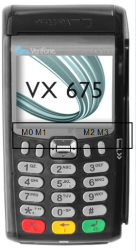
M0 '…' M1 '†' Middle '‡' Up '' Left '‚' Right 'ƒ' Down '„' M2 'ˆ' M3 '‰' 0 - 9 '0' - '9' * (-) 'Š' # (+) '‹' 
'' 
'' 
' '
-
VX820 key access key value 
0 - 9 '0' - '9' * 'Š' # '‹'
''
''
' '
-
e285 key access key value 
0 - 9 '0' - '9' * 'Š' # '‹'
''
''
' '
-
Mx9xx key access key value 
0 - 9 '0' - '9'
''
''
' '
-
Ux100/Ux100 key access key value 
0 - 9 '0' - '9' DOWN (

)
'ˆ' UP (

)
'†' 
'' 
'' 
'Œ' 
' '
-
P200/V200c key access key value 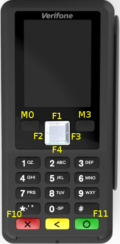
M0 '…' F1 '' F2 '‚' F3 'ƒ' F4 '„' M3 '‰' 0 - 9 '0' - '9' F10 'Š' F11 '‹'
''
''
' '
-
V200t/V205c key access key value 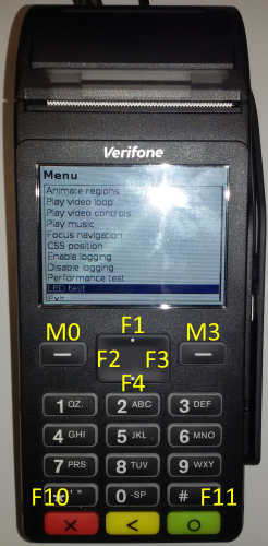
M0 '…' F1 '' F2 '‚' F3 'ƒ' F4 '„' M3 '‰' 0 - 9 '0' - '9' F10 'Š' F11 '‹'
''
''
' '
-
P400/V400/P630 (V/OS3) key access key value 
0 - 9 '0' - '9' F10 'Š' F11 '‹'
''
''
' '
-
V240m key access key value 
0 - 9 '0' - '9' * 'Š' # '‹'
''
''
' ' Camera button
(only devices with camera)'Ž'
-
V400m key access key value 
0 - 9 '0' - '9' * 'Š' # '‹'
''
''
' '
-
e280 key access key value 
POWER ''
Trigger action on key release
Function keys (not normal keys) may trigger an action on release. For this add 18 to the function key value, e.g.
<button action='return 0' accesskey='Ž' style="display:none"></button>triggers the action on pressing of the camera button and
<button action='return 0' accesskey=' ' style="display:none"></button>triggers on release of the camera button.
Key Combinations
For <button> elements more than one key may be specified in "accesskey" to set up a key combination. The keys have to be separated by '+'. Key combinations only work for invisible buttons (display:none).
Example display status screen when pressing <Enter>+'1':
<button action='load statuspage.html' accesskey=' +1' style="display:none"> </button>Virtual Keyboard Support
Virtual keyboard support in ADK-GUI works as follows:
- A set of HTML pages must be set up as virtual keyboard. It consists of a set of buttons that use action
"active.sendkey()"to generate key strokes. sendkey takes the decimal Unicode value of the character to be inserted as parameter. By providing more than one value it can be used to send sequences of key strokes. - The buttons in the virtual keyboard must have the attribute set to "nofocus" so that the input focus is not changed when clicking the button.
- "Shift" or other means of switching to a different character set are implemented by loading a new virtual keyboard page using action "load".
- A separate region has to be defined for the virtual keyboard using
uiLayout(). The coordinates of the region may be specified in gui.ini and referenced by name. - In the application, the virtual keyboard is displayed using
uiInvokeURLDetached()which runs the dialog in the background.
Important: Make sure that timeout handling is disabled for the virtual keyboard, either by settingUI_PROP_TIMEOUTto -1 (the default value) or by adding an infinite timeout to the virtual keyboard dialog using<inputtype='timeout'value='-1'>. Failing to do so, the virtual keyboard will stop working after the timeout elapses. - Control keys have been mapped to the following key codes:
| Control Key | Key Code |
|---|---|
| Backspace | 8 |
| Tab | 9 |
| Enter | 13 |
| Home | 16 |
| Cursor Left | 17 |
| Cursor Up | 18 |
| Cursor Right | 19 |
| Cursor Down | 20 |
| Page Up | 21 |
| Page Down | 22 |
| End | 23 |
| Escape | 27 |
Dynamic Keyboard Switching
ADKGUI sends the IPC notification "_uiInputFocus" when focus is given to or removed from an input field. This can be used to dynamically show a virtual keyboard whenever the user clicks into an input field and remove it when focus is withdrawn from the input field . The _uiInputFocus notification sends the following information:
| Field | Value | Description |
|---|---|---|
| focus | true/false | true if an input field has focus, false if the focus has been removed from an input field |
| type | alphanumeric/numeric | This is only sent if an input field has gained focus, not when losing focus. It indicates which kind of keyboard should be shown. |
Dialog Timeout Handling
A global dialog timeout property UI_PROP_TIMEOUT for all dialogs can be set using uiSetPropertyInt() call. It applies to any dialog invoked using the uiInvoke() and uiInvokeURL() or one of the other standard dialog client API functions. The API functions return with a UI_ERR_TIMEOUT value if the global timeout expires.
Each dialog definition may have one HTML element that specifies the timeout for the specific dialog and one HTML element that specifies the idle timeout. An associated action can be provided also. The HTML <input> element defines a hidden input field which specifies the timeout behavior of the dialog.
Setting the timeout using an HTML <input> element disables the global timeout set by UI_PROP_TIMEOUT.
Setting the timeout to a negative value disables the global default timeout (i.e. using an infinite timeout).
| Definition | Documentation |
|---|---|
| <input type="timeout" style="display:none" value="xxx" action="yyy"> | Defines a hidden input field that acts as timeout specifier for the dialog. duration xxx specifies the timeout value in seconds unless unit 'ms' is given. action yyy specifies the action to be taken when timeout expires (see Event Handling) |
| Definition | Documentation |
|---|---|
| <input type="idletimeout" style="display:none" value="xxx" action="yyy"> | Defines a hidden input field that acts as idle timeout specifier for the dialog. duration xxx specifies the timeout value in seconds unless unit 'ms' is given. Optionally two timeout values can be provided separated by ','. In this case the first timeout is active until the first user interaction, then the second timeout is used. action yyy specifies the action to be taken when timeout expires (see Event Handling) |
Example:
<html><body>1 sec timeout<input type="timeout" value="1" style="display:none" action="load timeout1.html"></body></html><html><body>500ms timeout<input type="timeout" value="500ms" style="display:none" action="load timeout2.html"></body></html>Dynamic Data Placeholder in HTML Files
HTML resource files may contain placeholders for dynamic data elements. These placeholders are replaced before actual HTML rendering process takes place. The content is obtained from the key value map provided by the application (see section Passing Data to/from Dialogs).
The following syntax (XML processing instruction syntax) is supported at any place of the HTML file:
| Definition | Documentation |
|---|---|
| <?var name?> | this token is replaced with the value of a name/value pair provided in the uiInvoke() or uiInvokeURL() client API functions |
| <?varhtml name?> | this token is replaced with the value of a name/value pair provided in the uiInvoke() or uiInvokeURL() client API functions. The value may contain HTML code. |
| <?foreach name|prefix|body|postfix?> <?foreach name|prefix|body|postfix|empty?> |
This token is replaced with the content of the array found in 'name'. The array has to be JSON encoded and may contain objects with several members. The replacement works as follows: If the JSON encoded array is empty, then the token is replaced by 'empty'. If the JSON encoded array is not empty, then the token is replaced by:
|
| <?fadedscreen color?> |
This token is replaced by a data url containing a screenshot of the current region faded with the supplied color. color should be a semi transparent color (e.g. #00000080 to fade to 50% black). This can be used to create popup window like effects like this: |
| <?include filename?> | This token is replaced by the content of file filename. The file is looked up relative to the current file or to the resource folder when HTML was provided directly. |
| <?ifexist name body?> <?ifnexist name body?> |
This token is replaced by body if the variable 'name' exists/does not exist in the map of name/value pairs. body may contain HTML tags with "<>" replaced by "()", e.g. use "(div)" instead of "<div>". If "(" or ")" should not be replaced, escape it using "\". |
| <?ifeq name value body?> <?ifneq name value body?> <?ifgt name value body?> <?ifge name value body?> <?iflt name value body?> <?ifle name value body?> |
This token is replaced by body if comparing the content 's' of the variable 'name' with the string 'value' matches according to the following rules:
|
| <?ifz name body?> <?ifn name body?> |
This token is replaced by body if the variable 'name' is an empty (ifz) or a not empty string (ifn). If the variable does not exist in the map of name/value pairs, name is taken as an empty string. body may contain HTML tags with "<>" replaced by "()", e.g. use "(div)" instead of "<div>". If "(" or ")" should not be replaced, escape it using "\". |
| <?ifin name val1 val2 body?> | This token is replaced by body if the variable 'name' is within the numeric interval val1...val2. Values are treated as integers for comparison. body may contain HTML tags with "<>" replaced by "()", e.g. use "(div)" instead of "<div>". If "(" or ")" should not be replaced, escape it using "\". |
| <?ifnotin name val1 val2 body?> | This token is replaced by body if the variable 'name' is not within the numeric interval val1...val2. Values are treated as integers for comparison. body may contain HTML tags with "<>" replaced by "()", e.g. use "(div)" instead of "<div>". If "(" or ")" should not be replaced, escape it using "\". |
Unless <?varhtml name?> is used when inserting values, HTML special characters are escaped so that they will be displayed on screen (e.g. '<' will be substituted by '<'). The application may not break the HTML structure but will also not be able to insert HTML tags via this mechanism. To dynamically insert HTML tags, <?varhtml name?> must be used instead.
Example:
<p>IP-address: <?var ipaddr?></p> <?foreach tabledata |(table border=1)(tr)(th)JSON(/th)(th)Name(/th)(th)Value(/th)(/tr) |(tr)(td)[](/td)(td)[name](/td)(td)[value](/td)(/tr) |(/table) |Empty table(br) ?>Barcode Display Support
(For scanning barcodes see Barcode)
The GUI system supports rendering barcodes and displaying them on screen.
The barcode can be specified in the HTML files using the following XML processing instruction:
<?barcode type data maxwidth maxheight?><?barcodevar type variablename maxwidth maxheight?><?barcodevar2 variablename?>Supported Barcode Types
| Type | Description |
|---|---|
| inter-2/5 | INTERLEAVE 2/5 barcode |
| ean-13 | EAN-13 barcode |
| ean-8 | EAN-8 barcode |
| upc-a | UPC-A barcode |
| upc-e | UPC-E barcode |
| code-128 | code-18 barcode |
| code-128r | code-18 barcode rotated by 90 degrees (printed top to bottom) |
| aztec-x | Aztec code, x represents the symbol's part (%)allocated for error correction words |
| aztec | Aztec code, with 23% error correction words |
| qr-l | Level L, 7% of codewords can be restored |
| qr-m | Level M, 15% of codewords can be restored |
| qr-q | Level Q, 25% of codewords can be restored |
| qr-h | Level H, 30% of codewords can be restored |
Data format:
The type and length of supported data depends on the type of the barcode (e.g. EAN-13 only supports digits). Check the corresponding standards for more information. The data is percent-encoded, i.e. special characters are escaped by "\%hex". Null bytes are currently not supported.
Example: %20 equals to a space character.
maxwidth, maxheight:
This specifies the maximum width and height (in pixel) of the generated barcode image.
Example: EAN barcode with a maximum size of 384x60 pixels containing the data '4104640025303':
<?barcode ean-13 4104640025303 384 60?>Dynamic data:
<?barcodevar ... ?> takes the value for the barcode from a variable so that dynamic data may be passed from the application. The variable name refers to an entry in the value map passed on to uiInvokeURL().
In addition <?barcodevar2 ... ?> allows not only controlling the content but also the type, width and height of the barcode from the application. Also in this case the variable name refers to an entry in the value map passed on to uiInvokeURL(), but this time the content of the variable needs to be JSON encoded and contain the following fields:
- data content of the barcode
- type type of the barcode
- width target width of the barcode in pixels
- height target height of the barcode in pixels
Example: '{"data":"4104640025303","type":"ean-13","width":384,"height":60}'
Code-128 and EAN-128
EAN-128 is a subset of Code-128 that uses the function code FNC1 to implement a specific formatting of the contained data. To issue the required function codes use the following ASCII values:
| Code | ASCII |
|---|---|
| FNC1 | 128 (0x80) |
| FNC2 | 129 (0x81) |
| FNC3 | 130 (0x82) |
| FNC4 | 131 (0x83) |
Generic Scripting Support
ADKGUI comes with a set of different scripting processors pre-installed for handling dynamic data (e.g. <?varhtml ... ?>). For more demanding applications additional libraries can be used to register a XML processors that preprocess the HTML code (e.g. for JavaScript, see chapter JavaScript support). Each script processor will be invoked for the XML processing instruction for which it has been registered. It receives the content of the XML processing instruction along with the global key value map as input. The output of the script is inserted into the HTML document. Preprocessing happens until no more XML processing instructions are found for which XML processors have been registered.
XML processing syntax is used to run scripts that generate output on the fly. All XML processing instructions have the form:
<?name script_source_code?>name refers to the name of the scripting language and selects the script processor to be used. If a corresponding script processor has been found, the XML processing instruction is replaced by the output of the script, which in turn can contain HTML code or new XML processing instructions. If new XML processing instructions have been generated, these will be processed in the next pass until either no XML processing instruction remains or until an internal limit is hit that is used to break infinite recursion.
Note that the script must not contain '?>' as this indicates the end of the script source code and other representations need to be used if '?>' is required. For example, in JavaScript '?>' can be constructed by concatenating two strings "?" + ">" which eliminates the sequence '?>' from the source code.
New script processors can be installed using htmlSetScriptProcessor() that takes the name of the script language and a function pointer that is invoked to process the script.
htmlSetScriptProcessor(name, callback_func, cb_data);'name' refers to the name in the XML processing instruction (i.e. the name immediately following '<?').
The script has access to the key value map supported by most dialog functions (see Passing Data to/from Dialogs). The script may write data to two strings corresponding to stdout and stderr. The data written to the first string is inserted into the document while the second is used for error reporting.
JavaScript support
Since version 2.1.1 the XML processor for JavaScript/ECMAScript is part of standard GUIPRT distribution package. The library libjsproc is provided as static or as dynamic library as a kind of plugin for V/OS, V/OS2. Following files and packages are available:
V/OS:
jsproc.h,libjsproc.a,libjsproc.so(part of development packageguiprt-vos-dev-X.X.X-X.zip)dl.libjsproc-X.X.X-X.tar(part of load packageguiprt-vos-load-X.X.X-X.zip)
V/OS2:
jsproc.h,libjsproc.a,libjsproc.so(part of development packageguiprt-vos2-dev-X.X.X-X.zip)dl.libjsproc-X.X.X-X.tar(part of load packageguiprt-vos2-load-X.X.X-X.zip)
V/OS3:
jsproc.h,libjsproc.a,libjsproc.so(part of development packageguiprt-vos3-dev-X.X.X-X.zip)dl.libjsproc-X.X.X-X.tar(part of load packageguiprt-vos3-load-X.X.X-X.zip)
JavaScript has to be added manually by the application before it can be used like this:
#include "html/jsproc.h"...htmlSetScriptProcessor("js",js::jsProcessorExt,0);Furthermore, the address of a local Http proxy should be set like this:
jsSetHttpProxy("http://localhost:12345");In addition the program need to be linked against one of the libjsproc library variants. Header files and libraries for linking are found in the js development package. After that, JavaScript scripts can be provided inside the <?js ... ?> XML processing instruction. The XML processing instruction is replaced by the output of the JavaScript script that was written to stdout using print(). The key value map that was passed on to e.g. uiInvokeURL() is passed on to the script as object "ARGV". Values written to this object are passed on to the dialog and are also returned to the application.
The script may generate other XML processing instructions and these will be processed in another pass over the document. This can be used, for example, to insert barcodes or translated texts into the document.
The following example inserts all keys and values as is into the HTML document:
<?jsfor(i in ARGV) { print(i,":",ARGV[i],"<br>\n")}?>For security reasons JavaScript processing is done on client side. This ensures that it is running with the same permissions and privileges as the main application and cannot be used to gain additional permissions which could present a security risk.
The scripting engine internally uses Duktape (http://www.duktape.org) which conforms to ECMAScript version 5.1.
JavaScript Extensions
The following extensions have been added to JavaScript for interfacing with ADKGUI:
| Element | Description |
|---|---|
| ARGV | Object used for passing a flat map of key-value pairs between the application and the script. Values are restricted to basic types, objects cannot be passed. |
| print() | Takes an arbitrary number of parameters. Each parameter is printed to stdout, which goes into the HTML document. |
| console.log() | Takes an arbitrary number of parameters. Each parameter is printed to the GUI Viewer JavaScript console window. |
| XMLHttpRequest() |
A subset of the standard XMLHttpRequest() object is supported. The following properties and methods are provided:
There is no full support of asynchronous mode: send() always blocks until the transmission is complete. Selecting asynchronous mode just activates calling the callback function provided in onreadystatechange. It will not be called for intermediate status changes but only when transfer has completed. |
| exit() |
Stop processing the current script. Optionally one of the following parameters may be provided:
If a parameter is provided the dialog is not displayed, instead the action in the parameter is processed. For example using 'exit("return 42")' the dialog will return with returncode 42. Using 'exit("load test.html")' it will load dialog "test.html". |
| notify(to, id, object, flags) | Send a notification with notification ID id to application to. The destination address may be an application ID or "1" to send it to a single application or "*" to send it as broadcast to all applications. Data in object is sent along the notification. flags passes notification flags. These are optional and may be omitted. The function returns 0 in case of success or an error code. In case of invalid parameters -12 is returned.Sending notifications is only supported if a notification callback has been installed using js::jsSetNotify(). |
| notifyAndWait(to, id, object, flags, wait_id) | Send a notification with notification ID id to application to. The destination address may be an application ID or "1" to send it to a single application or "*" to send it as broadcast to all applications. Data in object is sent along the notification. flags passes notification flags. These are optional and should be set to 0 if not used. After sending the notification the function waits for a reply with notification ID wait_id. It returns an object with two members:
|
| fs.readDir(path) | Read the directory and return an array containing the files names |
| fs.exists(path) | Returns true if path exists and false if not |
| fs.stat(path) | Obtain information about a file or directory. The following information is returned:
|
| fs.readFile(path) | Read file path and return the content |
| fs.writeFile(path,content) | Write content to file path. If the file does not exist, it is created. |
| fs.appendFile(path,content) | Append content to file path. If the file does not exist, it is created. |
| fs.rename(old,new) | Rename file from old to new |
| fs.remove(path) | Remove a file or empty directory |
| fs.size() | Return the total size of the flash file system available for use by scripts in kilobytes. |
| fs.free() | Return the free size in the flash file system available for use by scripts in kilobytes. |
| printer.printHTML(html,valuemap,landscape) | print the HTML code given in html. valuemap provides a key-value map. Landscape printing is selected by setting landscape to true. |
| printer.printURL(url,valuemap,landscape) | print the HTML code found in file url. The file name is relative to UI_PROP_PRINT_ROOT. valuemap provides a key-value map. Landscape printing is selected by setting landscape to true. |
| printer.getHTML(html,valuemap) | Obtain the resulting HTML code from HTML code given in html after substituting values from the key-value map valuemap. Images and barcodes are converted to inline images, CSS is inserted as style header so that the resulting HTML document is self contained. The function returns an object with two members:
|
| printer.getHTMLURL(url,valuemap) | Obtain the resulting HTML code from file url after substituting values from the key-value map valuemap. Images and barcodes are converted to inline images, CSS is inserted as style header so that the resulting HTML document is self contained. The function returns an object with two members:
|
| printer.getProperty(property_name) | Obtain the property property_name. The following properties are supported:
|
| log.info(message) log.info(message,details) |
Send log message to CP log service at info log level. Objects passed as parameter are converted to a JSON string. message goes to the msg field and details to the aD field of the CP log message. |
| log.debug(message) log.debug(message,details) |
Send log message to CP log service at debug log level. Objects passed as parameter are converted to a JSON string. message goes to the msg field and details to the aD field of the CP log message. |
| log.error(error_code, error_name, error_message) | Send log message to CP log service at error log level. Objects passed as parameter are converted to a JSON string. error_code goes to the eC field, error_name to the eN field and error_message to the msg field of the CP log message. |
| log.logAt(log_level, message, details) log.logAt(3,error_code, error_name, error_message) |
Seng log message using the configurable log level log_level. Using levels 6 / 7 behave the same as log.info / log.debug. Level 3 behaves the same as log.error. In levels 0 1 2 4 and 5 the mapping of parameters to fields in the CP log message is as follows: message goes to msg and details goes to aD. |
| lang.setLanguage(lang) | Set the language to be used, lang takes the two letter ISO-639-1 language code. Setting the language selects the catalog "lang".ctlg in the resource folder. Both the current resource folder and the default resource folder are checked for the file. Note that setting the language also affects all successive <?text ...?> occurrences. |
| lang.getLanguage() | Read the current language setting. |
| lang.getText(label, defaulttxt) | Obtain the text string from the catalog file that corresponds with label, if no text is found defaulttxt is returned. |
| crypto.getRandomString(len) | Get a cryptographically strong random string of length len consisting of the characters 0-9 and A-F. The length is limited to 4096 bytes. |
JavaScript Security Considerations
JavaScript limits file access to the subdirectory of the file system that has been set in ::UI_PROP_JS_ROOT. The application has to make sure that this subdirectory does not contain any sensitive information that could be leaked.
JavaScript provides network access via the XMLHttpRequest object. It is considered to be used with a local http proxy installed on the terminal. This proxy provides two functions:
- Check if connection is allowed
- Provide encryption, e.g. https/SSL
Since the proxy need to have access to the content of the messages for performing security checks, the provided XMLHttpRequest object does not support HTTPS/SSL. This is the task of the http proxy to provide appropriate encryption.
JavaScript Modules
ADKGUI supports the use of JavaScript modules by implementing Duktape.modSearch(). Modules are looked up in the modules folder next to the platform specific folders. By default this is www/modules for standard applications or www/<app-id>/modules for CP applications. The file name is the module name plus extension ".js". Modules are loaded using the global require() function.
Example:
<?js var lib=require("hello"); lib.hello();?>Variables and functions inside the module are local to the module and do not affect the global object. Modules export their symbols by assigning them to the exports object:
// file hello.jsexports.hello=function() { print("Hello");}More information regarding module support can be found here: http://www.duktape.org/guide.html#modules
HTML Templates
HTML template files are used to define the look of the standard dialogs. They represent the content of an HTML file that is found between <body> and </body> in a regular HTML file. Place holders are used to insert the parameter values of the standard functions into the template. The following place holders are supported:
| Definition | Documentation |
|---|---|
| <?insert text?> | This is replaced by the content of the text parameter |
| <?insert menu?> | This is replaced by a sequence of <option>...</option> that represents the menu entries passed on to uiMenu() |
Template files have a .TMPL file extension. The extension is automatically added and must not be passed to the UI functions.
Example: Menu Template
The following template demonstrates the use of template parameter described above. The dialog consists of a table with a headline that is filled using the <?insert text?> place holder. The second row of the table contains the menu. The <option> tags for that menu are filled using the <?insert menu?> place holder. The last row of the table is filled with buttons for "UP", "OK", "DOWN" linked to corresponding keys on the keypad using accesskey attribute and related actions using the action attribute.
<table border='0' style='height:100%;width:100%'> <tr><td style='height:1px;vertical-align:top'><?insert text?></td></tr> <tr><td style='height:100%'> <select name='uimenu' size='2' style='height:100%;width:100%'> <?insert menu?> </select> </td></tr> <tr><td style='height:1px'> <table style='width:100%'> <tr><td style='width:33%'> <button accesskey='…' style='width:100%' action='call uimenu.up()'>UP</button> </td><td style='width:34%'> <button accesskey=' ' style='width:100%;background-color:green' action='call uimenu.action()'>OK</button> </td><td style='width:33%'> <button accesskey='‰' style='width:100%' action='call uimenu.down()'>DOWN</button> </td></tr> </table> </td></tr></table>Multi Language Support
Multi-language support with catalog files:
Since version 1.2.0, the UI system supports using catalog files for multi-language support. By using catalog files, an application is able to separate texts from the HTML code making it possible to create language independent HTML and template files.
A catalog file contains a text map, which consists of several lines of name-value text pairs, each having the following syntax:
name=valuename represents the key for text value both separated by '='. During runtime the UI system will look up name and inserts the value into the HTML document dynamically. The value should be UTF-8 encoded and allows usage of HTML elements and XML processing instructions like placeholder <?var ... ?>.
Example:
headline=Multi-languagetext1=Sample dialog <?var sample?> demonstrates Multi-language support with catalog files.text2=Just use placeholder <?text <i>name</i>?> inside HTML documents.The catalog file is loaded to the UI system with following API function:
int uiSetCatalog(const std::string &filename)The current catalog can be unloaded with filename=="" or by loading another catalog file.
By default, UI system expects catalog files in the UI resource folder (see UI_PROP_RESOURCE_PATH) as described in UI Resources : "www/\<platform>". Please note that uiSetCatalog() does not use file prefix UI_PROP_FILE_PREFIX for catalog files.
HTML and template files may access entries of the current catalog with the following dynamic data elements:
Syntax:
<?text name [default_text]?>or
<?textvar var [default_text]?>(since version 1.5.1)
The placeholder <?text ... ?> (XML processing instruction syntax) is supported at any place in the HTML document and is replaced with the corresponding text from the catalog specified by name before actual HTML rendering process takes place.
In case no valid entry has been found in the catalog file, the (optional) default text is used instead of a translation. In the default text the characters '()' have to be used instead of '<>' to write HTML tags. For example having a bold default text would look like:
<?text name (b)Bold default text(/b)?>Dynamic data placeholders (e.g. <?var ... ?>) may be used in the catalog file. It will be processed in a second step after inserting the text from the catalog file. For more information see Dynamic Data Placeholder in HTML Files.
Additionally (since version 1.5.1), the XML processing instruction <?textvar ... ?> is provided. This allows the application to pass the catalog key name as a variable in map value (UI function parameter). In the following code example, value["hl"] stores "headline" for placeholder <?textvar hl?> used in the HTML document. In this case, the placeholder equals the following expression: <?text headline?>. Here, "headline" is used as name for the lookup.
Code Example:
map<string,string> value;value["sample"]="multilang.html"; // value for built-in variablevalue["hl"]="headline"; // variable name for HTML catalog lookupuiSetCatalog("en.ctlg"); // load the catalog fileuiInvokeURL(value,"multilang.html");uiSetCatalog("de.ctlg");uiInvokeURL(value,"multilang.html");uiSetCatalog(""); // unloadIt is up to the application to use one catalog file per language (e.g. de.ctlg, en.ctlg etc.) or to use different catalogs files in same language for several HTML documents.
When the uiSetCatalog() function is invoked, the catalog is applied to all subsequent UI functions calls in the current UI thread context.
Using Catalogs in Multi-Threaded Applications:
uiSetLocalProperties() affects the handling of catalog files. If thread local properties have been enabled, a thread may set its own catalog file not affecting other threads.
Catalog files are cached and are released when the last UI thread using a catalog has unloaded the catalog or has terminated.
Applications may look up a text from current catalog and use it for other purposes than HTML files. Following API function is provided for that:
std::string uiGetText(const std::string &name, const std::string &deflt="");The name parameter specifies the key for the text that should be found and returned. If no catalog is loaded or the text is not found in the current catalog, the function returns the string deflt (which is an empty string by default). Please note that every UI thread has its own catalog. The used catalog depends on the calling thread.
Please note that function uiGetText() has limitations over using gettext(): UI catalogs are tuned to contain HTML code, this is the reason why it is not possible to have some control characters inside (e.g. most notably, strings cannot contain newline characters \n). Thus, using catalogs is not a replacement for using gettext().
b) Multi-language Support with UI_PROP_FILE_PREFIX:
Another approach for multi-language support is the use of a file prefix to switch between different sets of HTML pages and templates.
Use uiSetPropertyString() with UI_PROP_FILE_PREFIX property for that purpose. There is no predefined set of prefixes for choosing languages. It is up to the application to define some.
c) Other Multi-language Concepts:
Optionally, it can be considered to use a gettext() based framework for language support since it is not limited to the GUI but also covers other functions such as printing or sending texts to remote devices (e.g. electronic cash registers).
Images Support
Static as well as animated images are supported. In case of ADK-GUI JPEG, PNG, BMP, PAM and (animated) GIF are supported.
Syntax:
<img src='url'>The <img> tag has to be used to specify an image file in an HTML document. The src attribute specifies the URL of the image file relative to the current HTML document location. For ADK-GUI, the URL must refer to a file on local disk.
Background images can be specified using the CSS background-image attribute, see CSS support in ADK-GUI.
Interactive Dialog Elements
The following input types are supported:
- text - input
- number - numeric input
- password
- mask
- checkboxes
- radio buttons
- push buttons
- selection menus
- range (slider)
- barcode
- photo
- plugin
- hidden
The name attributes of HTML <input>, <button> and <select> tags are used to provide a unique name to an interactive element.
The action attribute is used to specify actions such as dialog exit points, references to other dialogs or an internal dialog action to be triggered (see Event Handling).
At least one element in an HTML document must contain a "load" or "return" action in order to provide an exit point for the dialog.
The name of the input elements links to the key value map provided during invocation of the dialog (see Passing Data to/from Dialogs). When displaying the dialog, the input fields are initialized using the value found in key value map. The name of the input element is used as a key to look up the corresponding value. When the dialog is closed, the current values of the input fields are stored back in the key value map and returned to the application.
If cursorname is provided, the cursor position of the input field is set from the value in the key value map and when the dialog is closed, the current cursor position is stored in the key value map.
Numeric Input
Syntax:
<input type='number' size='nnn' name='nnn' action='aaa' maxlength='x' precision='x' format='aaa'>This type is used for entering fixed point decimal numbers. The following attributes are supported:
- size - Visible width of the input field in characters
- maxlength - Maximum number of characters
- precision - Number of decimal digits
ADK-GUI in addition supports:
- autosize - If set, use the largest font so that the value fits the input field. The font size specified via CSS is used as minimum font size
- prefix - Prefix to be displayed
- postfix - Postfix to be displayed
- dsep - decimal separator
- tsep - thousands separator
- sepkey - If provided with a key code, numeric input starts with the integer part of the number and pressing the selected key switches to the fractional part.
- format - custom numeric format for display, '?' represents optional digits, '#' represents mandatory digits (e.g. leading '0'). In addition it sets the allowed length of the input. Display of English format could be achieved by setting format="??.???.??#,##". Unused portions of the format string are removed for display. Using format overrides maxlength and thousands and decimal separators.
The formatting of the value depends on the configured properties for decimal point (UI_PROP_DECIMAL_SEPARATOR) and thousands separators (UI_PROP_THOUSANDS_SEPARATOR).
The input value is returned as string without any separators.
Range Input
Syntax:
<input type='range' name='name' min='nnn' max='nnn' step='aaa' orient='vertical' action='...'>This type is used for entering a decimal value in the range [min,max] using a slider. The returned value is a multiple of step. When provided the action is triggered when the slider is released. orient determines the orientation of the slider which is horizontal by default.
CSS:background-color and CSS:color may be used to set the colors of the slider
The input value is returned as string containing the decimal value.
String Input
Syntax:
<input type='text' size='nnn' name='nnn' action='aaa' allowed_chars='abcd' maxlength='x'>This type is used for entering alpha-numeric texts in insert mode with cursor. The initial cursor position is at the end of the string. The following attributes are supported:
- size - Visible width of the input field in characters
- maxlength - Maximum number of characters
- allowed_chars - Allowed characters accepted in the input field
ADK-GUI in addition supports:
- autosize - If set use the largest font so that the value fits the input field. The font size specified via CSS is used as minimum font size
- prefix - Prefix to be displayed
- postfix - Postfix to be displayed
Password Input
This type is used for entering a password. Same as type=text, except that characters are not shown in clear text, but with a configurable password character.
An optional mask may be used to provide an input mask for password input, see Mask Input for more details.
The attribute show may be used to indicate that specific characters of the password should be displayed as clear text: Each character in the input for which the attribute show has a '1' at the corresponding position, the character is displayed as clear text. For example show="1101" would display the first, second and fourth character as clear text during password entry.
In order to set the password input characteristics, the following properties can be used with uiSetPropertyInt():
| Property | Description | Default Value |
|---|---|---|
| UI_PROP_PASSWORD_CHAR | Default character used to mask numeric inputs | '*' |
| UI_PROP_PASSWORD_SHOW_CHAR | Time in ms that the last entered character is displayed before being masked | 0 |
Mask Input
Syntax:
<input type='mask' size='nnn' name='nnn' action='aaa' allowed_chars='abcd' maxlength='x' mask='mmmm' rfill mask_char='a'>This type is used to input a formatted string based on a mask definition in overwrite mode.
The following attributes are supported:
- size - Visible width of the input field in characters
- maxlength - Maximum number of characters
- mask - Input mask: The wildcard character (default: '*') represents an input character
- allowed_chars - Allowed characters accepted in the input field
- rfill - If set, the mask is filled from the end
- mask_char - Character that is displayed at empty places in the mask. If not present '_' is used by default.
- wildcard - Character to be used for representing input characters, default: '*'.
ADK-GUI in addition supports:
- autosize - If set, use the largest font so that the value fits the input field. The font size specified via CSS is used as minimum font size
- prefix - Prefix to be displayed
- postfix - Postfix to be displayed
Radio Button
Syntax:
<input type='radio' name='nnn' action='aaa' value='vvv'>This type is used to define a radio button group.
The name attribute of the input tag allows the user to make a selection. If the user checks a radio button, all other radio buttons with the same name are unchecked.
The radio buttons return the value of the selected radio button specified in the HTML value attribute.
Checkbox Button
Syntax:
<input type='checkbox' name='nnn' action='aaa'>This type is used to define a checkbox.
Checkboxes return "1" or "0" depending on whether they are checked or not.
When invoked, the parameter value may be used to initialize the default content/setting of the input fields.
PIN Input
Syntax:
<input type='pin' name='nnn' action='aaa' minlength='x' maxlength='x'>This type is used to define a PIN input prompt. Note that the PIN is not returned to the application. In case of a successful PIN entry, just the number of entered digits is returned. In case of an error, "error" is returned. If the user presses CANCEL button, the dialog returns "cancel". A PIN entry timeout detected in the security device returns "timeout" and PIN bypass returns "bypass". The PIN itself is stored in a secure place for further processing.
The following attributes are supported:
- minlength - Minimum PIN length
- maxlength - Maximum PIN length
In order to set the PIN input characteristics the following properties can be used with uiSetPropertyInt():
| Property | Description | Default Value |
|---|---|---|
| UI_PROP_PASSWORD_CHAR | Default character used to mask numeric inputs | '*' |
| UI_PROP_PIN_AUTO_ENTER | Ends PIN entry when maximum number (maxlength) of allowable PIN digits are entered | 0 (disabled) |
| UI_PROP_PIN_CLEAR_ALL | Clear all entered PIN digits when CLEAR key is pressed. Else clear only last entered digit. | 0 (disabled) |
| UI_PROP_PIN_BYPASS_KEY | Key code of key used for PIN bypass. Allows pressing the specified key before any digit was entered to bypass the PIN entry. Following key codes are supported: 0: bypass disabled 13: ENTER key 8: CLEAR (BS) key |
0 (disabled) |
| UI_PROP_PIN_ALGORITHM | Selects the used PIN algorithm. Supported values: value used for iPS_SelectPINAlgo(). Use definitions of enums like EMV_PIN. |
EMV_PIN |
| UI_PROP_PIN_INTERCHAR_TIMEOUT | Inter character timeout in milliseconds for PIN input | 0 (disabled) |
| UI_PROP_INPUT_ERROR_BEEP | Activates error beeps, if more digits were entered than allowed | 0 (disabled) |
PIN Input via Touchscreen
On devices that do not have a real keypad PIN entry has to happen via a virtual keypad on the touch screen. The input field is the same as for normal PIN entry (see previous section). To protect PIN input a virtual keypad has to be used that uses a special mode to directly process PIN input in the security module. This is accomplished by using the pinkey attribute to mark buttons as PIN entry buttons and define the ASCII value to be returned by them.
A virtual keypad could look like this:
<table style="width:50%"><tr> <td style="width:33%"><button style="width:100%" pinkey="1">1</button> <td style="width:34%"><button style="width:100%" pinkey="2">2</button> <td style="width:33%"><button style="width:100%" pinkey="3">3</button><tr> <td><button style="width:100%" pinkey="4">4</button> <td><button style="width:100%" pinkey="5">5</button> <td><button style="width:100%" pinkey="6">6</button><tr> <td><button style="width:100%" pinkey="7">7</button> <td><button style="width:100%" pinkey="8">8</button> <td><button style="width:100%" pinkey="9">9</button><tr> <td> <td><button style="width:100%" pinkey="0">0</button> <td><tr> <td><button style="width:100%" pinkey="">X</button> <td><button style="width:100%" pinkey=""><</button> <td><button style="width:100%" pinkey=" ">OK</button></table>The keypad must define all keys '0'-'9', Cancel (), OK ( ) and Correction ().
PIN Input via touchscreen for the visually impaired
ADKGUI has special support for PIN input for visually impaired persons in case of PIN input via touchscreen. This mode is activated by adding mode='navigator' or mode='navigator2' to the input element. It is considered to be used with a full screen virtual PIN input keypad. Activating navigator mode has the following effects:
- the PIN input field is hidden
- touching the screen does not enter a digit, instead PIN state notifications are sent that indicate changes in the touched key
- when the user moves the finger across the screen, each time a new key is reached a new PIN state notification is sent
- double tapping on the screen (mode='navigator') or pressing the confirmation button (mode='navigator2') enters a PIN digit or one of the other keys.
It is considered that an external application (e.g. on Android side on X10) registers for the notification and plays appropriate sound files as feedback to the user, so that he can determine the position on the keypad.
Example:
<html><body> <input name='pin' type='pin' mode='navigator' action='return 0'> <table style='width:100%;height:100%'> <tr> <td style='width:33%'><button style='width:100%;height:100%' pinkey='1'>1</button> <td style='width:34%'><button style='width:100%;height:100%' pinkey='2'>2</button> <td style='width:33%'><button style='width:100%;height:100%' pinkey='3'>3</button> <tr> <td style='width:33%'><button style='width:100%;height:100%' pinkey='4'>4</button> <td style='width:34%'><button style='width:100%;height:100%' pinkey='5'>5</button> <td style='width:33%'><button style='width:100%;height:100%' pinkey='6'>6</button> <tr> <td style='width:33%'><button style='width:100%;height:100%' pinkey='7'>7</button> <td style='width:34%'><button style='width:100%;height:100%' pinkey='8'>8</button> <td style='width:33%'><button style='width:100%;height:100%' pinkey='9'>9</button> <tr> <td style='width:33%'><button style='width:100%;height:100%' pinkey=''>X</button> <td style='width:34%'><button style='width:100%;height:100%' pinkey='0'>0</button> <td style='width:33%'><button style='width:100%;height:100%' pinkey=' '>OK</button> </table></body></html>The following information is sent in the PIN state notification:
EXT_SYS_PINSTATE_NTF (broadcast)
| Tag | Type | Value | Note |
|---|---|---|---|
| state | String | "start" | The PIN dialog has been shown |
| "ok" | PIN has been entered | ||
| "cancel" | PIN entry has been cancelled or timed out | ||
| "bypass" | PIN bypass has been selected | ||
| "selected" | A key has been selected by the user | ||
| "confirmed" | A key has been confirmed by the user | ||
| "overflow" | The maximum number of digits has been exceeded | ||
| "underflow" | The user tried to enter a PIN with too few digits | ||
| key | String | "digit" | Digit key (which one is unknown) |
| "cancel" | Cancel key | ||
| "clear" | Clear key | ||
| "enter" | Enter key | ||
| digitcnt | Integer | Number of entered digits |
The "key" tag is optional and only sent when the information is provided by the OS. The "digitcnt" tag is sent in states "ok" and "confirmed".
When using an external bluetooth conformation button, it is considered that this button triggers a EXT_SYS_CUSTOM_EVENT_NTF notification with the following content:
EXT_SYS_CUSTOM_EVENT_NTF
| Tag | Type | Value | Note |
|---|---|---|---|
| cmd | String | "acceptButton" | command to replace double tap event in Navigator |
| type(optional) | Integer | "0".."1" | 0: button pressed 1: button released<br> Note: If this flag is not sent, consider this as a button press |
PIN Input training via touchscreen for the visually impaired
ADKGUI supports a training mode for PIN input for visually impaired persons in case of PIN input via touchscreen. This mode is activated by adding mode='training' to the input element. It is considered to be used with a full screen virtual PIN input keypad. Activating training mode has the following effects:
- the PIN input field is hidden
- touching the screen does not enter a digit, instead PIN training notifications are sent that indicate changes in the touched key
- when the user moves the finger across the screen, each time a new key is reached a new PIN training notification is sent
- double tapping on the screen confirms the selected key.
Important: The pin training input element must follow the buttons in the HTML document to work correctly.
Palm rejection can be activated by setting the attribute palm-rejection="1". Setting it to "0" disables palm rejection, which is also the default.
It is considered that an external application (e.g. on Android side on X10) registers for the notification and plays appropriate sound files as feedback to the user, so that he can determine the position on the keypad.
Example:
<html><body> <table style='width:100%;height:100%'> <tr> <td style='width:33%'><button style='width:100%;height:100%' pinkey='1'>1</button> <td style='width:34%'><button style='width:100%;height:100%' pinkey='2'>2</button> <td style='width:33%'><button style='width:100%;height:100%' pinkey='3'>3</button> <tr> <td style='width:33%'><button style='width:100%;height:100%' pinkey='4'>4</button> <td style='width:34%'><button style='width:100%;height:100%' pinkey='5'>5</button> <td style='width:33%'><button style='width:100%;height:100%' pinkey='6'>6</button> <tr> <td style='width:33%'><button style='width:100%;height:100%' pinkey='7'>7</button> <td style='width:34%'><button style='width:100%;height:100%' pinkey='8'>8</button> <td style='width:33%'><button style='width:100%;height:100%' pinkey='9'>9</button> <tr> <td style='width:33%'><button style='width:100%;height:100%' pinkey=''>X</button> <td style='width:34%'><button style='width:100%;height:100%' pinkey='0'>0</button> <td style='width:33%'><button style='width:100%;height:100%' pinkey=' '>OK</button> </table> <input name='pin' type='pin' mode='training' action='return 0'></body></html>The following information is sent in the PIN state notification:
EXT_SYS_PINTRAINING_NTF (broadcast)
| Tag | Type | Value | Note |
|---|---|---|---|
| state | String | "selected" | A key has been selected by the user |
| "confirmed" | A key has been confirmed by the user | ||
| key | String | "0"..."9" | Digit key |
| "cancel" | Cancel key | ||
| "clear" | Clear key | ||
| "enter" | Enter key |
Signature Capture
Syntax:
<input type='signature' output='ooo' linewidth='x' name='nnn' trigger='n' action='act' loadsig readonly dpi='resolution'>This type is used to define a signature capture input field. Depending on the output attribute, different ways exist of returning the signature data. The following values of output are supported:
- raw: The signature is returned as JSON encoded array of x/y coordinates. (-1,-1) is used to separate different strokes of the signature. In addition to the x/y coordinates each entry contains a timestamp
tin milliseconds. The timestamp of separators is set to 0. - tiff: A TIFF image is created containing the signature. The name of the file is returned.
- png: A PNG image is created containing the signature. The name of the file is returned.
- screenshot: A screenshot of the signature capture field is written to a file and the file name is returned. The format of the file is binary PPM (Portable PixMap / P6). The screenshot contains everything that is seen on screen. This can be used to put a signature on top of some text and save everything to an image.
- pngscreenshot: Like "screenshot" but using PNG instead of PPM.
- realtime: Signature coordinates are sent as update events in realtime as JSON encoded structure (no array as in raw). (-1,-1) is used to separate different strokes of the signature. When the dialog returns, the returned value is empty, the coordinates are not sent a second time. Update events must have been enabled when using realtime signature input.
The size of the signature capture input field may be configured using CSS width and height attributes. The line width may be controlled using the linewidth attribute, taking the width in pixels. The default width is 1. For geometric symmetry reasons even line widths are increased by one to get an odd line width when generating TIFF or PNG images, e.g. setting line width to 2 creates the same output as setting it to 3.
The action 'act' is triggered after the user has painted a number 'n' of strokes given in the trigger attribute. This can be used for example to enable a confirmation button after the first signature stroke.
By default the signature capture input field starts empty even if the key value map contains some data for this input field. By setting the attribute loadsig the input field can be initialized to contain some signature data on start. The initialization values are read from the key value map in this case just like for any other input field. The data format is that of the "raw" signature output format, i.e. the output data of a "raw" signature input field can be used to initialize another one. Strokes provided via loadsig are not considered for the trigger attribute. trigger only counts new strokes.
If the signature is just to be displayed by loadsig but not to be changed or continued, the readonly attribute can used to prevent modification.
dpi can be used to set the dpi value that gets written to a TIFF signature. This only affects the DPI property but does not change the image data written. By default 150 is used.
Example receipt with signature on top:
<html><body> <table style="width:100%;height:100%" border="0"> <tr><td style="height:1px">Signature: <tr><td> <div style="height:0px"><div style="padding:5px"> Some receipt text<br>Please sign here: </div></div> <input type="signature" output="screenshot" name="signature" style="width:100%;height:100%;background-color:transparent" trigger="1" action="call ok.enable()"> <tr><td style="height:1px"><center><button name="ok" action="return 0" disabled>OK</button> </center></table></body></html>Mimimum example for realtime signature input, printing captured coordinates to console:
#include <html/gui.h>#include <stdio.h>#include <unistd.h>#include <pthread.h> using namespace vfigui; pthread_mutex_t mutex=PTHREAD_MUTEX_INITIALIZER;pthread_cond_t cond=PTHREAD_COND_INITIALIZER;int done; void async(void * datap, vfigui::UICBType type, vfigui::UICBData &data){ stringmap &v=data.value(); if(type==UI_CB_UPDATE) { JSObject j; j.load(v["sig"]); printf("x: %ld y: %ld t: %ld\n",j("x").getInt(),j("y").getInt(),j("t").getInt()); } if(type==UI_CB_RESULT) { pthread_mutex_lock(&mutex); done=1; pthread_cond_signal(&cond); pthread_mutex_unlock(&mutex); }} int main(){ uiSetPropertyInt(UI_PROP_UPDATE_EVENTS,1); uiInvokeAsync("<input type='signature' name='sig' output='realtime' style='width:100%;height:90%;box-sizing:border-box'>" "<button action='return 0'>OK</button>",async,0); pthread_mutex_lock(&mutex); while(!done) pthread_cond_wait(&cond,&mutex); pthread_mutex_unlock(&mutex); return 0;}Signature Capture on remote displays
Normally in case of signature capture of output type png, tiff, screenshot or pngscreenshot, the captured signature is written to a file in the file system and the file name is returned. In case of a remote display, this would be the file system of the remote display, which is not really useful in most cases. Therefore, in case of a remote display, the signature is returned as data URL to the application instead of as a file name.
The application can use the functions uiDataURLType() to check for a data URL and use uiDataURLToFile() to store it to the local file system.
Push Buttons
Syntax:
<button name='nnn' action='aaa' autofocus nofocus value='vvv' disabled pushsound='file'>Buttons may be specified using the HTML <button> tag. The value found in the value attribute is returned as return value of the dialog.
Selection Menu
Syntax:
<select name='nnn' size='2' style='height:80px'> <option value='vvv' action='aaa'>MENUTEXT 1</option> ... <option value='vvv' action='aaa'>MENUTEXT n</option></select>Single item selection menus are specified using the HTML <select> tag. Each selection item is specified using the <option> tag. Each <option tag> might specify its own action attribute.
Barcode
This input type is only available on devices equipped with a camera and barcode scanning support. For barcode scanning support the optional libhoneywell bundle needs to be installed.
Syntax:
<input type='barcode' name='nnn' enable='a,b,...' action='...' focus='auto|center|nnn' zoom aimer illumination pick trigger[='key'] power_line_freq='0|50|60' nofullscreen>The barcode input shows the camera image on screen to aid in pointing to the barcode. The size of the image is scaled to fit within the specified size. Note that for performance reasons, only a predefined set of sizes is supported and, therefore, the size of the image may actually be smaller than specified. The image is shown as black and white image with a red crosshair in the center. In case of auto focus it indicates where focussing will happen. If the pick attribute is set, it indicates which barcode is to be returned to the application. If not set all barcodes in the view of field are considered.
Barcode scanning is performed continuously on every video frame delivered by the camera unless the trigger attribute has been set. In continuous mode when a barcode is detected it is marked by a red frame on screen and the action is triggered if supplied. With the trigger attribute set the video preview just shows the captured scene but no scanning of barcodes takes place. This improves performance of the video preview as no scanning is performed. When the optional trigger key is pressed or the scan action is invoked the next video frame is scanned for barcodes. If a barcode is detected, the preview is stopped for some time and the detected barcode(s) are marked by a red frame on the screen. If an action has been supplied it is run.
If update events are activated, an update event is sent for each barcode scanned. By this several barcodes can be scanned in a row and also if several barcodes come into view at the same time, all of them will be scanned.
Unless a trigger key has been set when a barcode has been scanned, scanning a barcode with the same content is suppressed for some time to prevent that the same barcode is reported again and again for each video frame.
The barcode symbologies to be supported are passed as a comma separated list in the enable attribute. The follogwing symbologies are supported:
| Name | Symbology | Group | Also known as |
|---|---|---|---|
| az | Aztec Code (normal and inverse) | 2d | |
| cbar | Codabar | 1d | |
| cba | Codablock A | 2d | |
| cbf | Codablock F | 2d | |
| c11 | C11 | 1d | |
| c128 | Code 128 | 1d | |
| c39 | Code 39 | 1d | |
| c93 | Code 93 | 1d | |
| cc | Composite code decoding / TLC 39 | 2d | |
| dm | Data Matrix (normal and inverse) | 2d | |
| hk25 | Hong Kong 2 of 5 | 1d | |
| hx | Han Xin | 2d | |
| i25 | I 2 of 5 | 1d | |
| kp | Korea Post / Korean 3 of 5 | ||
| m25 | Matrix 2 of 5 | 2d | European Matrix 2 of 5 |
| mc | MaxiCode modes 0 - 5 | 2d | |
| mpdf | MicroPDF417 | 2d | |
| msip | MSI/Plessey | 1d | |
| nec25 | NEC 2 of 5 | 1d | Matrix 2 of 5 Japan |
| PDF417 | 2d | ||
| qr | QR Code (normal and inverse) | 2d | |
| rss | RSS (all variants) | 2d | |
| s25-2 | Straight 2 of 5 with 2 bar start/stop codes | 1d | Standard 2 of 5, IATA 2 of 5, and Airline 2 of 5 |
| s25-3 | Straight 2 of 5 with 3 bar start/stop codes | 1d | Industrial 2 of 5, Code 2 of 5, and Discrete 2 of 5 |
| tp | Telepen | 1d | |
| trioptic | Trioptic | 1d | |
| ean | EAN, JAN, UPC | 1d | |
| upc | EAN, JAN, UPC | 1d | |
| jan | EAN, JAN, UPC | 1d | |
| passport | OCR for passport scanning |
Giving a group name enables all barcodes in that group.
In addition to the symbologies above one of the following postal codes may be selected:
| Name | Supported codes |
|---|---|
| p-ap | Australia Post |
| p-info | Royal Mail InfoMail |
| p-jp | Japan Post |
| p-kix | KIX Code |
| p-pl | PLANET |
| p-pn | POSTNET |
| p-rm | Royal Mail 4 State Customer Code |
| p-info+rm | Royal Mail InfoMail and Royal Mail 4 State Customer Code |
| p-upu | UPU |
| p-usps4cb | USPS 4CB |
| p-cp | Canada |
| p-sp | Sweden Post |
| p-pn+bf | POSTNET with B fields |
| p-pn+cepnet | CEPNET |
| p-pl+pn | PLANET and POSTNET |
| p-pl+upu | PLANET and UPU |
| p-pn+upu | POSTNET and UPU |
| p-pl+usps4cb | PLANET and USPS 4CB |
| p-pn+usps4cb | POSTNET and USPS 4CB |
| p-upu+usps4cb | UPU and USPS 4CB |
| p-pl+pn+bf | PLANET and POSTNET with B fields |
| p-pn+bf+upu | POSTNET with B fields and UPU |
| p-pn+bf+usps4cb | POSTNET with B fields and USPS 4CB |
| p-pl+pn+upu | PLANET, POSTNET and UPU |
| p-pl+pn+usps4cb | PLANET, POSTNET and USPS 4CB |
| p-pl+upu+usps4cb | PLANET, UPU and USPS 4CB |
| p-pn+upu+usps4cb | POSTNET, UPU and USPS 4CB |
| p-pl+pn+bf+upu | PLANET, POSTNET with B fields and UPU |
| p-pl+pn+bf+usps4cb | PLANET, POSTNET with B fields and USPS 4CB |
| p-pn+bf+upu+usps4cb | POSTNETwith B fields, UPU and USPS 4CB |
| p-pl+pn+upu+usps4cb | PLANET, POSTNET, UPU and USPS 4CB |
| p-pl+pn+bf+upu+usps4cb | PLANET, POSTNET with B fields, UPU and USPS 4CB |
| p-eib | Royal Mail EIB |
| p-eib+info | Royal Mail EIB and Royal Mail InfoMail |
| p-eib+rm | Royal Mail EIB and Royal Mail 4 State Customer Code |
| p-eib+rm+info | Royal Mail EIB, Royal Mail 4 State Customer Code and Royal Mail InfoMail |
| p-bz4 | Brazilian 4 state code |
| p-bz4+pn+cepnet | Brazilian 4 state code and CEPNET |
If the enable attribute is not provided, barcodes in the groups "1d" and "2d" are enabled by default.
Some barcodes support options controlling additional properties. Options are passed in the enable attribute along the selection of barcodes. To set an option, the barcode (or group containing it) needs to be provided as well.
Options consist of a name and a value separated by '=' (without space in between). Only one value can be assigned to an option name. Trying to assign more than one value the result is undefined.
The following options and values are supported:
| Option | Description |
|---|---|
| o-c11-c=1 | Code 11 checksum: check one digit |
| o-c11-c=2 | Code 11 checksum: check two digits (default) |
| o-c11-c=3 | Code 11 checksum: check one digit and strip it from the result |
| o-c11-c=4 | Code 11 checksum: check two digits and strip it from the result |
| o-c39-a=0 | Code 39 full ASCII support: disable (default) |
| o-c39-a=1 | Code 39 full ASCII support: enable |
| o-c39-c=0 | Code 39 check digit: disable checking (default) |
| o-c39-c=1 | Code 39 check digit: check |
| o-c39-c=2 | Code 39 check digit: check and strip from result |
| o-hk25-l=1 | Hong Kong 2 of 5: Enable barcodes of length 1 (length > 2 always enabled) |
| o-hk25-l=2 | Hong Kong 2 of 5: Enable barcodes of length 2 (length > 2 always enabled) |
| o-hk25-l=1+2 | Hong Kong 2 of 5: Enable barcodes of length 1 and 2 (length > 2 always enabled) |
| o-i25-l=2 | Interleaved 2 of 5: Enable barcodes of length 2 (length > 4 always enabled) |
| o-i25-l=4 | Interleaved 2 of 5: Enable barcodes of length 4 (length > 4 always enabled) |
| o-i25-l=2+4 | Interleaved 2 of 5: Enable barcodes of length 2 and 4 (length > 4 always enabled) |
| o-m25-l=1 | Matrix 2 of 5: Enable barcodes of length 1 (length > 2 always enabled) |
| o-m25-l=2 | Matrix 2 of 5: Enable barcodes of length 2 (length > 2 always enabled) |
| o-m25-l=1+2 | Matrix 2 of 5: Enable barcodes of length 1 and 2 (length > 2 always enabled) |
| o-nec25-l=1 | NEC 2 of 5: Enable barcodes of length 1 (length > 2 always enabled) |
| o-nec25-l=2 | NEC 2 of 5: Enable barcodes of length 2 (length > 2 always enabled) |
| o-nec25-l=1+2 | NEC 2 of 5: Enable barcodes of length 1 and 2 (length > 2 always enabled) |
| o-25-2-l=1 | Straigth 2 of 5 with 2 bar start/stop codes: Enable barcodes of length 1 (length > 2 always enabled) |
| o-25-2-l=2 | Straigth 2 of 5 with 2 bar start/stop codes: Enable barcodes of length 2 (length > 2 always enabled) |
| o-25-2-l=1+2 | Straigth 2 of 5 with 2 bar start/stop codes: Enable barcodes of length 1 and 2 (length > 2 always enabled) |
| o-25-3-l=1 | Straigth 2 of 5 with 3 bar start/stop codes: Enable barcodes of length 1 (length > 2 always enabled) |
| o-25-3-l=2 | Straigth 2 of 5 with 3 bar start/stop codes: Enable barcodes of length 2 (length > 2 always enabled) |
| o-25-3-l=1+2 | Straigth 2 of 5 with 3 bar start/stop codes: Enable barcodes of length 1 and 2 (length > 2 always enabled) |
Obtaining the symbology of a scanned barcode:
The option o-tx-sym controls whether only the data or also the symbology is returned.
| Option | Description |
|---|---|
| o-tx-sym=0 | Only return scanned data as is. (default) |
| o-tx-sym=1 | Return symbology and data in the following format: <symbology> ':' <data> The symbology uses the names from the table above. |
Focus can be controlled using the focus attribute. It takes the following values:
- "auto": Auto focus
- "center": Auto focus that is tuned to focus the center of the image
- decimal number: Manual focus using the number as focus setting. Higher values mean closer focus. The focus range is in 0..610.
If the focus attribute is not provided, "center" is used as default.
The following table lists the focus distance depending on the focus setting:
| Focal distance (cm) | Focus attribute |
|---|---|
| 8 | 440 |
| 9 | 415 |
| 10 | 380 |
| 11 | 365 |
| 12 | 353 |
| 13 | 340 |
| 14 | 330 |
| 15 | 320 |
| 16 | 310 |
| 17 | 300 |
| 18 | 290 |
| 20 | 280 |
| 30 | 260 |
| infinity | 0..195 |
Attribute zoom enables digital zoom to support larger scanning distances (at lower frame rates) when present.
Attributes aimer and illumination switch on the corresponding LED on the camera module when present.
Attribute power_line_freq is used to set the power line frequence to reduce interference with electric lighting.
On Android using ARRS barcode scanning is handled by a separate barcode scanning service. By default this is displayed full screen. Using attribute nofullscreen the size and position of the scanning service can be controlled using CSS. In this case it is displayed as overlay on a faded background. On V/OS nofullscreen does not have any effect and is ignored.
Normally all barcodes in the view of field are reported. With the pick attribute set, only the barcode found under the red crosshair is returned.
Attribute trigger is used to set a key that triggers barcode scanning. If unset all video frames are scanned for barcodes.
Example for single shot scanning:
<html><body><input type="barcode" style="width:100%;box-sizing:border-box" name="barcode" action="return 0"><center><button action="return -1">Cancel</button></body></html>Example for scanning several barcodes (update events need to be enabled):
<html><body><input type="barcode" style="width:100%;box-sizing:border-box" name="barcode"><center><button accesskey="" action="return -1" style="display:none"></button></body></html>Example for scanning barcode unter the red crosshair on keypress (OK or '0' key) (update events need to be enabled):
<html><body><input type="barcode" focus="center" pick trigger=" " style="width:100%;box-sizing:border-box" name="barcode"><center><button accesskey="0" action="call barcode.scan()" style="display:none"></button><button accesskey="" action="return -1" style="display:none"></button></body></html>Photo
This input type is only available on devices equipped with a camera.
Syntax:
<input type=photo name='nnn' action='...' power_line_freq='0|50|60'>The photo input shows the camera image on screen. Taking a photo is triggered by invoking the photo function. In this case the preview area is brightened to give a visual feedback. When a photo has been taken the action in the photo input is processed and the input element returns the name of the file containing the photo.
Photos are taken at maximum resolution using MJPEG mode of the camera and are stored as JPEG image. Since the compression happens inside the camera compression parameters cannot be changed.
The file is only valid until the next photo has been taken.
Example:
<html><body> <input type="photo" style="width:100%;box-sizing:border-box" name="photo" action="load photo2.html"> <table style="width:100%"> <tr> <td style="width:45%"> <button accesskey="" style="width:100%" action="return -1">Cancel</button> <td> <td style="width:45%"> <button accesskey=" " style="width:100%" action="call photo.photo()">Photo</button> </table></body></html>Input plugins
Input plugins provide a way of accepting input from devices like barcode or card readers. Plugins are shared libraries that need to be installed in the plugins directory next to guiserver/guiprtserver. The name of the shared library is constructed as follows: input_<plugin-name>.so
Only the following characters are allowed in the plugin name: 'a'-'z', 'A'-'Z', '0'-'9', '_', '-'
The plugin name and options are passed in the plugin attribute. The plugin name is separated by whitespace from the plugin options. The plugin options are passed as string to the input plugin. The format of the options is dependent on the input plugin. Plugin options may contain arbitrary characters including whitespace.
The value of the input element is set to the value returned by the input plugin (e.g. it contains the read barcode). If present, the action is triggered when some input has been captured.
When the beep attribute is found, a beep is played when the input plugin provides input data. Default is not to play a beep.
Syntax:
<input type='plugin' plugin='<plugin-name> <plugin options>' name='nnn' action='aaa' style='visibility: hidden' beep>For more information about supported input plugins check the section Input plugins
Hidden Input
Syntax:
<input type='hidden' name='nnn' value='aaa'>This input type only inserts data into the returned key value map. It does not show any input field.
Invoking Dialogs
The API provides functions to invoke dialogs from HTML files (based on a given URL) or HTML documents passed directly by the calling application. The dialogs can be invoked either synchronously or asynchronously.
All API functions are available as synchronous and asynchronous variants.
See reference part of this documentation for a complete list of supported functions.
Synchronous API
The synchronous API is used to display a dialog and wait until the user has finished entering data. Since the function waits until the dialog has been finished only one dialog can be shown per thread at a time. While the dialog is shown the thread is blocked and cannot perform some other tasks.
Example for a synchronous API:
// invoke the dialog and wait for completion, return the dialog parameteruiInvokeURL(values, url);Most synchronous functions offer the use of a callback function. This callback function is invoked about 5 times a second and can be used to cancel the current dialog: If the callback returns false the dialog is cancelled, if it returns true the dialog continues to be displayed.
Asynchronous API
Using the asynchronous API displaying the dialog and reading the result has been split in two separate parts. This allows displaying more than one dialog per thread and allows processing of data in the background without having to create a new thread.
Two modes of operation are supported:
- wait for result of the dialog via
uiInvokeWaitor similar - use of a callback function, that gets invoked if some new data is present
These two modes cannot be combined. Either the first or the second is used. The distinction is made by passing a pointer to a callback function or by passing NULL.
Asynchronous API Using Wait Function
This mode of operation used the wait function that corresponds to the asynchronous invocation function, e.g. using uiInvokeURLAsync with uiInvokeWait. The asynchronous function returns a transaction ID that is used in the wait function to wait for the result of the dialog. As long as UI_ERR_WAIT_TIMEOUT is returned, the dialog has not been finished within the specified timeout. In this case the wait function has to be invoked again to obtain the result. Compared to ADKGUI 1.x the interface of the wait functions has been simplified: Only in case of UI_ERR_WAIT_TIMEOUT the function has to be invoked again, now all other cases are handled internally and are not passed on to the application.
Instead of waiting for the result, a dialog can also be cancelled using uiInvokeCancel.
Both ui*Wait and uiInvokeCancel release the memory occupied by the dialog result.
In case the dialog result is not read some simple garbage collection has been added: Each time a new dialog is shown in the same region, a counter kept within the dialog result is increased and once it reaches a certain limit the result is considered garbage. In this case the result is deleted to prevent a memory leak.
Example for corresponding asynchronous API:
int txn_id; // send the dialog invocation request to the GUI servertxn_id =uiInvokeURLAsync(values, url); // do some other processing // wait for the response with a timeout of 1000 ms and get the returned// dialog parameterif(txn_id>=0) { while(uiInvokeWait(txn_id, values,1000)==UI_ERR_WAIT_TIMEOUT) { // do some more processing }}Asynchronous API Using a Callback
Instead of using one of the wait functions ui*Wait a callback can be provided to the asynchronous function, e.g.:
int uiInvokeURLAsync( int region_id, const std::map<std::string,std::string> &value, const char *url, uiAsyncCallback cb=0, void *data=0);The callback function is invoked if new data is available regarding the dialog. The callback has the following prototype:
void callback(void *data, UICBType type, UICBData &uidata);'data' is the data pointer that was passed to the asynchronous function. It is forwarded to the callback as is and can be used to provide the callback function with additional application specific data. 'type' refers to the reason why the callback was invoked. Currently the following cases exist:
- UI_CB_RESULT: The dialog has finished and the result can be read.
UI_CB_UPDATE:Some input field has been updated - UI_CB_LOAD: A new dialog has been loaded
- UI_CB_ERROR_LIST: An error was recorded in the error list. The error list is reset just after the callback was invoked.
- UI_CB_STATISTICS: Statistics data is available.
UI_CB_RESULT indicates that the dialog (sequence) has finished and that the result can be read.
UI_CB_UPDATE and UI_CB_STATISTICS are only generated in case the corresponding property has been activated.
In call cases the uidata object is used to obtain entered data and other information. It allows reading the following data:
- int result(): return code of the dialog
- int txn_id():
TransactionID(this is the same ID that is returned by the asynchronous function) - stringmap &value(): Key value map containing input data. It is only updated in case of
UI_CB_RESULTandUI_CB_UPDATE - std::string &url(): URL of the currently shown dialog as provided by the application or by action='load ...'
- std::vector<UIErrorEntry> &error():Error list
- UIStatistics &statistics(): Statistics data
If a callback function is provided uiInvokeWait and the other wait functions cannot be used and return UI_ERR_INVALID.
Passing Data to/from Dialogs
All interfaces allow passing a (sometimes optional) key value map to the dialog. This key value map serves several purposes:
- It is used to set the initial value of input fields and return entered data. The key used is determined by the name specified in the input field (see Interactive Dialog Elements).
- It is used to provide data that gets inserted into the HTML document dynamically, e.g. by using
<?var...?> (see Dynamic Data Placeholder in HTML Files).
Obtaining partial input
If an application needs to have access to the input as it is typed in, it may activate update events by setting the property UI_PROP_UPDATE_EVENTS and use a callback function along the asynchronous set of dialog functions. If active each time one of the input fields changes the callback function is invoked with UI_CB_UPDATE and the updated values can be obtained using the object passed on to the callback function
GUI System Runtime Properties
The GUI system supports changing some properties during runtime. Refer to the uiGetPropertyInt(), uiGetPropertyString(), uiSetPropertyInt(), uiSetPropertyString() functions for that purpose.
See UIPropertyInt and UIPropertyString enumerators for supported properties.
By default the properties are global to the application. If required uiSetLocalProperties() can switch to thread local properties. In this case the current thread receives a copy of the global properties and changes only affect this thread while other threads continue to use the global set of properties.
GUI Server Properties
For achieving a consistent look and feel across different applications, server properties are supported that may overwrite application settings. Server settings can be read and written using uiGetServerProperty() and uiSetServerProperty(). Check #UIServerProperty for a description of the available properties.
Display Regions
The GUI system provides support for definition of independent non-overlapping display regions. The content of a region can be updated independently of any other regions content.
A GUI region is defined by a set of absolute coordinates and identified by a unique identifier. A default region ID is used if no region is created.
Example applications for the use of display regions might be regions for displaying
- User interactions (default region)
- System status information
- Contactless LED emulation
- Customer Banners
The GUI system API supports regions with the uiLayout() function call that accepts a list of region definitions and thus defines the layout of the display. Changing the layout cancels the dialogs in those regions that no longer exist.
Regions are described by the following structure:
struct UIRegion { int id; int left; int top; int right; int bottom; int flags; };The current region layout may be obtained using uiGetLayout();
Regions can be hidden by setting the UI_REGION_FLAG_HIDDEN flag. This may be used to temporarily hide a dialog and display another one in the same place:
Use uiGetLayout() / uiLayout() to set UI_REGION_FLAG_HIDDEN in the region to be hidden and add a new region using the same coordinates for the new dialog. If the new dialog has finished, remove its region and unset the UI_REGION_HIDDE_FLAG to unhide the old dialog again.
Dialogs in hidden regions continue to work, i.e. timeout remain still in place and will be processed. Invoking new dialogs in hidden regions is supported.
Important: Visible display regions must not overlap. If there is some overlap undefined behavior may result.
uiLayout can be used to move and resize existing regions: When a region ID already exists, the region is moved and resized according to the new coordinates and then redrawn at the new location. If this is not desired, uiClear() may be used to remove the content of a region before moving and resizing the region.
Region Hierarchy
Starting ADK-GUI version 2.x regions form a hierarchy so that regions may be subdivided into smaller regions. Effectively regions form a tree and dialogs can be displayed at the leaves of this tree.
uiEnterRegion() and uiLeaveRegion() are used to navigate in this tree. uiEnterRegion() makes the provided region the current region and from then on all functions work relative to it.
After descending in the tree using uiEnterRegion() a new default region is created automatically. It can be replaced by new sub-regions using uiLayout().
Displaying a dialog in a region that is no leaf of the tree automatically prunes the tree and all affected dialogs are cancelled.
Example:
// create two regionsUIRegion r[]={ {0, 0,0, -1,19}, {1, 0,20, -1,-1}};uiLayout(r,2); // display something in region 0uiInvoke("Region 0"); // descend to region 1uiEnterRegion(1); // subdivide into two regionsuiLayout(r,2); // display something in the two regionsuiInvoke("<div style='height:100%;background-color:#aaa'>" "Region 1/0</div>");uiInvoke(1,"<div style='height:100%;background-color:#ff0'>" "Region 1/1<br>" "<button action='return 0'>OK</button>" "</div>"); //ascend one leveluiLeaveRegion(); // display dialog removing old dialogsuiInvoke(1,"<div style='height:100%;background-color:#0ff'>" "Region 0/1<br>" "<button action='return 0'>OK</button>" "</div>");Multi-Display Support
ADKGUI has support for accessing multiple displays from one application. Multi-display support is activated by providing more than one address in the environment variable GUI_DISPLAY separated by whitespace when running the client. For example:
GUI_DISPLAY=":0 192.168.0.1:5"This would set up the client to use two displays, the first resides on localhost port 5900 and the second is accessed on 192.168.0.1 port 5905.
In the program the display is selected by passing the display parameter. The display parameter is in the range 0 .. uiDisplayCount()-1
Virtual LED support
Not all terminals are equipped with status LEDs required for contactless payments. On these devices the LEDs have to be emulated on the display. Due to the very tight timing constraints HTML cannot be used in most cases. ADKGUI offers a set of functions for emulating these status LEDs.
Using virtual LEDs consists of two steps:
- Configuring the LEDs
- Switching LED states
Two variants of virtual LEDs are supported:
- Separate LED area, that is independend of HTML dialogs
- HTML LED element for use inside HTML dialogs.
The first variant installs a permanently visible area on screen, similar to GUI regions, that displays the LEDs. Accessing the LEDs has less overhead compared to the second variant but has restrictions placing the LEDs on screen. The second variant allows placing the LED area at an arbitraty position but has higher overhead and may suffer from complex HTML dialogs. Therefore, in this variant it is the responsibility of the application to make sure that timing constraints are met.
In both cases uiSetLED() is used to switch LEDs on or off.
Separate LED Area
The LEDs are configured using one of:
- uiConfigLEDs(UILEDShape shape, int width, int height, unsigned off_rgba, unsigned on0_rgba, unsigned on1_rgba, unsigned on2_rgba, unsigned on3_rgba)
- uiConfigLEDs(const char *filename)
The first sets up LEDs using a standard shape, width and height is the size of a single LED. The remaining parameters provide the colors of the LEDs in off state (same color for all) and on state. The color values are RGBA values, the alpha channel is ignored.
The second sets up LEDs based on a PNG image. The PNG image has to contain 5 LED images next to each other. The first showing the off state, the other 4 showing the on state of the respective LEDs.
Example:

The alpha channel of the PNG image may be used to create non-rectangular LEDs.
The virtual LEDs are activated using uiShowLEDArea(). The edge close to which the LEDs are displayed can be chosen as well as the size of the area. If the area is smaller than the display, it is centered along the edge. LEDs are distributed automatically within this area. uiShowLEDArea() resets the LED state to the off state. The area is removed using uiHideLEDArea().
If uiShowLEDArea() is called more than once, the same number of uiHideLEDArea() is required to remove the virtual LEDs from the screen. Only the parameters of the first call to uiShowLEDArea() take effect, successive calls just increase an internal reference counter.
When virtual LEDs are active, the window for HTML output is shrunk by the size of the LEDs area. Due to this some regions on screen may be moved and/or resized. Therefore, dialogs that are used while virtual LEDs may be active, should be designed so that they can adjust to different region sizes within some limits.
The LED area will always be shown on display and cannot be put to the background. It is inaccessible to HTML dialogs.
HTML LED Area
<input type='led' src='led_config.png'> is used to set up the LED image and define a LED element that is placed on screen. The image file provided in src is the same format as the image file provided to uiConfigLEDs() (see above). The size and background of the element can be set using CSS. For performance reasons border-radius and a transparent background-color is not supported. Zooming of the LEDs is also not supported.
Use of a transparent background-image for the LED area may degrade the performance, therefore, it is recommended to either use a solid color or use a background-image without transparency.
Within the HTML element the LEDs are distributed evently. The orientation vertical or horizontal depends on the size of the element. If the width is higher or equal than the height, then LEDs are arranged horizontally, if not they are arranged vertically.
Multi-Application-Controller Interface
Multi-Application-Controller (MAC) is used to run several applications in parallel on a terminal. For this it sets up a separate region for each application. Applications then run within this region using sub-regions. For this MAC sets up the environment variable GUI_REGION, which has a whitespace separated list of parent regions, one for each display. GUI_REGION is automatically considered during startup of an application so that most of the MAC handling is transparent to the application.
Thread Support
All API functions of the GUI system are thread-safe. Please note that invoking a dialog from a different thread might cancel currently active dialogs invoked by other threads when using the same region ID.
Formatting Strings with HTML Content
The GUI system provides specific support for handling strings with HTML content. Printf like function calls uiPrint() and uiPrintV() are provided for that purpose.
Animated Screen Transitions
Starting with GUI version 2.x support for animated screen transitions has been added. Animation takes place when changing from one HTML document to another. Various transition types (like slide, crossfade, etc.) are supported. Transition speed and animation direction can be adjusted. Screen transition settings can be applied per display region.
See uiSetTransition() function for more details on available options.
While uiSetTransition sets a global configuration for a region, it is also possible to activate a transition for one dialog only. This works by setting the variables "_transition" and "_transduration" in the key value map. "_transition" is the hex-number of the transition type (e.g. "131" for slide up with ease in and out) and "_transduration" contains the duration in milliseconds.
Backlight Control
ADKGUI supports controlling the backlight brightness using ::uiSetBacklightConfig. It takes a set of brightness levels along with a time, that tells how long they will be used. Initially the first brightness level is used (index 0). When the time has elapsed, the next brightness level is used, and so on until the last entry has been reached. As soon as some user activity has been detected (touch or key press) ADKGUI switches back to the first entry. If there is more than one entry in the list, the last entry is considered the off state. In this state, if brightness is 0, a touch or keypad event is considered a wakeup event, that just activates the backlight but that is otherwise ignored to not inadvertedly trigger some action.
Each time the backlight brightness is changed, a broadcast notification is sent as information for other components. The notification has the ID "_uiBacklight". The parameter object has a single member "brightness" which contains the new brightness in percent (0..100).
The application may switch to a certain level using ::uiSetBacklightLevel. uiSetBacklightLevel(0) activates maximum brightness and uiSetBacklightLevel(-1) switches to minimum brightness or OFF depending on configuration.
Performance Optimizations
When creating HTML documents for a terminal, note that the terminal has much less computing power compared to a desktop computer or even a smart phone. HTML pages and style sheets must be properly designed to avoid resource heavy tasks. The following lists some tweaks to speed up the display of dialogs:
- Avoid large PNGs with alpha channel. Using an alpha channel needs to mix the image with the background. This process has turned out to be quite slow. If possible, transparent areas should be replaced with pixels showing the background, i.e. eliminating the transparency. Note however, that the transparent channel needs to be eliminated altogether since it already slows down things even if all pixels are marked opaque.
- Nested tables need several passes in the layout process. The number of passes depends on the nesting level. If possible use rowspan and colspan to reduce the nesting level of tables.
Pixel level access
For applications that need pixel level access ADKGUI allows installing a canvas in a region using uiCanvas(). uiDraw() is used to draw to the canvas. Drawing primitives are sent in a group to speed up operation. This group is created using a UIDrawing object, that offers different drawing primitives including text and image support.
The canvas element integrates with the UI region concept, i.e. by switching the region it can be resized or moved to the foreground or background. The content is preserved, when hiding a region containing a canvas element.
Touch and keyboard events are delivered via the ::uiEventCallback callback function that has been passed to uiCanvas(). The following events are delivered:
- ::UI_PUSH the user started a touch action
- ::UI_DRAG the user is dragging the finger across the screen
- ::UI_RELEASE the user lifted the finger off the touch screen
- ::UI_KEYDOWN the user pressed a key
- ::UI_KEYUP the user released a key
The following key codes are used for function and control keys:
| Control Key | Key Code |
|---|---|
| Backspace | 8 |
| Tab | 9 |
| Enter | 13 |
| Home | 16 |
| Cursor Left | 17 |
| Cursor Up | 18 |
| Cursor Right | 19 |
| Cursor Down | 20 |
| Page Up | 21 |
| Page Down | 22 |
| End | 23 |
| Escape | 27 |
| F0...F35 | 128...163 |
uiTextMetrics() is provided, so that an application can determine the dimensions of a text. It allows determining the width of several texts in a batch. The following information is returned:
- height: Height of the font in pixels. It may be different from the nominal size of the font to account for accent marks or the like. In general this is the distance two lines of text should have to not overlap.
- width: Width of the text in pixels. This is returned per provided text.
- descent: Size of the descender in pixels (number of pixels text may reach below the base line)
Drawing images the following image file formats are supported:
- GIF (only static GIFs without animation)
- BMP
- PNG
- JPEG
- PAM
File names are relative to the resource directory. These images can also provided as in-memory pointers instead of as file name, see UIDrawing::image()
In addition in-memory images can also provided as raw images, i.e. uncompressed pixels in memory. In this case width and height must be provided separately. The following raw image formats are supported:
- Grayscale: 1 byte per pixel
- Grayscale with alpha: 2 bytes per pixel
- RGB: 3 bytes per pixel in the order red, green, blue
- RGBA: 4 bytes per pixel in the order red, green, blue, alpha
The canvas element is active until some other content is displayed in a region (e.g. using ::uiInvokeURL) or when a new canvas element is installed.
Input plugins
Input plugin "sfbarcode"
This plugin is for scanning barcodes on X10 with the help of an Android application. It is using the IPC notification interface to start / stop scanning on Android side and to receive scanned data. The plugin does not take any configuration parameters.
See https://confluence.verifone.com:8443/display/GR/Notify+Message+Android+Server+specifications for more information
Input plugin "se2707"
This plugin is for scanning barcodes on e280 with barcode scanner module SE2707.
The plugin takes the following configuration parameters:
enable=a,b,cThe barcode symbologies to be supported are passed as a comma separated list in the enable option. The follogwing symbologies are supported:
| Name | Symbology | Group | Also known as |
|---|---|---|---|
| az | Aztec Code (normal and inverse) | 2d | |
| cbar | Codabar | 1d | |
| c11 | C11 | 1d | |
| c128 | Code 128 | 1d | |
| c39 | Code 39 | 1d | |
| c93 | Code 93 | 1d | |
| cc | Composite code decoding / TLC 39 | 2d | |
| ccc | Composite code decoding / CC-C | ||
| ccab | Composite code decoding / CC-A/B | ||
| dm | Data Matrix (normal and inverse) | 2d | |
| c25 | Chinese 2 of 5 | 1d | |
| hx | Han Xin | 2d | |
| i25 | I 2 of 5 | 1d | |
| m25 | Matrix 2 of 5 | 2d | European Matrix 2 of 5 |
| mc | MaxiCode modes 0 - 5 | 2d | |
| mpdf | MicroPDF417 | 2d | |
| msip | MSI/Plessey | 1d | |
| PDF417 | 2d | ||
| qr | QR Code (full size and MicroQR) | 2d | |
| qrf | Full size QR Code (normal, inverse and mirrored) | ||
| qrm | MicroQR Code | ||
| d25 | Discrete 2 of 5 with 2 bar start/stop codes | 1d | |
| trioptic | Trioptic | 1d | |
| ean | EAN-8, EAN-13, JAN | 1d | |
| upc | UPC-A, UPC-E | 1d | |
| jan | EAN, JAN, | 1d | |
| ean8 | EAN-8 | ||
| ean13 | EAN-13 | ||
| upca | UPC-A | ||
| upce | UPC-E | ||
| upce1 | UPC-E1 | ||
| bookland | Bookland EAN | ||
| databar14 | GS1 DataBar-14 | ||
| databarlimited | GS1 DataBar Limited | ||
| databarexpanded | GS1 DataBar Expanded | ||
| p-ap | Australia Post | ||
| p-jp | Japan Post | ||
| p-kix | KIX Code | ||
| p-pl | PLANET | ||
| p-pn | POSTNET | ||
| p-rm | Royal Mail 4 State Customer Code | ||
| p-upu | UPU | ||
| p-usps4cb | USPS 4CB |
Giving a group name enables all barcodes in that group.
If the enable option is not provided, barcodes in the groups "1d" and "2d" are enabled by default.
Some barcodes support options controlling additional properties. Options are passed in the enable attribute along the selection of barcodes. To set an option, the barcode (or group containing it) needs to be provided as well.
Options consist of a name and a value separated by '=' (without space in between). Only one value can be assigned to an option name. Trying to assign more than one value the result is undefined.
The following options and values for 1D barcodes are supported:
| Option | Description |
|---|---|
| o-ap-f=0 | Australia Post autodiscriminate |
| o-ap-f=1 | Australia Post raw format |
| o-ap-f=2 | Australia Post alphanumeric encoding |
| o-ap-f=3 | Australia Post numeric encoding |
| o-bookland-f=0 | Bookland ISBN format ISBN-10 (default) |
| o-bookland-f=1 | Bookland ISBN format ISBN-13 |
| o-c11-c=0 | Code 11 checksum: check no digit |
| o-c11-c=1 | Code 11 checksum: check one digit |
| o-c11-c=2 | Code 11 checksum: check two digits (default) |
| o-c11-c=3 | Code 11 checksum: check one digit and strip it from the result |
| o-c11-c=4 | Code 11 checksum: check two digits and strip it from the result |
| o-c128-gs1=0 | Code 128 disable GS1-128 |
| o-c128-gs1=1 | Code 128 enable GS1-128 (default) |
| o-c128-isbt=0 | Code 128 disable ISBT 128 |
| o-c128-isbt=1 | Code 128 enable ISBT 128 (default) |
| o-c128-isbt-c=0 | Code 128 disable ISBT concatenation (default) |
| o-c128-isbt-c=1 | Code 128 enable ISBT concatenation |
| o-c128-isbt-c=2 | Code 128 autodiscriminate ISBT concatenation |
| o-c128-isbt-cr=<val> | Code 128 set ISBT concatenation redundancy to <val> (range 2..20, default: 10) |
| o-c128-isbt-t=0 | Code 128 disable ISBT table check |
| o-c128-isbt-t=1 | Code 128 enable ISBT table check (default) |
| o-c39-a=0 | Code 39 full ASCII support: disable (default) |
| o-c39-a=1 | Code 39 full ASCII support: enable (cannot be used when trioptic has been enabled) |
| o-c39-c=0 | Code 39 check digit: disable checking (default) |
| o-c39-c=1 | Code 39 check digit: check |
| o-c39-c=2 | Code 39 check digit: check and strip it from result |
| o-c39-c32=0 | Code 39 disable conversion to Code 32 |
| o-c39-c32=1 | Code 39 enable conversion to Code32 |
| o-c39-c32-p=0 | Code 39 disable prefixing Code 32 barcodes with prefix character "A" |
| o-c39-c32-p=1 | Code 39 enable prefixing Code 32 barcodes with prefix character "A" |
| o-cbar-clsi=0 | Codabar disable CLSI editing (default) |
| o-cbar-clsi=1 | Codabar enable CLSI editing |
| o-cbar-notis=0 | Codabar disable NOTIS editing (default) |
| o-cbar-notis=1 | Codabar enable NOTIS editing |
| o-cbar-case=0 | Codabar upper case start/stop characters (default) |
| o-cbar-case=1 | Codabar lower case start/stop characters |
| o-databar-eanupc=0 | do not convert GS1 DataBar to EAN/UPC (default) |
| o-databar-eanupc=1 | do not convert GS1 DataBar to EAN/UPC |
| o-databar-sl=0 | GS1 DataBar security level 0 |
| o-databar-sl=1 | GS1 DataBar security level 1 (default) |
| o-databar-sl=2 | GS1 DataBar security level 2 |
| o-databar-sl=3 | GS1 DataBar security level 3 |
| o-ean8-e=0 | EAN-8 do not extend |
| o-ean8-e=1 | EAN-8 add 5 leading zeros to EAN-8 symbols |
| o-eanupc-s=0 | EAN/UPC/JAN ignore supplementals |
| o-eanupc-s=1 | EAN/UPC/JAN require supplemental |
| o-eanupc-s=2 | EAN/UPC/JAN autodiscriminate supplementals (default) |
| o-eanupc-s=3 | EAN/UPC/JAN enable smart supplemental mode |
| o-eanupc-s=4 | EAN/UPC/JAN enable 378/379 supplemental mode |
| o-eanupc-s=5 | EAN/UPC/JAN enable 978/979 supplemental mode |
| o-eanupc-s=6 | EAN/UPC/JAN enable 414/419/434/439 supplemental mode |
| o-eanupc-s=7 | EAN/UPC/JAN enable 977 supplemental mode |
| o-eanupc-s=8 | EAN/UPC/JAN enable 491 supplemental mode |
| o-eanupc-s=9 | EAN/UPC/JAN enable user programmable supplemental mode type 1 |
| o-eanupc-s=10 | EAN/UPC/JAN enable user programmable supplemental mode type 1 and 2 |
| o-eanupc-s=11 | EAN/UPC/JAN enable smart user programmable supplemental mode 1 |
| o-eanupc-s=12 | EAN/UPC/JAN enable smart user programmable supplemental mode 2 |
| o-eanupc-s1=<val> | EAN/UPC/JAN set supplemental 1 to <val> |
| o-eanupc-s2=<val> | EAN/UPC/JAN set supplemental 2 to <val> |
| o-eanupc-sr=<val> | EAN/UPC/JAN set supplemental redundancy to <val> (range 2..16, default: 10) |
| o-i25-c=0 | Interleaved 2 of 5 checksum not checked (default) |
| o-i25-c=1 | Interleaved 2 of 5 verify USS check digit |
| o-i25-c=2 | Interleaved 2 of 5 verify OPCC check digit |
| o-i25-c=3 | Interleaved 2 of 5 verify USS check digit and strip it from result |
| o-i25-c=4 | Interleaved 2 of 5 verify OPCC check digit and strip it from result |
| o-i25-ean=0 | Interleaved 2 of 5 disable conversion to EAN-13 |
| o-i25-ean=1 | Interleaved 2 of 5 enable conversion to EAN-13 |
| o-issean=0 | Disable ISSN EAN |
| o-issean=1 | Enable ISSN EAN |
| o-m25-c=0 | Matrix 2 of 5 do not verify check digit (default) |
| o-m25-c=1 | Matrix 2 of 5 verify check digit |
| o-m25-c=2 | Matrix 2 of 5 verify check digit and strip it from result |
| o-msip-c=0 | MSI/Plessey verify one check digit (default) |
| o-msip-c=1 | MSI/Plessey verify two check digits (MOD 10/MOD 10) |
| o-msip-c=2 | MSI/Plessey verify two check digits (MOD 11/MOD 10) |
| o-msip-c=3 | MSI/Plessey verify one check digit and strip it from result |
| o-msip-c=4 | MSI/Plessey verify two check digits and strip it from result (MOD 10/MOD 10) |
| o-msip-c=5 | MSI/Plessey verify two check digits and strip it from result (MOD 11/MOD 10) |
| o-rm-c=0 | transmit royal mail postal check digit (default) |
| o-rm-c=1 | strip royal mail postal check digit |
| o-ucc=0 | disable UCC coupon extended code (default) |
| o-ucc=1 | enable UCC coupon extended code |
| o-ucc-f=0 | Old UCC coupon format |
| o-ucc-f=1 | New UCC coupon format (default) |
| o-ucc-f=2 | Autodiscriminate UCC coupon format |
| o-ucc-gs1=0 | disable GS1-128 emulation mode for UCC/EAN |
| o-ucc-gs1=1 | enable GS1-128 emulation mode for UCC/EAN |
| o-upc-cm=0 | UPC Composite Mode, transmit UPC barcode regardless whether a 2D symbol is detected |
| o-upc-cm=1 | UPC Composite Mode, transmit UPC barcode + 2D portion only if a 2D symbol is detected |
| o-upc-cm=2 | UPC Composite Mode, automatically detect 2D portion |
| o-upca-c=0 | UPC-A strip check digit |
| o-upca-c=1 | UPC-A transmit check digit (default) |
| o-upce-c=0 | UPC-E strip check digit |
| o-upce-c=1 | UPC-E transmit check digit (default) |
| o-upce1-c=0 | UPC-E1 strip check digit |
| o-upce1-c=1 | UPC-E1 transmit check digit (default) |
| o-upca-p=0 | UPC-A no preamble |
| o-upca-p=1 | UPC-A system character preamble (default) |
| o-upca-p=2 | UPC-A system characterand country code preamble |
| o-upce-p=0 | UPC-E no preamble |
| o-upce-p=1 | UPC-E system character preamble (default) |
| o-upce-p=2 | UPC-E system characterand country code preamble |
| o-upce1-p=0 | UPC-E1 no preamble |
| o-upce1-p=1 | UPC-E1 system character preamble (default) |
| o-upce1-p=2 | UPC-E1 system characterand country code preamble |
| o-upce-upca=0 | UPC-E do not convert to UPC-A (default) |
| o-upce-upca=1 | UPC-E convert to UPC-A |
| o-upce1-upca=0 | UPC-E1 do not convert to UPC-A (default) |
| o-upce1-upca=1 | UPC-E1 convert to UPC-A |
| o-us-c=0 | transmit US postal check digit (default) |
| o-us-c=1 | strip US postal check digit |
The following options and values for 2D barcodes are supported:
| Option | Description |
|---|---|
| o-az-i=0 | Aztec scan regular barcodes only |
| o-az-i=1 | Aztec scan inverse barcodes only |
| o-az-i=2 | Aztec scan both regular and inverse barcodes (default) |
| o-dm-i=0 | Data Matrix scan regular barcodes only |
| o-dm-i=1 | Data Matrix scan inverse barcodes only |
| o-dm-i=2 | Data Matrix scan both regular and inverse barcodes (default) |
| o-dm-m=0 | Data Matrix scan regular barcodes only |
| o-dm-m=1 | Data Matrix scan mirrored barcodes only |
| o-dm-m=2 | Data Matrix scan both regular and mirrored barcodes (default) |
| o-hx-i=0 | Han Xin scan regular barcodes only (default) |
| o-hx-i=1 | Han Xin scan inverse barcodes only |
| o-hx-i=2 | Han Xin scan both regular and inverse barcodes |
For restricting the length of scanned barcodes two lengths per barcode may be set. The meaning is as follows:
| length 1 | length 2 | Meaning |
|---|---|---|
| 0 | 0 | barcodes of any length |
| a | 0 | barcodes of length a |
| a | b (with b>a) | barcodes of length in range a..b |
| a | b (with b<a) | barcodes of length a or b |
The following lengths can be set:
| Option | Description | Default value |
|---|---|---|
| o-cbar-l=<value> | Codabar length 1 | 5 |
| o-cbar-l2=<value> | Codabar length 2 | 55 |
| o-c11-l=<value> | Code 11 length 1 | 4 |
| o-c11-l2=<value> | Code 11 length 2 | 55 |
| o-c128-l=<value> | Code 128 length 1 | 0 |
| o-c128-l2=<value> | Code 128 length 2 | 0 |
| o-c39-l=<value> | Code 39 length 1 | 2 |
| o-c39-l2=<value> | Code 39 length 2 | 55 |
| o-c93-l=<value> | Code 93 length 1 | 4 |
| o-c93-l2=<value> | Code 93 length 2 | 55 |
| o-i25-l=<value> | Interleaved 2 of 5 length 1 | 6 |
| o-i25-l2=<value> | Interleaved 2 of 5 length 2 | 55 |
| o-m25-l=<value> | Matrix 2 of 5 length 1 | 3 |
| o-m25-l2=<value> | Matrix 2 of 5 length 2 | 32 |
| o-msip-l=<value> | MSI/Plessey 2 of 5 length 1 | 4 |
| o-msip-l2=<value> | MSI/Plessey 2 of 5 length 2 | 55 |
| o-d25-l=<value> | Discrete 2 of 5 length 1 | 12 |
| o-d25-l2=<value> | Discrete 2 of 5 length 2 | 0 |
Example:
<input type="plugin" plugin="se2707 enable=ean,qr">Generic options, independent of the symbology:
| Option | Description |
|---|---|
| o-aim=0 | Disable aiming pattern |
| o-aim=1 | Enable aiming pattern (default) |
| o-continuous=0 | Disable continuos barcode scanning (default) |
| o-continuous=1 | Enable continuos barcode scanning |
| o-display=0 | Disable display mode (default) |
| o-display=1 | Enable display mode which improves bar code reading performance off mobile phones and electronic displays. |
| o-illum=0 | Disable illumination |
| o-illum=1 | Enable illumination |
| o-inverse=0 | scan regular 1D barcodes (default) |
| o-inverse=1 | scan inverse 1D barcodes |
| o-inverse=2 | scan both regular and inverse 1D barcodes |
| o-pause=1..99 | Pause between sending consecutive barcodes in 100ms steps, default: 1 (0.1s). (continuous scanning only) |
| o-pick=0 | Disable picklist mode |
| o-pick=1 | Enable picklist mode: Only the barcode is decoded at which the aimer is pointing. |
| o-same-timeout=1..99 | Timeout the barcode needs to be out of view before scanned again in 100ms steps, default: 6 (0.6s). (continuous scanning only) |
| o-timeout=5..99 | Scan timeout in 100ms steps, default: 99 (9.9s). Note: The timeout does not trigger the action. Note: The timeout is ignored in continuous mode. |
| o-tx-sym=0 | Only return scanned data as is. (default) |
| o-tx-sym=1 | Return symbology used for the barcode and data in the following format: <symbology> ':' <data> The symbology uses the names from the table above. |
| o-unique=0 | Disable unique barcode scanning (default) |
| o-unique=1 | Enable unique barcode scanning |
<input type="plugin" plugin="se2707 enable=1d,2d,o-pick=1">Input plugin "magtekmicr"
This plugin it for scanning checks using an external Magtek MICRMini check reader connected to a serial port of the terminal.
The plugin takes the following configuration parameters:
port=<port><port> can be one of com1, com2, com 3 or com4. These map to the following Linux devices:
| Name | Device |
|---|---|
| com1 | /dev/ttyAMA0 |
| com2 | /dev/ttyAMA1 |
| com3 | /dev/ttyUSB0 |
| com4 | /dev/ttyUSB1 |
The serial port settings are considered to be set to 9600 bits per second, 8 data bits, no parity, 1 stop bit.
When a check has been scanned, the scanned data is returned followed by '/' and a status code.
The data is sent in raw data format using the following characters for non-digits:
E13-B character Set
| Symbol | Character |
|---|---|
| Transit | T |
| On-Us | U |
| Amount | $ |
| Dash | - |
| Error | ? |
CMC-7 character set
| Symbol | Character |
|---|---|
| SI | A |
| SII | B |
| SIII | C |
| SIV | D |
| SV | E |
The following status codes are supported by the scanner:
| Priority | Code | Type | Description |
|---|---|---|---|
| 9 | 01 | Error | No MICR data: no transit and no account found |
| 8 | 09 | Status | Mexican check |
| 7 | 08 | Status | Canadian check |
| 6 | 05 | Error | Transit error: No transit, bad character, bad length, bad check digit |
| 5 | 07 | Error | Account error: No account, bad character |
| 4 | 04 | Error | Check # error: Bad character in check number |
| 4 | 04 | Status | No check number |
| 3 | 03 | Status | Low MICR signal, good read |
| 2 | 10 | Status | Business check |
| 1 | 11 | Status | Amount field present |
| 0 | 00 | Status | Good read |
For more information check the reference documentation of MINI MICR RS232 that is provided by Magtek.
Android Remote Rendering Server
Android Remote Rendering Server (ARRS) is a server that is largely compatible with guiserver and can be used to display an application running on terminal side on the Android display. For this the variable GUI_DISPLAY has to be configured to point to the ARRS server by setting:
GUI_DISPLAY=vfi-android:0
However, there are some conditions the application on terminal side has to consider.
- ARRS may not be started during power up but may be started way later on by the user. Therefore, the application has to wait "forever" for it to come up.
- The user may terminate ARRS on Android and restart it later on. In this case the application should be also re-started.
ADKGUI provides means to handle these two cases: The number of attempts to connect to the server can be set to infinite by
uiSetConnectAttempts(0);
For simplified detection of shutdown of the server, the application may install a callback function using uiSetDisconnectCallback() that can perform a clean shutdown of the application.
Applications that are started by Secure Installer (and not by MAC) need to re-start themselves so that they will show up again, if ARRS is started again. This can be achieved by use of fork() like this:
void disconnect(int disp){ exit(0);} int main(int argc, char *argv[]){ pid_t pid; while((pid=fork())>0) { int status; waitpid(pid,&status,0); } uiSetConnectAttempts(0); // infinite number of attempts uiSetDisconnectCallback(disconnect); // shut down if ARRS terminates ...}So we have two cases:
Applications started from Secure Installer
- Set GUI_DISPLAY=vfi-android:1 (or GUI_DISPLAY=192.168.50.1:0 depending on OS release) when starting the application (e.g. in the start file)
- Use fork() to re-start the application as shown above.
- Use uiSetConnectAttempts() to set an infinite number of attempts to connect to ARRS.
- Use uiSetDisconnectCallback() to terminate application in case of shutdown of ARRS
Applications started from MAC
- Use uiSetDisconnectCallback() to terminate application in case of shutdown of ARRS
Re-starting the application and setting up GUI_DISPLAY will be handled by MAC so that the application does not have to take care about this itself. The application will be started from MAC after ARRS has been started, therefore, using the standard number of connect attempts is sufficient.
libvfiguiprt.so on Android
When run on Android libvfiguiprt.so performs some specific actions:
- Default display is "builtin" instead of ":0". By this libvfiguiprt checks for an integrated ARRS in the current Android package. If it finds one, then this ARRS is used for display output. If not found it checks, whether an ARRS exists unter display address ":0" and uses this one.
- PIN entry uses SDI server for PIN entry: On Android PIN entry is specific to the Android device in use. To support all Android devices, ADKGUI relies on SDI server for PIN entry on these devices. By default it tries to connect to SDI server running on localhost. If SDI is not running on localhost but a different address needs to be contacted, the environment variable SDISERVER may be used to provide the required address. Setting the environment variable can be performed e.g. by the use of setenv(), e.g. setenv("SDISERVER","1.2.3.4",1). Best is to set the environment variable before invoking any of the ADKGUI functions.
Commerce Platform Application Support
Commerce Platform (CP) applications are developed using HTML, CSS and JavaScript. Unlike traditional Web architectures, the Commerce Platform Runtime loads only authentically pre-installed HTML/CSS files that come together with an application manifest. Additional security countermeasures are implemented to sandbox the execution of the CP-application into a controlled environment. CP-applications have only limited access to system resources and will not get access to any clear text sensitive data.
ADKGUI has some extensions for CP applications that are required to support the CP application security model.
CP app extensions are activated by setting the properties UI_PROP_CP_APP_MODE and UI_PROP_CP_APP_DIR. The following security measures are activated:
- Setting UI_PROP_CP_APP_MODE disables <?varhtml..?> and the Javascript function print().
- Setting UI_PROP_CP_APP_DIR limits file access for the CP application to the files and subdirectories within the provided directory. Setting UI_PROP_CP_APP_DIR does not affect UI_PROP_RESOURCE_DIR. This has to be set to an appropriate value in addition to setting UI_PROP_CP_APP_DIR if required.
The application directory contains all application specific dialogs and resources. Dialogs are only allowed to refer to images and videos within this directory.
ADK-GUI Viewer
Introduction
GUI Viewer allows viewing dialogs on a PC like they would be displayed on a terminal running ADK-GUI to speed up development of dialogs. To support different terminal types a terminal definition file is used that specifies display dimensions and available buttons.
System Requirements
GUI Viewer requires Windows 7 or newer to run. Versions for Linux may be provided upon request.
Installation
GUI Viewer is provided as ZIP file. Just unzip the file for installation. A Windows installer is not provided / required. If gui_viewer.exe does not start, it may be required that Microsoft Visual C++ 2008 SP1 Redistributable Package (x86) must be installed. Installer is available here:
http://www.microsoft.com/de-de/download/details.aspx?id=5582
When some non-standard fonts are used on the terminal, these have to be installed separately on Windows or the display of text may be different from the terminal.
Usage
When starting GUI Viewer it starts with the last used configured device and configuration. On first startup the device and configuration have to be set up as follows:
- Select menu File -> Select Device to load the desired terminal configuration file (*.def).
- Select menu File -> Load Configuration to load the
gui.inifile of the terminal application to be sure that the correct key mapping, font, etc. is used. Be sure that the used font is installed in your PC environment. Otherwise the GUI Viewer will use another font and you won't get similar result displaying the files in the GUI Viewer and running the terminal application. Thegui.inifile must match the terminal type or the font and key settings may be wrong. - Select menu File -> Load HTML or press the

button to select a *.html, resp. *.tmpl file to load and display it. Alternatively you could enter the path and the filename directly in the input field next to the button and press return.
- Alternatively CP applications may be loaded using File -> Load Application.
- In case you changed the HTML source code or the
*.dat file data of the currently displayed document you may reload the files by pressing

- GUI Viewer may display the dialogs on an external terminal. For this you need to connect to it using

The connection may be terminated by pressing

The terminal must be using guiserver 1.5.2 or newer and debugging must have been enabled on it. Optionally the "ipdisplay" package may be used to display the current IP address of the terminal after startup.
- The "Tools" menu offers tools for displaying and editing the internal key value map, for editing *.dat files, for displaying the JavaScript console and for displaying performance numbers.
Detailed Usage
Select Device
After specifying a terminal device the GUI Viewer tries to load the device definition file and apply the definitions. The GUI Viewer tries to load the terminal shape image and put the defined keyboard buttons on the terminal shape image. In case of success, the user could click with the mouse on a key and the GUI Viewer will simulate a key press. In case the HTML renderer is able to handle the key press, it will do so and present the result.
Load Configuration (gui.ini)
After specifying a configuration file the GUI Viewer tries to load the configuration file and apply the configuration. This is the gui.ini file that contains the default font and size. Make sure that the font is installed on your PC to have a WYSIWYG display. GUI Viewer will always use the layout provided in the [layout] section. If different layouts are to be used, it is considered to use different gui.ini files containing the different layouts.
(Re-)Load an HTML File
The GUI Viewer tries to load the specified HTML file, as well as the corresponding data file (if exist). Afterwards the GUI Viewer parses the HTML source code and tries to replace the supported <? * ?> tags with the information from the data file, if specified.
If the directory of the HTML file contains a directory js_root, the JavaScript file functions are enabled and this directory is used as root directory for the JavaScript file functions.
Pressing Keyboard Keys
In case an *.html or *.tmpl file was loaded the GUI Viewer simulates the configured key press. In case the HTML renderer is able to handle it, the specified action will be performed.
Simulating Dialog Behavior
When the dialog would be terminated using some button or input key the resulting action is displayed in the result line of the GUI Viewer window. In case of a "load" action the new dialog is loaded and displayed in GUI Viewer.
*.dat files may be used to provide variable data that is used for substituting <?var ..?> XML processing instructions and that normally would be provided by the terminal application. In addition it may be used to make GUI Viewer load other HTML dialogs based on the return code of the dialog.
Running CP Applications
Select File -> Load Application to load the manifest file of a CP application. GUI Viewer will then load the configuration files, the CSS file and display the dialog listed in the "desktop" section in the manifest file.
"(CP App Mode)" is shown in the title bar to indicate that GUI Viewer is running in CP application mode.
To be able to find the related files, the manifest file needs to be found next to the directory containing the resource files. This is the same directory layout as it is used on the terminal.
When running the application, GUI Viewer will automatically select the directory within the resource tree that corresponds to the selected device. Use File -> Select Device to switch to the desired device before loading the application.
After loading an application configuration and manifest, data is stored in the key-value map and can be checked using the value editor.
File -> Load Application activates CP application specific restrictions:
- While the restrictions are effective, a closed lock is shown:

- CP applications have only access to their own resources (images, videos), access to other directories is blocked.
Connecting to Terminal Hardware
By pressing
GUI Viewer can connect to a terminal and display the dialogs on the real terminal. For connecting the IP address of the terminal needs to be provided. For security reasons only development terminals support being used together with GUI Viewer.
On the terminal the following software needs to be present:
- guiserver version 1.5.2 or newer. Preferably the version of GUI Viewer should match the version of guiserver to have the same supported feature set on both sides.
- Fonts to be used have to be installed on the terminal.
Optionally the ipdisplay package can be installed to display the IP address of the terminal on screen after startup to simplify obtaining the IP address of the terminal. Note that you have to sign this package using a signing card matching the certificates installed in your terminal before installing this package.
As long as GUI Viewer is connected to a terminal it will display dialogs both on the PC and on the terminal display. Dialogs may be operated from the PC or from the terminal keyboard / touch screen. Mirroring of dialogs is limited to whole dialogs. For example when a dialog is finished and a new dialog is shown, the new dialog is also shown on both the PC and the terminal but actions within the dialog like scrolling up and down or entering some data into input fields are not mirrored to the other side.
Value Editor
The GUI system supports the use of variables to customize parts of dialogs or to de-fine initial values of input fields and variables are also used to return the content of input fields when a dialog returns. GUI Viewer stores the value of the variables and passes them on to the next dialog. Value editor allows displaying and editing of these variables.
New variables are created by entering a name in the empty "Name" field at the end of the table. Variables are deleted by deleting the name from the table. All variables may be deleted by pressing the "Clear" button.
"Values from \c *.dat files have priority" determines whether values found in a *.dat files or values displayed in the table are used when invoking a dialog. If the checkmark is not set, then values from the table have precedence. If set values are taken from the *.dat file which is also the case if the Value Editor window is not shown.
Data File Editor
The data file editor is a tool for creating and updating *.dat files.
The editor consists of two tabs. The first labeled "HTML settings" is used for editing values for use with HTML files. It has the following elements:
- Catalog: name of the text catalog file
- Variables: List of variables with the corresponding value
- Load file on return: Mapping of return codes to URLs to be loaded
New entries can be added at the end of the list by entering a new name or return code.
Variable names can be extracted from an HTML file and inserted into the variables table by selecting the menu entry File -> Import from HTML ....
Variable names and values can be imported from the current set of stored values by selecting the menu entry File -> Import from Values.
The second tab labeled "Templates" is used for editing settings for template files. It has the following elements:
- Dialog text: This is the text shown in the dialog
- Menu entries: This is the list of menu entries for the menu template. It is not used for other dialog types.
- Preselected menu entry: This lists which of the above menu entries is initially selected when the dialog is shown.
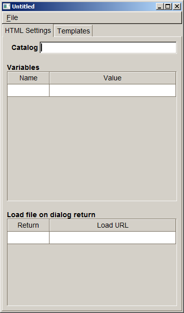
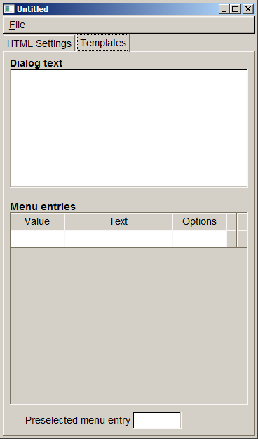
JavaScript Console
Selecting this menu entry opens the JavaScript console. This will display errors during JavaScript script execution and it will display output generated by calls to con-sole.log() from within the script. The JavaScript console will begin recording the output when started for the first time. Once it has been started it will even record the output when the window gets closed. In this case the output can be viewed by re-opening the JavaScript console window.
Performance
This tool shows some performance statistics numbers for the last shown dialog. If a terminal has been connected performance numbers are shown both for the PC and the terminal. The following values are shown:
- CSS: Time required for loading and parsing the CSS file
- HTML: Time required for parsing the HTML file, reading the CSS attributes referenced in the HTML file and determining the layout
- Draw: Time required for sending drawing commands to the graphics subsys-tem. At this point in time the dialog may not be visible on screen yet, depend-ing on the graphics subsystem there may be a short delay until the dialog can be seen on screen. This delay cannot be measured by GUI_Viewer since it has no access to the internal operation of the graphics subsystem.
Debug logs
Selecting this menu entry allows writing debug logs to a file. The logs are similar to activating GUI_LOGMASK and show the resulting HTML code among other information. If a terminal is connected, the client logs are written to this file as well. Selecting the menu again stops logging to the file.
Command Line Interface
GUI Viewer can be invoked from the command line. In this case it is possible to pass options and parameters to select which configuration to use and which file to show. In case there is already an instance of GUI Viewer running these parameters and options are passed on to this instance for processing and the newly started GUI Viewer immediately returns.
The usage is like this:
gui_viewer [options] [<url>]
<url> is the file name of the dialog file to be displayed. If it is not provided GUI Viewer starts with an empty terminal screen.
The command line options supported are:
--device <device.def> This options allows selecting the device to
be used just like using the "Select Device" menu entry. <device.def> is the name of the *.def file to be used
--config <gui.ini>
This options sets the configuration (gui.ini) file. <gui.ini> is the filename of that file.
--region \<id>
By this option the region id is selected given in <id>.
--check-terminal
This option prints the model name of the terminal to standard output. In case no terminal is connected "none" is printed.
--version
The version information and configuration is printed to standard ouput.
Device Definition File
The device definition file (*.def) specifies the terminal image used as background image and the size and position of display and buttons of the terminal. It has INI file format and contains the following sections.
[terminal]
This section contains the name, model_id and image of the terminal. The name is displayed as the window title of the GUI Viewer, the image is displayed as background image.
| Property | Description |
|---|---|
| name | Terminal name to be displayed in the window title |
| model_id | Model ID to be used for selecting resource files when running CP applications |
| image | Optional image of the terminal. If an image is provided, keys are invisible overlays on the image. If no image is provided, keys are drawn by gui_viewer, labels need to be provided for the keys. It is recommended to use a relative path for the image and use '/' as directory separators (even for Windows). The path is considered to be relative to the *.def file. GIF, JPEG and PNG images are supported. |
| scale | Optional scaling factor for displaying the terminal display. All coordinates found in the device definition file are scaled by this factor. |
Example:
[terminal]name=VX820model_id=VX820image=../shapes/vx820_shape.png[terminal_display]
This section defines the position of the upper left corner along the width and height of the terminal display. Coordinates are relative to the shape image and start with (0,0). The following keywords are used to specify the coordinates:
| Property | Description |
|---|---|
| x_pos | Horizontal position of the display |
| y_pos | Vertical position of the display |
| width | Width of the display |
| height | Height of the display |
Width and height must match the size of the physical display in pixels to obtain a preview that is as close as possible.
Example:
[terminal_display]x_pos=65y_pos=80width=240height=320[terminal_key_*]
As with the display terminal keys may be specified. These are placed as invisible buttons on top of the background image. Clicking on them emulates pressing the terminal key. The number and position of keys is terminal specific. The following keys are supported:
| Section | Description |
|---|---|
| terminal_key_F01 ... terminal_key_F12 | Function keys F1 ... F12 |
| terminal_key_0 ... terminal_key_9 | Numeric keys on the terminal |
| terminal_key_cancel | Red cancel key |
| terminal_key_back | Yellow back key |
| terminal_key_return | Green OK key |
For each section the coordinates / sizes are specified the same way as for the display. If no image is provided and keys are rendered by gui_viewer, a label needs to be provided for rendering the key.
| Property | Description |
|---|---|
| x_pos | Horizontal position of the display |
| y_pos | Vertical position of the display |
| width | Width of the display |
| height | Height of the display |
| label | Key label, required when no terminal image was given |
Example:
[terminal_key_0]x_pos=149y_pos=632width=74height=50label=0 [terminal_key_F10]x_pos=63y_pos=634width=74height=49label=F10So the key button area for the '0' key is positioned at 149,632 of the terminal shape image, 74 by 50 pixels in size and the key button area for the '*' key (mapped to F10) is positioned at 63,634 and 74 by 49 pixels in size.
The installation package contains device definition files for most terminal types in the devices directory.
Data Files
.html files and *.tmpl files may contain XML processing instructions (e.g. <?var ...?> to insert variable data. GUI Viewer will look up this information in *.dat files. These have the same base name as the HTML file but have the extension .dat. *.dat files have INI file format and support the following sections:
[value] Section
This section contains the variables available for processing the HTML file. The variable name is used as key and the content is used as value in the section.
Example:
[value]mytext=Text from dat fileValue section might also specify data for <?foreach?> statements. See the following HTML example snippet with <?foreach ?> processing syntax.
HTML Example:
<?foreach test1|(table border=1)(tr)(th)Name(/th)(th)Value(/th)(/tr)|(tr)(td)[name](/td)(td)[value](/td)(/tr)|(/table)|Empty table(br)?>Corresponding DAT file entry:
[value]test1=(<({"name":"item1","value":1},{"name":"item2","value":2},{"name":"item3","value":3})>)[template] Section
This section contains the text to be substituted for <?insert text?> in *.tmpl files.
Example:
[template]text=Inserted text<br>Second line![template_menu] Section
This section contains the text to be substituted for <?insert menu?> in *.tmpl files. The [template_menu] section is able to define several menu entries. For each menu item there is one line of the form <return value>=<text>. <text> is the text to be displayed for this menu item and <return value> is the value returned when this menu item has been selected. Options belonging to a menu item can be set using: <return value>_opt=<option value>. A menu item may be preselected using preselected=<return value>.
Example: menu.dat file:
[template_menu]selected=21=Menu Item 12=Menu Item 23=Menu Item 31_opt=0[return] Section
For creating a mock-up of a terminal with GUI viewer it is supported to load other HTML dialogs when the current dialog returns with a specific return code. The mapping of return codes to names of HTML dialogs to load is done in this section.
Example: menu.dat file:
[return]1=submenu1.html2=submenu2.html3=submenu3.html-1=homemenu.htmlIn this example if the 3rd menu is selected, then submenu3.html gets loaded.
[catalog] Section
The [catalog] section specifies a catalog file that can be used by the HTML file with XML processing instruction <?text ...?>. For more details please refer to chapter Multi-Language Support that describes Multi-language support with catalog files.
Example: catalog.dat file:
[catalog]file=en.ctlgGUI viewer comes along with demo HTML files demonstrating usage of catalog files.
Known Issues
- GUI Viewer always emulates a color display, emulation of B/W displays is not supported. Therefore, when colors are used in HTML files the emulated display will be different from the terminal display.
- *.html and *.tmpl files both use *.dat files for providing dialog data. This may lead to a conflict, for example both test.html and test.tmpl would refer to test.dat.
- Returned dialog variables will not be passed on to the next dialog.
System Setup and Requirements
The following are the hardware and software requirements of the ADK GUI system.
Hardware Support
The ADK GUI system is hardware platform agnostic and supports installation on V/OS, Raptor and V/OS3 terminals.
The GUI system is intended to run across the entire hardware portfolio. The following table list different characteristics of these devices.
| Model | Touch | Color | Resolution | Keypad | Function Keys | Resource Path |
|---|---|---|---|---|---|---|
| Vx820 | Yes | Yes | 240x320 | 0-9,*,#,CAN,CORR,OK | — | 240x320C15T |
| Vx675 | No | Yes | 320x240 | 0-9,*,#,CAN,CORR,OK | 4+4*Cursor+Enter | 320x240C24N |
| Mx915 | Yes | Yes | 480x272 | 0-9,CAN,CORR,OK | — | 480x272C13T |
| Mx925 | Yes | Yes | 800x480 | 0-9,CAN,CORR,OK | — | 800x480C13T |
| Ux100 | No | No | 128x64 | 0-9,CAN,CORR,OK,INFO | 2 | 128x64M16N |
| e280 | Yes | Yes | 320x480 | POWER | — | 320x480C0T |
| e285 | Yes | Yes | 240x320 | 0-9,*,#,CAN,CORR,OK | — | 240x320C15T |
| Carbon X10 | Yes | Yes | 854x480 | — | — | 854x480C0T |
| M400 | Yes | Yes | 854x480 | 0-9,*,#,CAN,CORR,OK | — | 854x480C15T |
| P400/V400 | Yes | Yes | 320x480 | 0-9,*,#,CAN,CORR,OK | — | 320x480C15T |
| P200/V200c | No | Yes | 240x320 | 0-9,*,#,CAN,CORR,OK | 2+4*Cursor | 240x320C21N |
| V200t/V205c | No | Yes | 320x240 | 0-9,*,#,CAN,CORR,OK | 2+4*Cursor | 320x240C21N |
| V240m/V400m | Yes | Yes | 320x480 | 0-9,*,#,CAN,CORR,OK | (Optional: Camera) | 320x480C15T |
| P630 (V/OS3) | Yes | Yes | 320x480 | 0-9,*,#,CAN,CORR,OK | — | 320x480C15T |
Users need to take these characteristics into account when designing GUI dialogs for the different hardware platforms.
The ADK GUI system can also run on Microsoft Windows platforms with underlying FLTK installations.
Software Requirements
ADK-GUI requires the installation of corresponding platform packages. For details please refer to the release notes.
Splash Screen Support
guiprtserver (and guiserver) support displaying a splash screen after startup to give the user some feedback until the payment application is ready. To activate the splash screen a PNG or JPEG image needs to be provided to be displayed on the splash screen. It needs to be found in the following location:
| System | Path for splash screen image |
|---|---|
| V/OS | /etc/config/adk/gui/ |
The following file names are probed (<width>x<height> refers to the screen size):
- splash-<width>x<height>.jpg (e.g. splash-320x240.jpg)
- splash-<width>x<height>.png
- splash.jpg
- splash.png
The first file found will be used as splash screen. The file extension must match the file type.
The image is centered on screen. If the image is smaller than the screen, the background is filled with the average color of the 4 image corners.
Troubleshooting
Logging
Since version 1.4.0 the UI system has added logging support for diagnostics and problem analyses. On all platforms logging messages can be enabled by setting environment variable GUI_LOGMASK (or PRT_LOGMASK for ADK Printer). The variable is defined as a bitmask consisting of following decimal values:
1   = LOG_EMERG:   log messages for conditions, if system is unusable
2   = LOG_ALERT:   log messages, which action must be taken immediately
4   = LOG_CRIT:    log messages for critical conditions
8   = LOG_ERR:     log messages for error conditions
16  = LOG_WARNING: log messages for warning conditions
32  = LOG_NOTICE:  log messages for normal but significant conditions
64  = LOG_INFO:    log messages with informational contents
128 = LOG_DEBUG:   log debug-level messages
LOG_EMERG represents the lowest logging level, which only generates messages, if the UI component cannot be started or is not working at all. The highest level LOG_DEBUG will produce many messages of low-level I/O routines and should only be enabled for debugging purposes. For first analyses it is recommended to set LOG_ERR, which will provide information about error conditions, e.g. wrong resource or image paths, communications problems between GUI server and client. In addition, LOG_INFO can be activated to display all communication data (JSON messages) between application and the UI system.
The environment variable GUI_LOGMASK can be used for the following UI components:
- ADK-GUI server (
guiserverandguiprtserver) - ADK-GUI library (
libfltkgui) - Remote GUIPRT library (
libvfiguiprt)
For each platform, UI components use different defaults for GUI_LOGMASK and also the output channels depend on the used operating system:
- V/OS
On V/OS, Raptor and V/OS3 the default value forGUI_LOGMASKis0, which means that no logging outputs are activated by default. Logging messages directly are redirected to stderr of the applications console. Depending on device the system console outputs are activated differently (e.g. on MX9 press key combination 3-5-7 at terminal startup). Since there is no possibility to set environment variables for applications with sysmode, the variableGUI_LOGMASKcan be either set for IPC libraries withsetenv()from inside application at startup or it can be added to start file of V/OS installation package as follows:
GUI_LOGMASK=64 gui_app(V/OS startup file example)
- Android
On Android the default value forGUI_LOGMASKis255and by default all logging messages are activated. Logging messages are directly passed to Android Logging API. Application might set environment variableGUI_LOGMASKwithsetenv()at startup to change the default values for the logging masks to enable a filter for the logging messages.
A logging message consists of several fields and the content is similar on the several platforms:
V/OS, Raptor:
A console logging message on V/OS and Raptor:
1) timestamp:
The timestamp format is <seconds>.<milliseconds>. The value represents the time since beginning of capture (startup of UI component).
2) log prefix, log channel:
Since version 2.0.0 ADK-GUI and ADK Printer server were combined to one server component and the logging message format has changed. Former field logging component was replaced by log prefix and this field is no longer used to identify the component. The field now is set to GUIPRT for both combined services to specify the system including all components of ADK-GUI and ADK Printer. For identification of the specific subcomponent the new field log channel was introduced to identify logging outputs for the following components:
- GUI: ADK-GUI server (guiserver) or GUI related module in combined guiprtserver
- PRT: ADK Printer server (prtserver) or ADK Printer related module in combined guiprtserver
- GUIPRT: shared module in combined guiprtserver
- GUICL: Remote GUI library, UI client
- PRTCL: Remote ADK Printer library, printer client
Android:
A logging message on Android captured with logcat tool coming along with ADB (Android Debug Bridge):
1) time:
The time format is <hour>:<minute>:<seconds>.<milliseconds>
2) log level IPC logging levels are mapped to Android logging levels as follows:
| IPC logging level | Android logging level | Description |
|---|---|---|
LOG_EMERG |
A |
Assert |
LOG_ALERT |
A |
Assert |
LOG_CRIT |
E |
Error |
LOG_ERR |
E |
Error |
LOG_WARNING |
W |
Warning |
LOG_NOTICE |
I |
Info |
LOG_INFO |
I |
Info |
LOG_DEBUG |
V |
Verbose |
3) log channel:
Same logging channels as used for V/OS and Raptor.
Support for ADKLOG: Logging with liblog library
Since version 2.15.3 ADK-GUI and ADK Printer server has added support for ADKLOG component. ADKLOG is required to implement the new ADK logging concept, which provides the Logging Control Panel (LCP) used as central instance to configure and enable logging for the several ADK components. For this, LCP uses configuration files (for GUI and for PRT), which are read by liblog library. If installed on the system and environment variables GUI_LOGMASK and PRT_LOGMASK are not set, liblog library will be used by client import libraries (libvfiguiprt, libvfiprt) and server components (guiprtserver, guiserver, prtserver) to output logging messages. In this case, the logging messages are passed to liblog library instead of using UI logging methods as described above.
In order to lookup the corresponding configuration files, ADKLOG uses component identifiers, which are reserved for each ADK component. GUI and PRT use the following:
| Component Id | Configuration file | Description |
|---|---|---|
GUI |
GUI_log.conf |
GUI server related log settings |
GUICL |
GUICL_log.conf |
GUI client related log settings |
PRT |
PRT_log.conf |
PRT server related log settings |
PRTCL |
PRTCL_log.conf |
PRT client related log settings |
The configuration files contain several settings for logging like output channels, verbosity and a logging mask, which is similar to environment variables GUI_LOGMASK and PRT_LOGMASK. For more details about configuration settings or logging message formats, please refer to documentation of ADKLOG project.
Hiding information in the Log
ADK-GUI does not know about the meaning of information and, therefore, by default logs all information, even sensitive one. The application may exclude sensitive information from logging by setting the variable "_loghide" in the key value map provided to commands like e.g. uiInvokeURL(). The value is the comma separated list of variable names that should be hidden in the log. When a variable name is contained, all characters of the value are replaced by '#', so that only the length of the value remains visible in the log but not the content.
Guiserver is terminated by OOM killer on V/OS
If an application allocates a huge amount of memory (e.g. by using big images or scaling up an image to arbitrary size), the GUI service (guiserver) may run out of resources and is terminated by the OOM killer of system (OOM=out of memory), if V/OS is not able to provide this memory.
In this case one of following messages may appear in console:
guiserver invoked oom-killer: gfp_mask=0x200da, order=0, oomkilladj=0...Out of memory: kill process 6162 (guiserver) score 12509 or a childor
terminate called after t[ 84.320000] grsec: denied resource overstep by requesting 4096 forRLIMIT_CORE against limit 0 for /home/usr1/bin/guiserver[guiserver:544]uid/euid:0/0 gid/egid:0/0, parent /bin/busybox[sh:102] uid/euid:0/0 gid/egid:0/0V/OS is configured to use overcommitted memory. This means that when malloc() or new operator return non-NULL, there is no guarantee that the memory really is available. In case it turns out that the system is out of memory, the process is killed by the OOM killer of the system.
For new and new[] operators, a possible way to detect the OOM during runtime is by catching exception bad_alloc as follows:
#include <string>#include <stdio.h>#include <stdlib.h>#include <exception>using namespace std; int main(){ try { int *p=new int[99999999999999999999999999]; *p=1; // force exception } catch(exception& e) { printf("This was to much memory, thrown e=%s !\n",e.what()); } return 0;}This would imply that all components (even OS libraries the guiserver is using) would implement such mechanism.
BUT: This exception is not thrown for invocations of malloc()!
In summary there is no chance to avoid OOM kills at all, unless V/OS is changed to use overcommitted memory. The only way to avoid OOM kills is to reduce usage of dynamic memory (e.g. by using smaller images).
Performance Optimizations
When creating HTML documents for a terminal it has to be considered that it has much less computing power compared to a desktop computer and even a smart phone. Therefore, care has to be taken when designing HTML pages and style sheets to avoid computationally expensive tasks. The following list gives some tweaks that can be used to speed up the display of dialogs:
- Avoid large PNGs with alpha channel. Using an alpha channels needs to mix the image with the background. This process has turned out to be quite slow. If possible the transparent areas should be replaced with pixels showing the background, i.e. eliminating the transparency. Note however, that the transparent channel needs to be eliminated altogether since it already slows down things even if all pixels are marked opaque.
- Nested tables need several passes in the layout process. The number of passes depends on the nesting level. If possible use rowspan and colspan to reduce the nesting level of tables.
- c) GUI system Configuration File
Migrating from Version 1.x to 2.x
This chapter contains detailed change descriptions between version 1.x and version 2.x.
Considerations
Version 2.x breaks compatibility to be able to fix some issues that exists in version 1.x. Furthermore, it paves the way for adding of new features in upcoming releases. Minor code changes are required when switching from version 1.x to 2.x. This chapter lists the incompatibilities and the changes required in the application.
- Since GUI and printer server have been merged into one component, the include files have been moved from the gui directory to a common HTML directory. For example
#include"html/gui.h"must be used instead of#include"gui/gui.h". - Components common to GUI and printer have been moved to the common namespace
vfihtml. This new namespace is automatically referenced byvfiguiandvfiprt. In most cases, no action is required. - The use of
uiMain()is no longer required or supported. Instead, the application has to usemain()just like any plain program. - UI properties are no longer thread local but have become global by default. Setting a property in one thread now affects all threads. Due to this, the function
uiThreadCreate()is no longer required or supported. Instead, the POSIX functionpthread_create()should be used. If for some purpose thread specific properties are required, they can be enabled usinguiSetLocalProperties(). - Since
UI_PROP_TIMEOUTis now global to all threads, switching it back and forth on each dialog invocation may create a race condition and should not be used. For setting up an idle timeout,<inputtype="idletimeout">should be used. This is much more flexible since it specifies the idle timeout inside the HTML document. It also controls the action taken in case of an idle timeout. - The default value of
UI_PROP_TIMEOUThas been changed to -1 (disable global timeout). uiReadConfig()no longer internally invokesuiLayout()to set the layout. This caused problems when using more than one application sinceuiReadConfig()destroys the first layout as soon as the second one is called.uiLayout()now has to be called explicitly by the application.- libvfigui has been replaced by libvfiguiprt which is the common client library for GUI and printer.
- The asynchronous function's interface has been changed. Now, the callback functions gets an object that can be used to read the different types of information provided by the dialog. Two types of operations are supported:
- Invoke the asynchronous function without callback.
In this case,uiInvokeWaitis used to get the result of the dialog. It either returns with the result or error code. In case of timeout, it returnsUI_ERR_WAIT_TIMEOUT. This has to be invoked again to obtain the result. All other cases that required to call uiInvokeWait again are not handled internally and are no longer visible to the application to simplify the use ofuiInvokeWait. - Invoke the asynchronous function with callback.
In this case, all data is passed to the callback via an access object. It is no longer required or possible to useuiInvokeWait.
- Invoke the asynchronous function without callback.
- A garbage collection function has been added. In case an asynchronous dialog is shown which does not provide a call function and the result has not been read using one of the ui*Wait functions, the result is discarded automatically after displaying some more dialogs within the same region. For this the dialog result has a counter that is increased each time a new dialog is displayed in the same region. If it reaches the limit, the result is considered garbage and released.
- The request ID has been replaced by a transaction ID. While the request ID is only valid for a single dialog and changed when displaying dialog sequences, the transaction ID stays the same for the whole sequence. Due to this, some call by reference parameters have been replaced by call by value parameters. This change should not affect the application's source code.
- In version 1.x, if a dialog contains
action='load...', next dialog loads in sequence as part of processinguiInvokeWait(or one of the otherui*Waitfunctions). For version 2.x, Loading happens independent ofuiInvokeWait, which should speed up the display dialogs in some cases. The application does not have to be changed to take advantage of this. - A new 'flags' field has been added to struct
UIRegion. When set to zero, it becomes compatible with version 1.x. - Support for hierarchical regions has been added.
uiEnterRegion()anduiLeaveRegion()are used to navigate within the hierarchy. As long as these functions are not used, regions behave exactly the same as in version 1.x. - WebGUI is no longer supported since it has not been used in the field and performance and resource consumption was not competitive compared to the use of the full-blown Opera browser. Therefore, all WebGUI specific functions have been removed. Calls to those functions have to be removed, they have never worked with ADK-GUI anyway.