Branding
1. Background
GPA is a highly brandable payment solution. By default, the Verifone brand is supplied but this can easily be modified to give a completely different branded look. As GPA is based upon HTML, CSS, font, and image resource sets, all of these items can be replaced to give a different aesthetic.
The following feature of GPA ensures maximum flexibility to provide a brandable solution to our customers.
Branding has 3 levels:
- Minimal branding (colours and fonts, via CSS)
- Regular branding (as minimal + resource set, changing images & icons)
- In-depth branding (as regular + modifications to the HTML templates)
Ideally, only minimal and regular branding should be performed.
The UI for GPA is defined in a combination of HTML, CSS & images as defined in the UI templates.
2. UI Layout
The layout is largely defined in the HTML files, although the CSS will affect the positioning and appearance of many aspects of the UI display. GPA aims to keep 90% of the customization of the UI in the CSS aiming to reduce any need to change the CSS. It is recommended to restrict the branding to CSS customization only.
The general layout is described in the following diagrams:
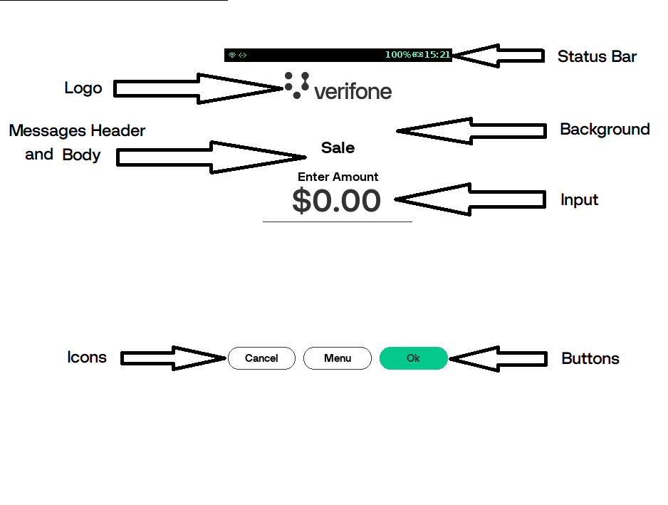
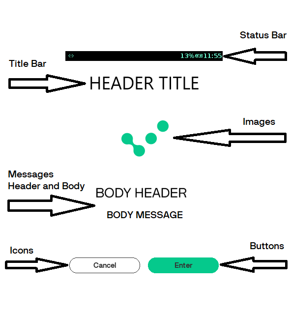
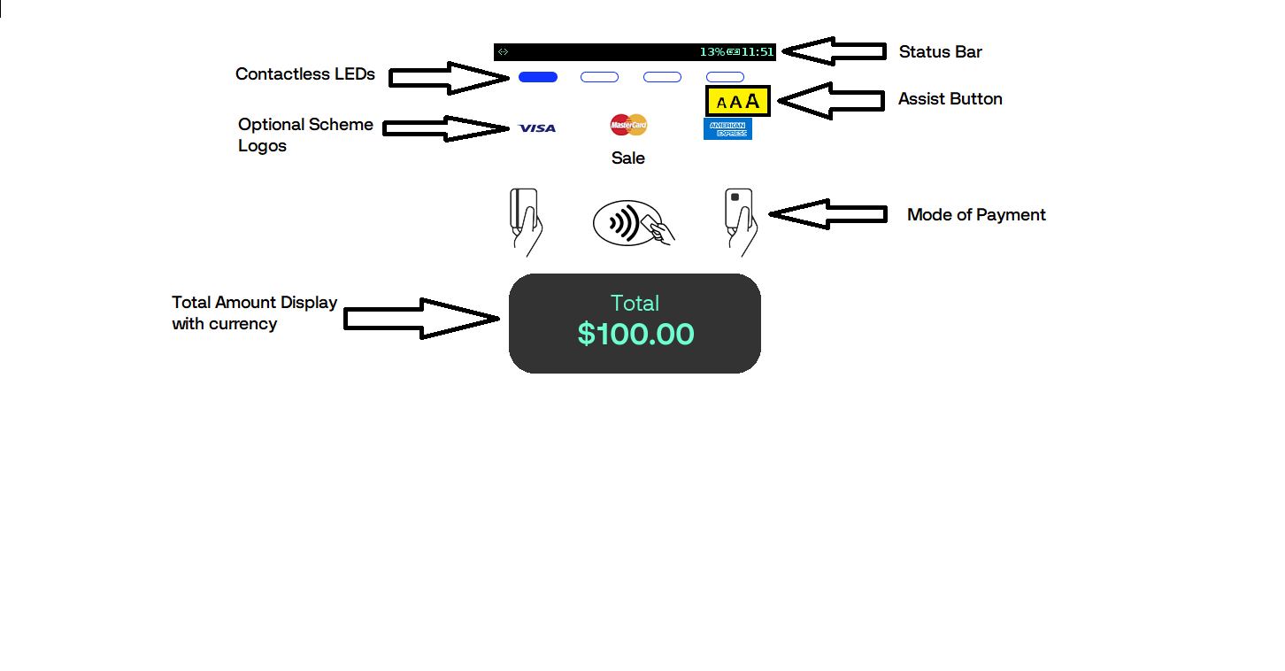
Status Bar
The status bar is supplied as a default part of the ADK. The application uses ADK MAC provided a status bar, where GPA uses MAC status bar UI. It is not recommended to customize the resource set, but rather modify the look and feel via the CSS. HTML built-in system variables are provided for use in the HTML document. The values for these variables are automatically supplied and updated by the status-bar thread and need not be provided by the application. They can be used in the HTML document for XML processing instructions (e.g. <?var name?>). The following HTML variables are recently supported:
| Variable Name | Description |
|---|---|
| sys_time | Pre-formatted time string, format: hh:mm |
| sys_time_hour | hours, format: 00 - 23 |
| sys_time_min | min, format: 00 - 59 |
| sys_time_sec | sec, format: 00 - 60 (The range is up to 60 to allow for occasional leap seconds) |
| sys_time_day | day, format: 01 - 31 |
| sys_time_month | month, format: 01 - 12 |
| sys_time_year | year, format: yyyy |
| sys_time_12h | hours, format: 01 - 12 |
| sys_time_am_pm | AM or PM designation, format: AM or PM |
| sys_battery_percentage | Battery Charge Percentage, format: 0 - 100 , -1 if no battery is available |
| sys_battery_percentage | Battery Charge Percentage, format: 0% - 100% , if no battery is available |
| sys_battery_level | Battery Charge Level, format: 1 - 11 (or 101-111 for battery charging), -1 if no battery available |
| sys_docking status | Docking Status (format: 0 == undocked, 1 == docked, battery charging) |
Following are the different status bar icons.
| Icon | Description |
|---|---|
 |
The PCI Reboot (Optional) is displayed if configured every 24-hour reboot. |
 |
The battery icons indicate the battery charge level and a percentage of charge can also be displayed. |
 |
The WiFi and 3G/GPRS icons indicate connectivity and signal strength. |
 |
The Bluetooth icon displays if the Bluetooth is ON on the Terminal. |
 |
The PCI P2Pe shield indicates if SRED is active. |
 |
The multi-sam icons indicate if a SAM is present in one of the sockets. |
 |
The Base is docker on. |
 |
The Base is docker off. |
 |
The Terminal displays “S” until the settlement process is successful. |
 |
Indicate Advice present. |
 |
Indicate Reversal present. |
Note
The status bar at both GPA idle screen and MAC screen will be the same. For example, if the reversal symbol ‘R’ is present at the GPA status bar, then it will be reflected on the MAC status bar as well.
Title Bar
The title bar is used to display the type of operation or transaction. If a title message is missing, then a default logo will be displayed.

LED Bar
The LED bar is displayed on the card present screen when the contactless reader is active if no hardware LED display is available. The LED bar will display the first LED blinking according to the EMV contactless rules.
Once a card is tapped, the rest of the LEDs will be lit according to the EMV rules for contactless processing.
Text/Prompts
Almost all screens have the option of displaying 2 lines of text on screen (normally on the lower half of the screen, below any icons or images that are displayed). These message lines are split into
- Header Body
- Header Message
The font and size of these messages are defined in the style sheet. The payment application sends HTML to these message fields so that in-line HTML can also be rendered in that region, i.e. <BR> and other HTML formatting commands.
Buttons
Almost all screens have an option of displaying one or more buttons as needed. The buttons are displayed based on the configuration sent by the payment application.
The button form, text, and background images are defined in the CSS.
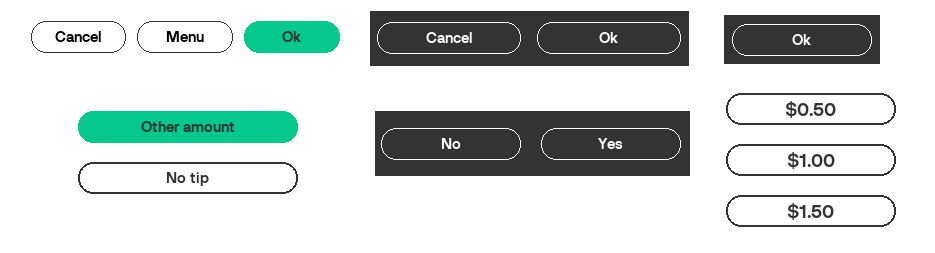
Buttons will expand or contract based on the available space. Most buttons are displayed in the same location at the bottom of the screen. However, some specialized buttons, i.e. Tip Buttons, appear at other set locations.
3. Style
Each terminal screen size is arranged in a different folder containing the default CSS settings. The style sheet is broken down into:
- Body Page
- Virtual Keypad
- Progress Bar
- Header
- Content
- Signature
- Dialog
- Action Buttons
- Tips Buttons
- Menu Buttons
- Currency Buttons
- Input
- List
- Settle
- Assist
- Present Card
- LEDs
- Amount Display
- Icons
By modifying these styles, the colours, sizes, fonts, and images can be altered to provide a similar layout but with different look.
4. Fonts
GPA can use any true type font for rendering the text on the screen and the printer. If the fonts are to use multi-byte references, then UTF-8 must be used in the language catalog files or any textual reference displayed. In this way, languages such as Cyrillic, Mandarin, Korean, etc. can be displayed along with any other custom symbol.
Note
- Fonts must be installed on the terminal. They must be referenced by the language table, default gui.ini, and /or CSS file.
- Some fonts are large, hence, only the required fonts should be loaded to minimize wasted space.
The default fonts loaded in GPA are as follows:
| Font Name | Description | View |
|---|---|---|
| 5x7_practical | Used for receipt printing | 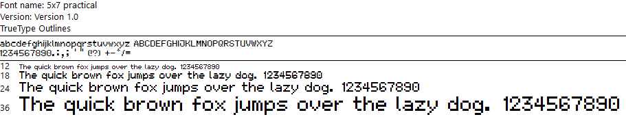
|
| DejaVuSans | General Font used for all displays | 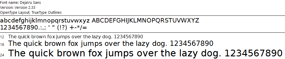
|
| Lato | General Font used for all displays | 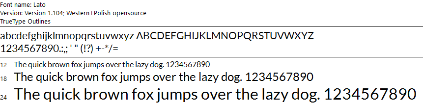
|
| NanumBarunGothic | General Font used for all displays | 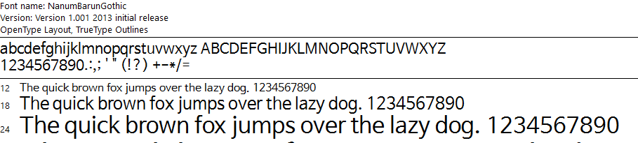
|
| RobotoCondensed | General Font used for all displays | 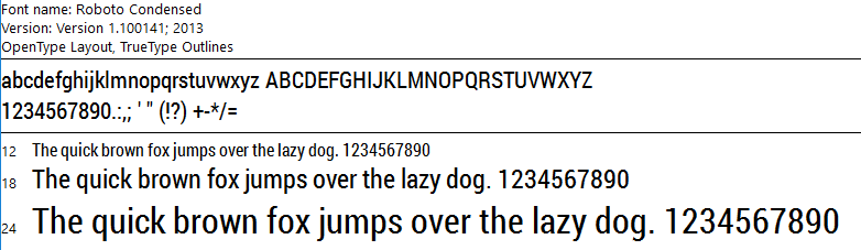
|
5. Iconography
Icons are typically used on buttons and action items. They are normally of fixed size and may have the image and the negative. All icons have transparent backgrounds and are of a generic size that can be used on all platforms wherever possible.
Button Icons
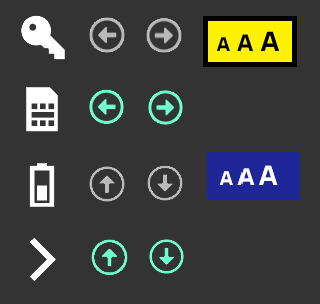
The icons for buttons are used as backgrounds for the button and are preferred over text due to language complications. Typical icons include: navigation, menu, printer, home, password, key, SIM, battery, and assist.
Some buttons will also have an alternative pressed image to indicate the button was pressed, i.e. the assist button. Other buttons may simply change the background colour of the button. All style settings for buttons and icons can be found in the CSS.
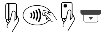
Card Icons
The card icons are used on the card present screen and are displayed based on the configuration supplied by the payment application. The contactless image is mandated by the EMV rules and must be displayed over the contactless reading area.
The insert card on the carbon 8 device can also be an animated icon.
The removed card is also an animated GIF and displayed when the card holder should remove the card.
Dialog Icons
The dialog icons are injected into the dialog HTML by the payment application based on the state of the application. These dialog icons can be replaced by a branded version if need be.
Animated Icons
Animated icons are supported as GIF files, although it is recommended to keep the FPS and number of images to a reasonable level.
The wait icon is a typical animated icon usage.
6. Images, Backgrounds & Logos
Images, backgrounds, and logos can be modified and added as needed to the GPA solution.
Backgrounds
The default backgrounds are as follows.
| Background | Description |
|---|---|
 |
The idle background is displayed on the idle screen, or any screen if modified in the CSS. |
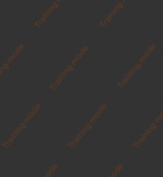 |
The training background is only displayed on all screens when the training mode is activated. |
 |
The screen saver or boot background is only displayed during these statuses of the application. |
Images & Logos
Other images can be displayed as needed, by updating the CSS or by modifying the HTML. Some default images are the scheme logos. These are optionally displayed on the card presentation screen.

7. Receipts & Reports
All receipts and reports follow the same mechanisms as the screen display. The reports and receipts are defined by the HTML files that are found in the print directory:
- Receipts
- Financial
- Reversal
- Administration Reports
- Key Injections
- General
- Consolidated
- Settlement Detail
- Settlement Summary
- Configuration Reports
- Report Data
- Report Entry
- Report Footer
- Report Header
- DCC Reports
- DCC Conversion
- Debug Reports
- EMV Debug
- ISO Dump View
- Raw Dump
- Miscellaneous Reports
- QR Code Print
- Rupay Service Detail
The reports and receipts also have a separate style sheet, language catalogs, INI configuration, and images.
8. Tools
This section details the tools that can be used to assist in the re-branding of the GAP UI.
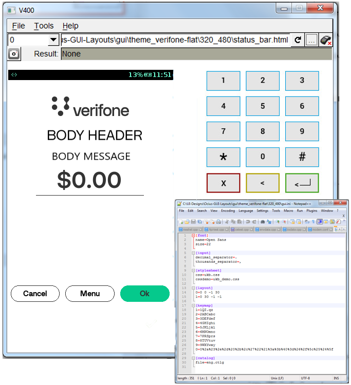
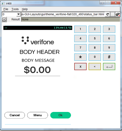
GUIViewer
It is a window executable tool that renders a terminal screen on a PC screen. It can be used to emulate the HTML & CSS screens on any of the Verifone terminals on the PC.
It assists the branding & project in the following ways:
- Improves application project efficiency and accuracy.
- Gets your UI screens quickly reviewed, independent of the application
- Saves time for solution developer / consumer / manager
- No special installation is required. The user needs to unzip the provided zip file.
- Supports all engaged terminals.
Usage
Execute the GuiViewer and it will bring up the default terminal screen. Once running, the following steps can be taken:
- Select the target device (full or compact)
- Load the GUI.ini configuration (default GUI settings)
- Load the HTML
This should then render the correct screen as it would appear on the selected terminal.
The screen capture button can be used to take screenshots and save them to the PC. These can then be used in the documentation, presentation, and mock-ups.

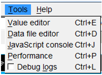
The tools menu provides the below additional features:
- Edit memory values
- Data file editor
- Java-script console
- Performance analytics
UI Files
The following files can be modified to edit the UI:
- Device Definition File
- For rendering the terminal on the PC screen
- Contains sections [terminal], [terminal_display], [terminal_key_*]
- Template Files
- Same ones used in the terminal application
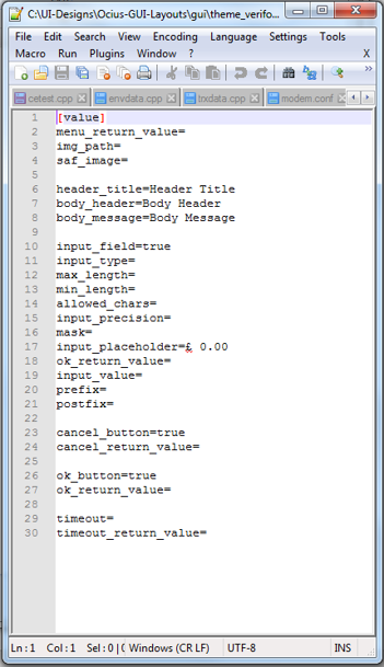
- Data File
- To provide data to be displayed
- Contains sections [value], [template_menu], [return] [catalog]
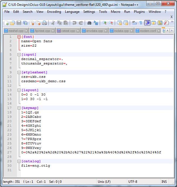
- GUI Configuration File (.ini)
INI Files
- GUI in the configuration file
- Default fonts and size
- Input separators
- Style sheets to be used
- Region layout
- Keymapping
- Language Catalogues
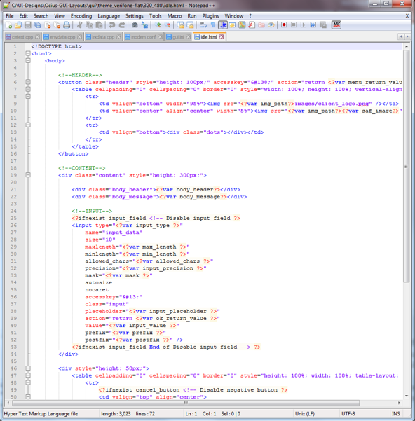
HTML Files
- Load HTML file
- Java-script
- Dynamic values (Values supplied by the app)
- Conditional values (Switches supplied the app)
- HTML
- In-line CSS
DAT Files
- Load dat file
- Default variables and values
Connecting to Hardware
- Connect to terminal
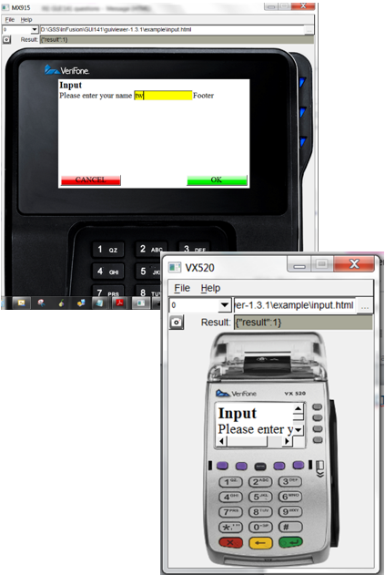
- GUIViewer can connect to a terminal and display the dialogs on the real terminal.
- The IP address of the terminal is required.
- For security reasons, only CPAppDev terminals are supported to be used together with GUIViewer.
- Fonts to be used must be installed on the terminal
Troubleshooting
If the executable does not run right away:
- The probable cause is the missing runtime libraries
- Solution: Install runtime libraries Microsoft Visual C++ 2008 SP1 Redistributable Package (x86)