10 practices to optimize your checkout funnel
Overview
Let’s get one thing straight right from the start and set the proper expectations before diving into this long article. This is by no means the Holy Grail of conversion optimization, for one simple reason: everything is unique to your own scenario. Reading about a test that proved to be successful on a certain website doesn’t automatically make it a best practice for yours. You can’t just copy and paste best practices from one website or even industry to another, expecting the same (or even better) results. Not saying it can’t happen, but it’s simply not a general rule.
This article is meant to be used as a guideline for tests that you should be running when optimizing your shopping cart for better conversions.
The keyword here is test. All the strategies illustrated below have proven successful in different scenarios. Some of our merchants have seen increases in their conversion rate by adhering to one, two, or more of these practices, but only after investing time in testing multiple variations and tailoring the strategies below to their own industry, market, and target audience.
We encourage you to analyze the tactics explained below and test any of them on your own terms. We’d love to learn the impact any of these have on your conversion rate, so if you find a specific strategy that works for you, don’t hesitate to let us in on it and maybe we can help you optimize even further!
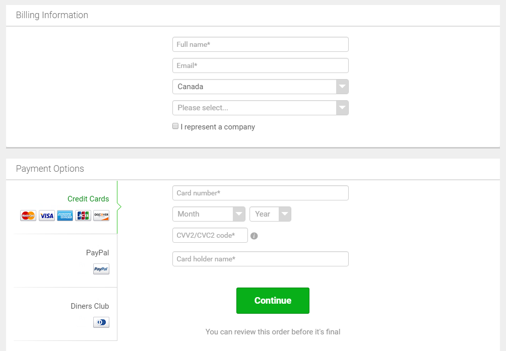
1. Optimize the checkout form
Shorten the checkout form by requesting only essential billing and/or delivery details. Extensive forms can discourage shoppers from completing a purchase. Marketing surveys or other information not required for placing the order should be moved to post-sale pages.
Use easily understandable error messages. Display only coherent error info and actionable remedies capable of helping shoppers resolve the issue. Provide visually distinctive cues when errors are generated and when they’re resolved. Most importantly, don’t blame your shoppers, and employ friendly and customer-centric instructions to help them correct the errors.
For new customers, avoid introducing a separate registration or “create account” step prior to the shopping cart. Instead, allow the cart to double as the registration process, collecting the shopper’s name and email. If a password is required, ideally this can be generated after the order is completed with a redirect from the Thank You/Order Confirmation page. Alternatively, include a password field in the Checkout form itself to avoid a separate step in the purchase funnel.
For returning customers purchasing an upgrade or subscription renewal, the shopping cart should automatically pre-fill their contact information on the Checkout page. Shoppers should not need to register or enter a password to access the shopping cart. The goal is to make it as easy as possible to complete the order.
Example
A solid example of a successful optimization project involved a SaaS provider working with 2Checkout and improving conversions by 36% with a cleaner design and by a further 12% with fewer form fields and optimized payment methods display.
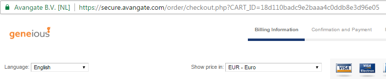
2. Use consistent branding
To deliver a seamless customer experience, the shopping cart should become an extension of your website, product, or app – with consistent branding, design, and layout throughout the purchase flow. Having a consistent brand, design, and style is crucial in building trust. You don’t want your cart to look more like a phishing attempt than a real cart. Apply the same Style Guide to the cart pages for a consistent look and feel.
Example
The header and footer of the cart pages should look exactly the same as the previous page in the purchase funnel. If you have different purchase funnels, for example, if some shoppers are coming from landing pages, some from a product page on your main site, and some from within your software, then use a unique template for each funnel to create a seamless customer experience.
Here are the elements that should be consistent between your site and the cart pages:
- Your company logo – size and position
- Header and footer - use the same color and layout even if the content is slightly different.
- Replicate any background patterns that are present on your website.
- Use the same style guide elements: font style, font size, colors, text links.
- Same button styles, shapes, and colors.
In addition, hosting the cart on a custom domain allows you to use the same URL as your website (e.g. store.yourdomain.com). This avoids redirecting the shopper to an unfamiliar URL which can create confusion or distrust.
For example, shoppers would go from www.yourdomain.com to store.yourdomain.com instead of going from yourdomain.com to secure.ecommerce provider.com. At the same time, for simplicity or if you have just started selling online, it may benefit you to leverage the trust and credibility of your eCommerce or payments provider by using their domain name for the online store.
3. Don’t just translate. Localize!
Speaking to your shoppers in their native language increases their trust in your services. However, don’t just translate the same message and interface texts into their language. Localize them instead, by first understanding how the people in a specific market actually refer to a product or service and how they talk about it. Ask for feedback when trials end and you might get useful information about how your product 'talks' to specific audiences.
Localization doesn’t just include text translations. Optimize your checkout pages to adapt to your shoppers’ locale. For instance, if somebody selects the United States of America as a billing country, make sure to include a State field that only they can see. Shoppers in the United Kingdom, on the other hand, should be allowed to select their county, so show them that specific field.
4. Multi-language, multi-currency, and geolocation
Make your shopping cart as friendly as possible for your shoppers by allowing them to select their own interface language to eliminate confusion. Equally important, try to support as many currencies as possible, so that sales tax and/or VAT don’t come as unexpected charges.
Take things one step further by using geolocation to dynamically adjust these settings to each shopper’s location. All content on the page, including cross-sell and upsell offers, should be displayed in the shopper’s local language. The currency and ultimately price of the product should be automatically configured according to the shopper’s geo-detected country. In-country pricing, where merchants establish a set price point for their top 10 countries, tends to convert better than real-time currency conversion, where the price point is automatically determined by currency exchange rates with a default currency, such as USD.
Example
This practice helps you prevent strange price points like $23.67 instead of in-country pricing such as $24.99, and also allows you to display consistent price points on your website before the shopper reaches the cart.
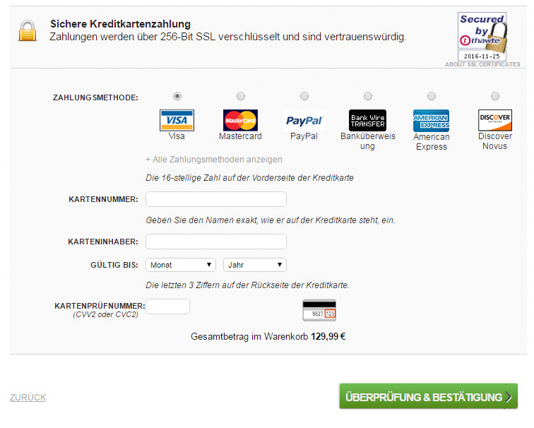
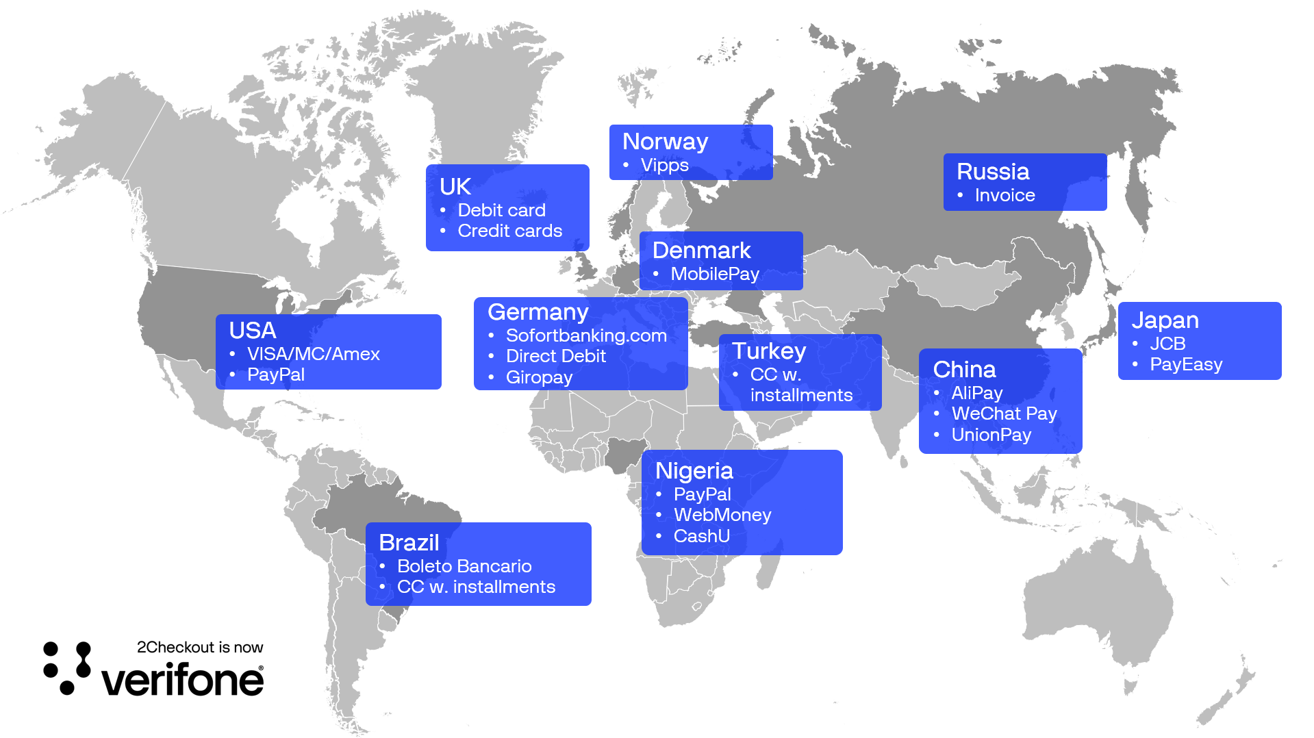
5. Local payment methods/local payment processing
Allow your customers to complete their order with the payment method of their choice. In many countries, credit cards are not the most utilized type of payment method. Ensure that your shopping cart supports all popular local payment methods specific to your target markets. Make sure that the payment methods are clearly visible, and that express options are available for payment methods such as PayPal, where the user is redirected to another site to complete their order.
Just keep in mind that these so-called “alternative payment methods” can make international customers feel sufficiently “at home” in your shopping cart to result in many successful purchases.
In-context checkouts are also useful, as they provide a single-page checkout experience, improving conversion rates.
Example
Display payment methods based on their market share according to the shopper's country. Make the checkout process easier by letting customers quickly select their preferred payment methods without going through long drop-down menus or complicated selectors.
We highly recommend going through our local processing recommendations to learn more about specific payment method market trends and optimizations:
- Local processing and cart support in Turkey
- Online bank transfers in Nordic countries
- Card authorization rates in Brazil
- Local payments in Japan - JCB
- Mobile bank transfers in the Czech Republic
- POLi bank transfers in Australia and New Zealand
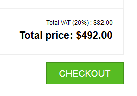
6. Display the total cost
The cart should list the total price the customer will be charged, broken out with separate line items for the product price, taxes, and shipping fees (if any). Hidden costs only frustrate shoppers and can lead to refunds and chargebacks.
7. Add intuitive navigation
Be sure to communicate the number of steps needed to place an order, and where the shopper currently is in the overall process. A progress map or indicator should be placed at the top of the page. Headlines and subheadings can also be used to describe the purpose of each section of the form.
When using a checkout flow with a Review page, letting customers know that they can review their order before it is finalized has been proven to increase conversion rates. Other navigation elements, such as the main navigation menu of your website, should not be displayed on the shopping cart pages in order to keep the shopper’s attention focused on completing their order.

8. Keep shoppers in the cart with discounts
Use exit offers to provide a discount or display a message to shoppers who are about to abandon the cart without completing a purchase. If shoppers close the browser, edit the URL, or move their mouse to the browser bar, an exit offer can be displayed.
For example, offering a 10% discount or showing a testimonial or a 30-day money-back guarantee can convince the shopper to return to the cart and complete their purchase.
Exit offers have a much higher conversion rate than remarketing emails, since only 30-50% of shoppers open emails.
9. Recover abandoned shopping carts
Don’t expect shoppers to return to an abandoned cart and pick up where they left off.
Create a comprehensive marketing campaign focused on recovering abandoned carts. Don’t limit remarketing efforts to just a single follow-up email.
Example
Consider sending out as many as three messages in the first 72 hours after a cart is abandoned. For example, email #1 is sent within 1 hour, email #2 is sent after 24 hours, and email #3 is sent after 72 hours. Each email should have unique content and link directly back to the cart pre-populated with the relevant product.
Craft the remarketing emails with customized data from the shopper; their name, products in the cart, and order value. Go a step further and incentivize the shopper to complete their purchase by offering a discount, free shipping, or a free upgrade.
10. Increase trust with the right messaging
Include relevant visual cues, such as thumbnail images of the product, to assure the shopper that they’ve added the correct item to the cart. When a shopper enters their information in a form field, display a checkmark to create positive momentum.
Another best practice is to display the specific credit card logo (e.g. VISA, MasterCard, Amex) after the shopper enters their credit card number. It’s also essential that you build trust in your business. Inform your shoppers that their online transactions are secure and their private information is kept safe.


Adding a well-known trust mark, such as Norton Security, VeriSign, ScanAlert, and Better Business Bureau logos, provides shoppers with comfort and increases conversion rates. You can use these as visual cues on the cart pages.
Example
A software provider working with 2Checkout has increased conversion rates by over 5% by simply adding a security logo and a refund guarantee to the cart. Overall, A/B testing their shopping cart delivered a 22% increase in revenue per visitor.
Conclusion
When optimizing your purchase funnel, it’s important to first identify the key performance metrics for your software or SaaS business. Then craft an optimization plan specifically designed for each metric.
Best practices serve as a starting point and foundation, and then you must split-test to optimize cart templates, purchase flow, and offers to maximize revenue for each specific target market.
The key takeaway is the absence of a one-size-fits-all solution to increase cart conversion rates and decrease cart abandonment. Optimization is an ongoing process and investing in this area can deliver a solid return on your investment.